Every Figma MCP demo looks the same. Point the agent at a frame, get a React component, done.
Then you try it on a real project and find out the demo skipped everything that matters: the design has two breakpoints that disagree with each other, the generated code assumes left-to-right, and the agent re-derives the design system from scratch on every single page.
I recently shipped a complete production site this way. A law-firm client, Hebrew RTL, a classic WordPress theme, Tailwind CSS v4. Every template was built from Figma comps through the Figma MCP server and Claude Code, then audited against the comps down to the pixel.
The service itself is nothing new; I’ve been doing Figma to WordPress builds for years. What changed is how much of the work the agent now carries.
This is the workflow that survived that project, including the places where the MCP’s output was flat-out wrong.
Skip to the checklist: what to hand the agent
What the Figma MCP Server Actually Gives You
The server exposes a handful of tools, but four of them carry the entire workflow.
| Tool | What it returns | What it’s actually for |
|---|---|---|
get_metadata | A cheap tree of frames with IDs, names, and sizes | Mapping the file once, before touching any single frame |
get_screenshot | A rendered image of a frame or section | The source of truth for visual placement, especially left vs. right |
get_design_context | Generated code plus exact values: px, weights, line-heights, colors | A spec to read, never code to paste |
get_variable_defs | Design tokens defined in the file | Naming your Tailwind theme values after the real system |
That third row is the core mindset shift. get_design_context returns something that looks like finished code, and on an LTR React demo it almost is.
On a real project you read it for the numbers: font sizes, weights, spacing, exact hex values. The DOM order and the positioning offsets you throw away. More on why in the RTL section.
Setup: Connecting Figma Desktop to Claude Code
The Figma MCP server (Figma dropped the original “Dev Mode MCP server” name) runs inside the Figma desktop app, not in the cloud. You need the desktop app open, and you need a Dev or Full seat on a paid plan.
Enable it from the Figma menu under Preferences, and it starts listening locally. Figma documents the details in its official Figma MCP server guide. Figma now offers a hosted remote endpoint too, but this workflow runs on the local desktop server, and the active-tab behavior below is specific to it.
Then register it in Claude Code:
claude mcp add --transport http figma-dev-mode http://127.0.0.1:3845/mcpIf you haven’t registered an MCP server before, the process is the same as any other local server. I covered it in detail in the MCP servers guide for Claude Code.
Node IDs come from the Figma URL. Copy a link to any frame and you get ?node-id=1074-15632. Replace the dash with a colon and that’s the ID the MCP expects: 1074:15632.
The MCP resolves node IDs against whichever file is the active tab in the Figma desktop app. Only one file is reachable at a time. When the server says a node “cannot be found”, the link is almost never broken. You have the wrong tab focused.
The style guide lived in one file and the page comps in another, so every switch between “what does the button spec say” and “what does the homepage look like” meant changing tabs in the desktop app first.
The Per-Page Workflow: From Frame to Template
After a few templates, the process settled into the same five steps every time.
- Run
get_metadataon the root canvas once. You get the whole frame tree, and you find the pair of frames for each page. In our file every page had two: a 1920 desktop frame and a 360 mobile frame, named like001a 1920 Homepageand001a 360 Homepage. - Run
get_screenshoton each frame, and on individual sections of long pages. The screenshot decides every placement question. If the code and the screenshot disagree about what sits on the right edge, the screenshot wins. - Run
get_design_contextper section, not per page. A full-page call burns tokens and blurs detail. A section call gives you exact values you can transcribe. - Build the section with your own tokens and component classes, then run your build.
- Verify by measuring, not by re-reading your classes. Emulate the real viewports, read computed styles, and put your screenshot next to the comp.
The last step is where most AI-built pages quietly fail. The agent wrote text-base, the class looks right, everyone moves on. Whether the browser actually resolved 16px on that element at that viewport is a different question. So we measure with the Chrome DevTools MCP:
// chrome-devtools MCP: emulate "360x800x3,mobile,touch",
// reload with ignoreCache, then per element:
const el = document.querySelector('.stats-bar .pill');
const cs = getComputedStyle(el);
JSON.stringify({
  fontSize: cs.fontSize,     // spec says 16px on mobile
  fontWeight: cs.fontWeight, // spec says 500
  color: cs.color,
  padding: cs.padding
});
// then emulate "1920x1200x1" and measure again
I wrote about the browser side of this in the Chrome DevTools MCP post. Same server, different job: there it audits performance, here it audits fidelity.
Transcribe the Design System Once
This is the biggest multiplier in the whole workflow, and nobody talks about it.
The naive loop asks the MCP about colors and type styles on every page. That re-derives the same design system dozens of times, burns tokens, and worse, produces slightly different answers each time.
Instead, we spent one session transcribing the entire Figma style guide into two places: a persistent agent skill file and Tailwind v4 tokens.
Tailwind v4 is CSS-first, so there’s no config file (if running Tailwind inside a WordPress theme is new territory, my Tailwind CSS v4 in WordPress guide covers the setup). The tokens live in an @theme block:
@theme {
  /* transcribed from the Figma style guide, node 12:340 */
  --color-blue-900: #081722; /* NOT #081822 - that hex belongs to a different ramp */
  --color-mint-300: #ACF8CB; /* fill only, never use as text color */
  --font-display: "Rubik", sans-serif;
}
The skill file holds the rest: six color ramps, 21 named Rubik type styles, and component classes like btn btn-primary and chip with their full state matrices.
From then on the agent reads the skill, not Figma, for anything system-level. Figma stays the origin; the skill is a cache. The skill file states the rule explicitly:
“Where this document and Figma disagree, Figma wins. But re-read the node and update this file.” – from our project’s design-system skill file
One thing I’d do again on day one: document what the design system does not define. Our style guide had no focus states, no disabled buttons, no blockquote or caption styles.
Left alone, the agent invents those differently on every page. We wrote the decisions down once (including a WCAG 2.4.7 focus ring the design never specified) and the inconsistency stopped.
Lessons that came up mid-project went into persistent memory files the same way. “Audit the 360 frame too” and “justify-end flips left in RTL” each cost us a bug exactly once.
Audit Both Breakpoints, Every Time
Here’s a real failure. Late in the project I ran a typography audit against the desktop comps. The report came back clean: everything matches.
Then we checked the 360 frames. The mobile stats pills were shipping at 14px against a 16px spec, and one row rendered in the wrong order. The desktop audit wasn’t wrong, it was just answering a different question.
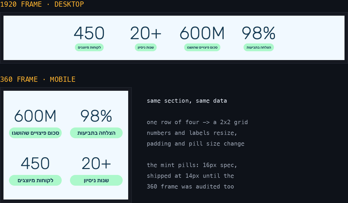
The same stats section in both frames: a row of four on desktop, a 2×2 grid on mobile. The mint pills under the numbers are the ones that shipped at 14px against a 16px spec.
A desktop-only audit is worse than no audit. It produces a confident “all match” verdict while the mobile build drifts, and confidence is exactly what stops anyone from checking again.
The reason this bites is that in a real design system, the two frames differ more often than they match, and not just in size.
On this project the article H1 was SemiBold 600 in the blue-500 color on desktop, but Medium 500 in blue-900 on mobile.
The practical rule: the 360 value is what your base Tailwind classes must produce, and the 1920 value is what your lg: variants or clamp() must resolve to. A clamp() counts as matching only after you’ve measured it at both widths.
RTL: Where the Generated Code Is Actively Wrong
Everything above applies to any project. This section is why the demo workflow falls apart on a Hebrew site, and none of the Figma MCP articles I’ve read even mention it.
Never Copy DOM Order or Offsets
Figma’s generated code is LTR-authored and physical. The DOM child order and every left: and right: value assume a left-to-right page. Under dir="rtl" the first DOM child renders on the right, which is the mirror image of the comp you’re staring at.
A value like left: 478px inside a 506px container doesn’t mean “left”. It means “inline-start”, which on your page is the right edge.
Logical Properties Only
Every directional utility in the build has to be logical: ms-* and me-* instead of ml-* and mr-*, ps-* and pe-*, start-* and end-*, text-start instead of text-left.
If the start/end mapping is new to you, my guide to CSS logical properties covers the whole system.
But the bug that kept coming back wasn’t a margin. It was flex alignment:
<!-- Figma's output: right-aligned in the comp, but this
     resolves to the physical LEFT under dir="rtl" -->
<div class="flex justify-end">
  <span class="ml-4">04</span>
</div>

<!-- What actually right-aligns the row on an RTL page -->
<div class="flex justify-start">
  <span class="ms-4">04</span>
</div>justify-end, items-end, and self-end all resolve to the physical left in RTL. Right-aligning a flex row means writing justify-start, which reads exactly backwards until it clicks.
This one bit us on form labels, footer headings, and contact-form fields before it went into the skill file as a standing rule.
Match the Screenshot, Row by Row
You’d think the fix is a blanket “mirror everything” rule. It isn’t, because real comps are inconsistent.
On our project the numbered stepper read right-to-left, starting from the right edge. The stats bar and the badge row ran 1 to N from the left, on the same pages. Whether that was designer intent or accident doesn’t matter; it’s what the client approved.
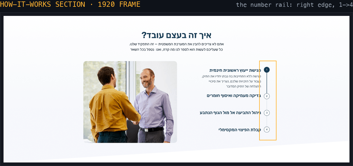
The numbered stepper from the comp: the rail sits on the right edge and reads 1 to 4 top-down. Our first build shipped it mirrored to the left.
So the rule became: match the screenshot per row. Build the row, screenshot your build at the same viewport, and compare which element sits at each edge. Both the stepper and the badge row shipped mirrored before we enforced that comparison.
Carousels get the same treatment: on an RTL page the “next” arrow points left and the progress logic mirrors with it.
Numbers Stay LTR
Inside RTL text, some content still runs left-to-right: numbers, prices in shekels, phone numbers, Latin brand names. Wrap them in <bdi> or a dir="ltr" span so the bidi algorithm doesn’t scramble them mid-sentence.
The Headless Chrome Trap
Headless Chrome clamps the layout viewport to roughly 500px minimum.
Ask it for a 390px screenshot of an RTL page and you get a picture that looks cut off on the right side. It’s not. The page is fine; the tool faked the bug.
Verify mobile through DevTools emulation, never through a headless window size flag.
What to Hand the Agent: The Full Checklist
Connecting the MCP is the easy part. What decides the output quality is the context you hand the agent next. Here’s the full list we converged on:
- The Figma file links and node IDs for the exact frames, and which file is the style guide vs. the page comps. Keep the right file focused in the desktop app.
- Both frames per page, 1920 and 360, by name or node ID.
- The stack context: WordPress classic theme, Tailwind v4 CSS-first, the build command, where the tokens live, and that the site is
dir="rtl"withlang="he". - The fixed-vs-free contract: which tokens, type styles, and colors are brand law, and where the agent has freedom (composition, motion). Include contrast rules, like our mint that works as a fill but never as text.
- Real assets: self-hosted font files and exported images. Don’t let the agent crop images out of Figma screenshots.
- House rules: a unique
idper section, the semantic HTML and accessibility floor, escaping and i18n functions. - An explicit verification mandate: measure computed styles at both breakpoints and compare screenshots against the comps before claiming done.
Item 7 matters most: an agent told to “build it, then prove it matches at 360 and 1920” catches its own mistakes, and you stop being the only QA in the loop.
Pitfalls That Each Cost Us Real Time
A few smaller ones, each learned the hard way:
- Node IDs move. A saved ID from last week may point at nothing after the designer reorganizes. Re-confirm before relying on one.
- Near-identical hex values can belong to different ramps. We had
#081722and#081822as separate tokens. Transcription has to be exact, because your eyes will never catch the difference in a screenshot. - Tokens from an early brief may not exist in the final guide. Our early docs mentioned a set of cream colors that the finished style guide had dropped. Verify every token against a current comp.
- WordPress-specific bonus: core injects an unlayered
:where(figure)rule with a bottom margin, and unlayered CSS beats every layered Tailwind utility. Figures needm-0!to actually reset.
FAQs
Quick answers to the questions that come up most with this workflow.
Summary
The Figma MCP server is genuinely good at what it does: it hands your agent exact design values straight from the source. Production accuracy comes from everything around it.
Treat the generated output as a spec, transcribe the design system once into tokens and a persistent skill, audit both breakpoints on every page, rebuild all directionality with logical properties on RTL sites, and make the agent prove the match with computed styles instead of claiming it.
The demo gets you a component. This workflow got us a client site that matches its comps at 360 and 1920, in a language the MCP’s output doesn’t even know exists.