One of the most frustrating things that happen when browsing a website is unexpected layout changes on a page.
A popup appears out of nowhere. Content shifts while you’re reading. A button moves just as you’re about to click it.
Google dislikes these sudden changes too, since they hurt user experience. That’s why they introduced a metric called Cumulative Layout Shift (CLS) – it measures layout instability during the page rendering process.
What is Cumulative Layout Shift (CLS)?
In short, CLS measures the sum of individual layout changes that happen throughout the lifespan of a specific page.
The CLS metric is part of Core Web Vitals and measures the visual stability (or instability) of a page. Before we continue, take a look at the following video:
The video illustrates what an undesirable layout shift looks like. I’m sure many of you have dealt with similar situations.
CLS assesses the ratio between the affected portion of the viewport and the distance the shifted elements moved. Because of its impact on user experience, CLS influences your site’s ranking alongside these other Core Web Vitals metrics:
- First Contentful Paint (FCP) metric.
- Interaction to Next Paint (INP) metric, which replaced FID in March 2024.
- Largest Contentful Paint (LCP) metric.
As always, it’s important to note that the goal is to achieve a good user experience, not just scores. Those scores are only indicators of actions to take or issues to address.
Expected Layout Changes vs. Unexpected Changes
Not all layout changes are bad. If the layout change occurs due to a user-initiated action, it’s considered an expected (positive) change.
For example, clicking the hamburger menu to open mobile navigation is an expected shift. So is clicking a button that reveals an accordion section and pushes content downward.
Google can differentiate between the two. Any change occurring within 0.5 seconds (500ms) of the user’s last interaction isn’t counted toward your CLS score.
Unexpected (negative) changes are a different story entirely. The video below shows what a bad layout shift looks like:
So, What’s a Good CLS Score and What Should We Aim For?
Google recommends aiming for a CLS score lower than 0.1. Anything above 0.25 is considered poor:
- Good – CLS less than 0.1
- Needs Improvement – CLS between 0.1 and 0.25
- Poor – CLS higher than 0.25
Note that unlike other core vitals metrics, CLS isn’t measured in time.
The formula for calculating the score is as follows:
Mobile layout changes have a bigger impact on the score due to the smaller screen area. You’ll see different CLS scores for mobile and desktop.

How to Check the CLS Score of a Specific Page?
You can measure CLS with both field data and lab data using several tools. PageSpeed Insights, GTmetrix, WebPageTest, and Google Search Console (under the Core Web Vitals report) are the most common options.
You can also use Chrome Lighthouse or the DevTools in Chrome as lab tools.
However, the real testing of layout changes doesn’t end with these tools. Testing in a development environment gives different results than the live site, since assets (CSS, fonts, images) are already cached in the browser on the live site.
This means layout changes happen much faster on the live site, making them hard to spot. You might notice some shifts but struggle to identify all of them.
How can you perform a thorough test? Here are two recommended methods…
First Method – Layout Shift Regions
In this method, we intentionally slow down the site’s loading speed for testing purposes. When the site loads extremely slowly, you can observe which elements changed and how many layout shifts occurred.
Dynamic elements will also load slowly, making all layout changes visible. You can set this up using Chrome DevTools:
- Open Chrome DevTools (by pressing F12) on the page you want to test the layout changes for and navigate to the Network tab.
- Click on the dropdown that says “Online” and change the setting to Slow 3G, for example, to simulate a slower internet connection.


After setting the connection speed to slow, go to the Elements tab, then “More Tools” (inside the three-dot menu) and select “Rendering.”
At the bottom, you’ll see “Layout Shift Regions.” Activate this option and reload the page. Areas where layout changes occur will be highlighted in blue.

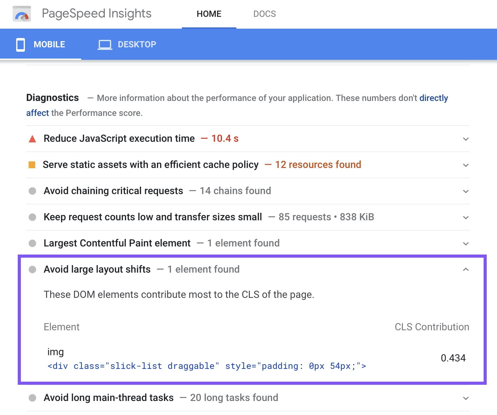
You can also see the specific element causing the layout shift in the PageSpeed Insights report.
Second Method – Performance Tab
Navigate to the Performance tab in Chrome DevTools and click “Start profiling and reload page.” This refreshes the page and provides a profile report under “Experience.”
Select a specific “Layout Shift” to see the HTML element causing it highlighted on the page. Click on the shift entry to view a summary with the original and new positions of the moving element.

How to Improve Your CLS Score
Now that we know how to check the CLS score and layout shifts on a website, let’s look at some common issues affecting that score and suggest solutions:
1. Loading Font Causes FOIT/FOUT
Fonts are among the main culprits affecting CLS. Most websites use at least one web font (from Google Fonts or other sources), and since web fonts have different letter spacing and sizes than the browser’s defaults, layout shifts occur when they load.
You can’t completely eliminate this issue, but you can mitigate it significantly. Pre-load your web fonts (rel = preload) so they get higher priority during page load. It’s also recommended to host web fonts locally on your server, though only if your hosting is fast and reliable.
The font-display property helps combat FOUT & FOIT effects that impact CLS. More about this in the article about the font-display property.
Using aggressive caching and a good CDN for static assets like fonts also helps. The CDN serves assets from the closest network location, resulting in faster loading and fewer font-related layout shifts.
Remember that preloading fonts might negatively impact the Largest Contentful Paint (LCP) metric if not used carefully.
Check out the detailed post I’ve written explaining what is LCP and how to get better LCP score.
Embeds and iFrames
Embeds let you display content from other sites on a page – YouTube videos, Google Maps, Instagram posts, and more. There are various embedding methods:
- iFrame
- Embedded HTML code
- Script tag with HTML fallback
The problem is that most embeddable applications don’t include exact dimensions upfront. If you embed a tweet, it might contain only text or text + an image – the platform can’t predict the exact height.
Since dimensions are unknown, most embed codes don’t include them. When the embedded content loads, it can cause significant layout shifts.
To improve CLS, set the required dimensions upfront and use a placeholder or fallback content.
You can determine the needed embed height using Chrome’s Developer Tools. Set placeholder dimensions so there’s enough space when the embed loads.
Widgets and certain platforms like Google Maps allow you to set the embed dimensions in a way that won’t cause issues in this regard.
Dimensionless Images and SVGs
Images are another very common cause of layout shifts, especially dimensionless images – those without fixed width and height.
When the browser encounters a dimensionless image, it doesn’t reserve space for it. When the image finally loads, it pushes text and other content around.
Images are usually loaded after textual content, as images have larger file sizes compared to HTML and CSS.
The simplest fix is defining width and height attributes on every <img> tag. For responsive design, the modern best practice is to use the CSS aspect-ratio property:
img {
  aspect-ratio: 16 / 9;
  width: 100%;
  height: auto;
}
This lets the browser reserve the correct space before the image loads, without breaking responsive layouts.
SVG images behave differently – they scale to the dimensions of their container element. Without defined dimensions, SVGs tend to load at full size, causing sudden shifts.
The fix is to define width and height directly in the SVG code. This ensures the SVG loads at the exact dimensions you want.
Here’s an example of SVG without defined dimensions. After opening the SVG in a text editor and adding the following width and height you can see the same SVG image with the dimensions we specified. Pay attention to the added width and height.
‹svg xmlns="http://www.w3.org/2000/svg" width="40px" height="40px" viewBox="...
There are many other specific methods, but this optimization should be a good starting point, as the browser will reserve space for image loading and prevent unwanted layout changes.
Advertisements
Advertisements are among the biggest contributors to layout shifts. Most ad platforms use dynamic sizes instead of fixed dimensions, which leads to performance and layout issues.
Ad content is served from third-party servers, so it loads slower than your own page elements. The dynamic sizing is designed to maximize CTR, but it comes at the cost of visual stability.
The best approach is to allocate space in advance using CSS. You can set a min-height on the ad container based on the most common ad sizes you serve.
Be cautious – reserving the maximum size could leave empty space if a smaller ad loads. Also account for scenarios where no ad is served at all. My advice is to display a placeholder, since the reserved area might collapse if no content loads.
There isn’t a one-size-fits-all solution for ads. It depends on your ad network and the historical data of your most common ad sizes.
Dynamic Content
Every website has dynamic content – related posts, newsletter signup forms, sticky bars with messages, and similar elements.
The simplest way to avoid layout shifts from dynamic content is to insert it beneath existing content, not above it. The exception is when dynamic content appears above existing content in response to a user interaction.
If you must place dynamic content above existing content, allocate enough space for it in advance.
Speed
Remember that any layout shift in response to a user interaction is considered a “good” shift. But the response must load within 0.5 seconds of the interaction.
If your site is too slow to render the expected changes within that window, they’ll count as unexpected shifts and hurt your CLS score. That’s why optimizing your overall site speed matters for CLS too.
Animations
Google’s recommendation for animations is to use CSS transform properties to prevent unexpected layout shifts. Unlike properties like top, left, width, or height, CSS transforms don’t trigger layout recalculations. For more on this topic, see our guide on frontend and animation performance.
If you’re using Lottie animations, with elements sliding onto the screen from left to right in fade-in/fade-out effects, my recommendation is still to define the element’s height in a way that won’t cause poor or unexpected layout shifts.
FAQs
Common questions about CLS and layout shift optimization:
font-display fallbacks, dynamically injected content (like ads and widgets), and animations that use layout-triggering CSS properties instead of transform.width and height attributes to your <img> tags. For responsive layouts, use the CSS aspect-ratio property to let the browser reserve the correct space before the image loads. This prevents content from being pushed around when images appear.Conclusion
CLS optimization is an ongoing process. With its weight increased to 25% in Lighthouse and its role as a Core Web Vitals ranking signal, CLS already has a direct impact on how Google evaluates your site.
Beyond rankings, reducing layout shifts improves user experience and can increase conversions. Sites passing all three Core Web Vitals see significantly lower bounce rates. Whether you’re focused on SEO or user experience, optimizing CLS is well worth the effort.