The font-display property determines how fonts loaded using @font-face are displayed on a website, based on whether the font has already been downloaded and is ready to be used or not.
To address this issue, where text is present but the fonts haven’t yet loaded, browsers utilize two different techniques. So, the font-display property is at the core of this post. However, before delving into it, you need to understand those techniques and the acronyms FOIT & FOUT.
A Few Words About FOUT & FOIT
FOUT & FOIT describe the two main methods browsers use to display text during the time between page load and font load:
- FOUT – Flash of Unstyled Text: This is when the browser shows some initial font defined in your CSS for a brief moment, and then swaps to the fully loaded custom font.
- FOIT – Flash of Invisible Text: This is when the browser doesn’t display any text until the custom font is loaded, and then replaces the invisible text with the desired font.
When I mention “custom font” or “web fonts,” I’m referring to fonts loaded using @font-face, of course.
Here’s an image illustrating these options and depicting FOUT and FOIT:
As of the time of writing this article, different browsers have different default behavior when it comes to font rendering. If you don’t specify otherwise and load the font using @font-face, you’re letting the browser decide how to behave during the font loading time.
So, what can you do about it? There are various approaches, as outlined in a detailed guide by Zach Leatherman. However, in this post, we’ll focus on the CSS property font-display, which allows us to have more control over what happens with text and fonts during their loading time.
The font-display Property
The font-display property is a relatively new feature that can be used alongside the @font-face rule. Its usage is as follows:
@font-face {
  font-family: Lato;
  src: url(/assets/fonts/Lato-LightItalic.woff2) format('woff2'),
       url(/assets/fonts/Lato-LightItalic.woff) format('woff');
  font-weight: 200;
  font-style: italic;
  font-display: swap;
}
Before we delve into the values that the font-display property can take, take a look at the following diagram that helps illustrate the concept behind the font-display property:
- During the block period, the browser renders the text with a fallback font. So, in some situations during the initial load of a website with heavy fonts, you might see invisible text or orphaned underlines.
- During the swap period, the browser renders the text with the fallback font, which is usually a sans-serif font.
- During the failure period, the custom font doesn’t load, and the browser renders the text with the fallback font.
So, as we mentioned earlier, the font-display property allows us to control the duration of each of these phases.
Values of the font-display Property
The font-display property can take several values:
1. auto – The browser’s default behavior. This behavior might vary across different browsers, but it’s usually similar to the block value (meaning block is the default behavior in most cases).
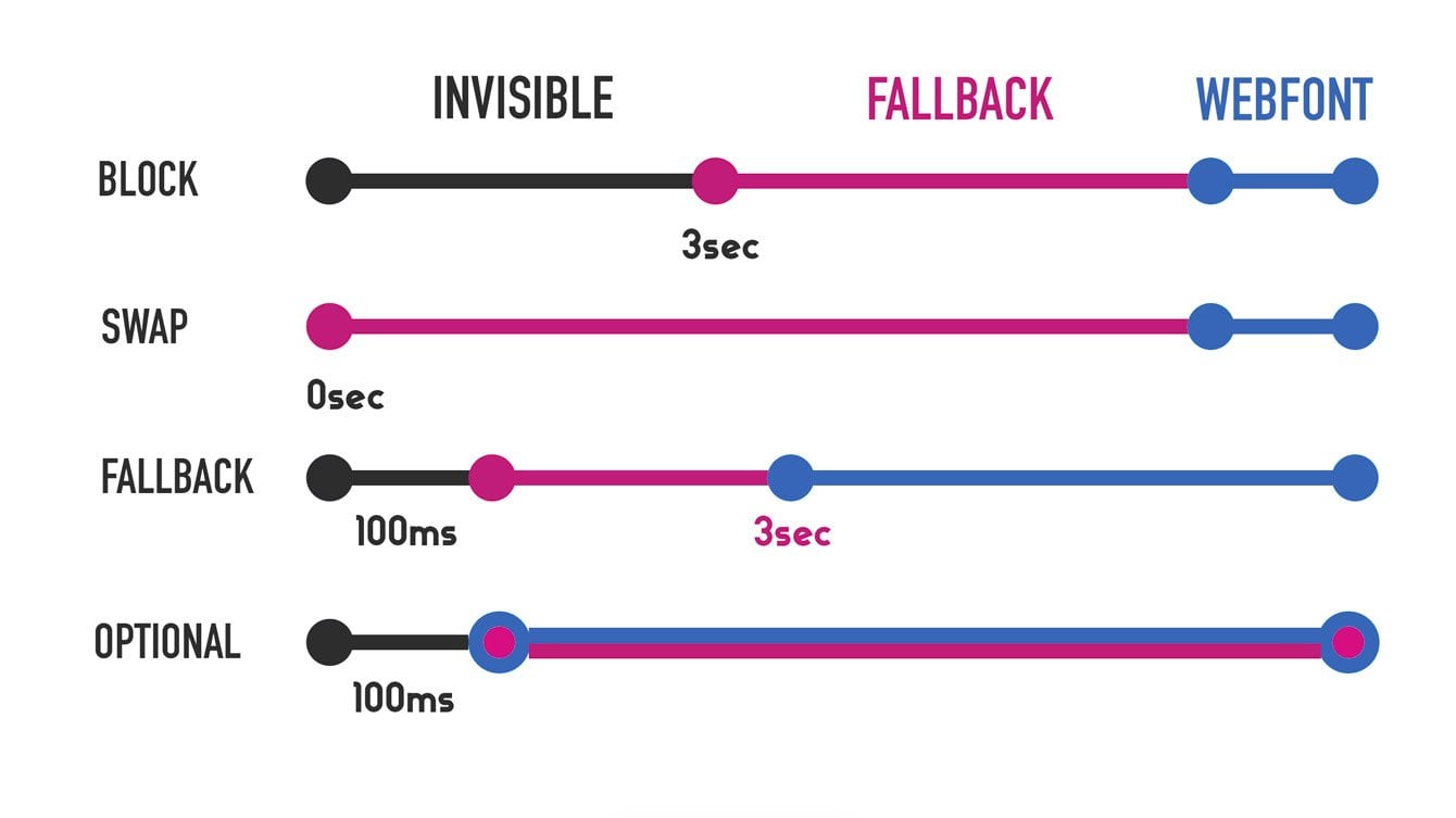
2. block – Allows a block period of around 3 seconds and an infinite swap period. In other words, the browser initially renders invisible text until the custom font loads, at which point it swaps to the custom font (FOIT).
The duration of the block value depends on the browser you’re using. Chrome, Safari, and Firefox use around 3 seconds, while IE uses 0 seconds (meaning no block period at all).
3. swap – Allows a very short block period (around 0ms) and an infinite swap period. This means the browser immediately renders the text with the fallback font if the custom font hasn’t loaded yet, and then switches to the custom font as soon as it’s fully loaded (FOIT). Here’s an example using font-display: swap.
4. fallback – Allows a very short block period (around 100ms) and a swap period of around 3 seconds. In other words, if the custom font isn’t loaded during the block period, the browser will display the fallback font but will switch to the custom font during the swap period.
5. optional – Similar to fallback, but with a shorter block period (around 100ms) and a swap period of 0 seconds. With the optional value, the browser decides whether to load the custom font at all or to download it in the background with low priority, depending on what’s best for the user and considering the internet speed they have.
In this case, if the custom font isn’t loaded within the 100ms block period, the custom font won’t be displayed at all.
However, in most cases, the browser will fetch the custom font in the background and cache it. If the user navigates to another page, the custom font will be loaded immediately from the browser’s cache.
I understand that this topic can be a bit confusing, so let’s look at these values side by side. This might help all of us better grasp the subject:

Using the font-display Property for Google Fonts
It’s worth noting that just this year, Google allowed the use of the font-display property for fonts served from its servers (Google Fonts). These fonts are also loaded using @font-face, and you can set the value to use as follows:
<link href="https://fonts.googleapis.com/css?family=Assistant&display=swap" rel="stylesheet">
Note that by default, Google provides you with code that uses the swap value, where text is immediately displayed to the user.
So, Which Value Should You Use?
Personally, I’m not a fan of FOUT in any way, as it’s simply a suboptimal user experience. For me, it’s worse to have text suddenly change than to wait a bit for the text to appear.
However, there are different approaches to this issue, and the decision of what’s better depends on the relevant website or application and also on the internet connectivity of the majority of your users.
You should consider that the font loading time, which influences the chosen value of the font-display property, depends on several factors such as connection speed (3G, WiFi, etc.), your server, and overall site optimization for performance.
If you find the sudden text swap bothersome, you might use font-display: block. In this case, the user won’t see the text until the custom font is loaded. But the general recommendation is to use this property only when the custom font is essential for the user’s experience and functionality on the site.
You can alternatively use font-display : optional. In this case, the text will not be replaced, but the content might be displayed to the user in the fallback font the first time they enter the website. This option is suitable for situations where the display of a custom font is “nice to have” but not critical to the user experience.
This is also an excellent option for situations where visitors to your site have particularly slow internet connections.
On the other hand, if you want the text to be displayed as quickly as possible to the user and you don’t mind it being swapped, use the font-display : swap or font-display : fallback property.
In practice, ‘fallback’ is a good candidate for the text on your site (body text) and for situations where you want the user to start reading the content as quickly as possible and don’t want their attention to be distracted by text swapping.
“First Contentful Paint” metric in PageSpeed Insights
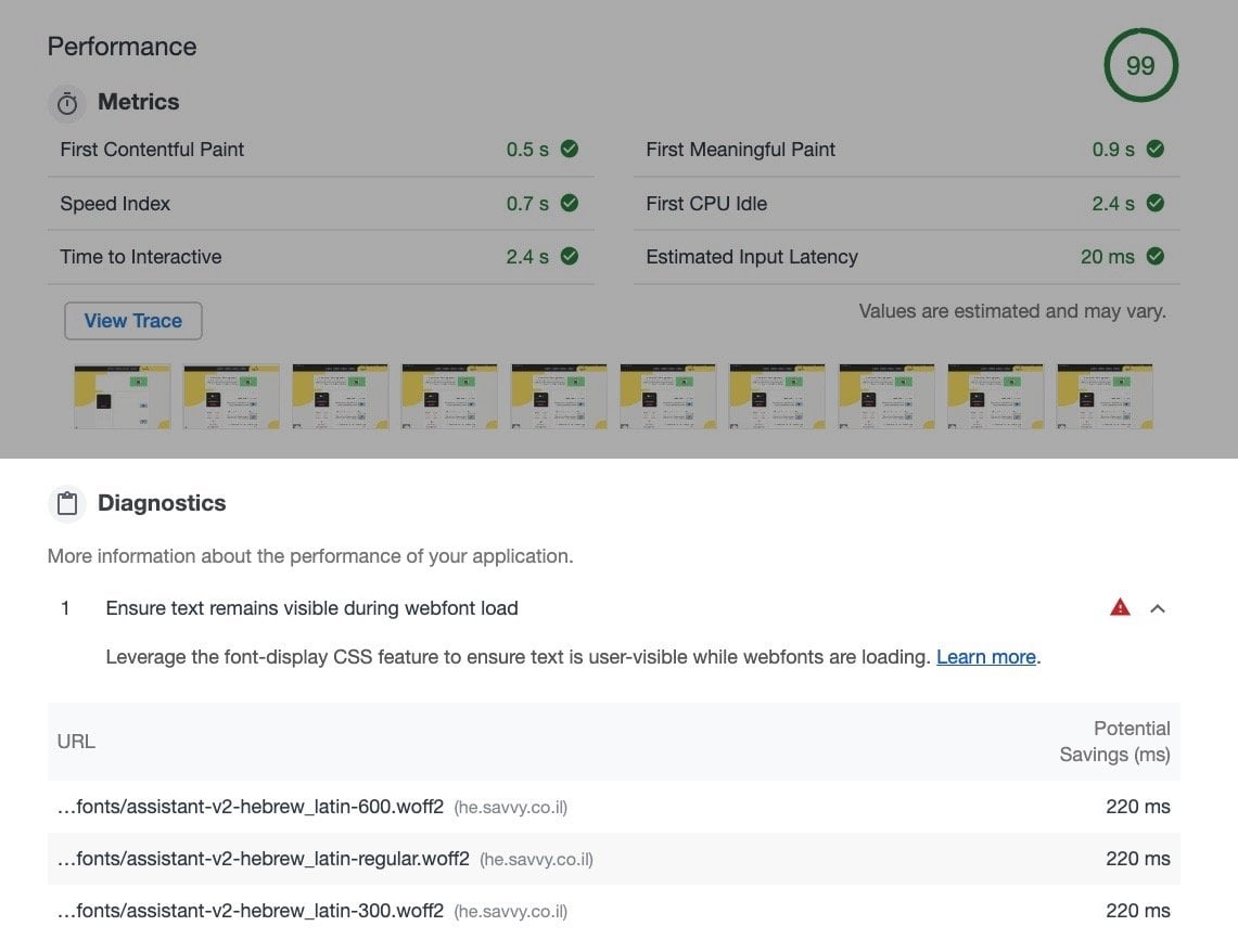
If you choose not to display the fallback font until the web font is loaded, you will likely see a message in Lighthouse and PageSpeed Insights like: “Ensure text remains visible during webfont load.“
Since I chose to use font-display : block in this blog, Lighthouse displays this comment:
Why do we get this comment? Because if the text isn’t immediately displayed for the user, it will affect the time when the main content is displayed (First Contentful Paint) for the user. If you choose, you can use font-display : swap for instance to eliminate this comment.
What about browser support?
Generally, if a certain browser doesn’t support this property, it will simply behave according to that browser’s default behavior. But it’s safe to say that most of the major browsers in the market support font-display. Take a look:

In conclusion
Typography and typographic hierarchy are the basis for interesting design, readability, a more pleasant user experience, and even accessibility. It’s no wonder that the use of web fonts for these purposes has significantly increased in recent years.
So, there are various ways to improve the loading time of web fonts and reduce the time of FOUT and FOIT. Using the rel=”preload” attribute, converting to Inline Data URI, and in general optimizing for speed and loading time using a fast server and optimization techniques.
Since fonts are static assets that don’t need frequent updates, ensure you’re using optimal Cache-Control settings. These settings are mentioned in the post I linked in the previous paragraph. Additionally, if you use Google Fonts, you might want to consider loading them locally from your server.
Either way, using the font-display property allows us to have much more control over how text is displayed on the site while the web font is loading.
I hope you find this guide helpful, and we would be interested to know about your experiences with this topic and what you’re using 🙂


Very detailed info about the topic, thanks!
Thanks 🙂
The “Invisible, Fallback, Webfont” image/timeline above is just what I needed. Thanks!
Great, glad it helped Seth!