CSS Variables, also known as CSS Custom Properties, are now supported in all modern browsers and have been long-awaited by Frontend developers. They bring the power of using variables to CSS, resulting in less repetitive code, more readable code, and greater flexibility.
But that’s not all; unlike CSS Preprocessors like Less or Sass that add another layer of complexity, CSS Variables are an integral part of the DOM, offering advantages on their own. In this guide, we’ll delve into CSS Variables and how to use them.
Why to Use CSS Variables?
As you probably know, CSS is not a programming language like PHP or JavaScript, where variables are the key to efficiency. CSS is limited in what it can do and is primarily a declarative syntax that instructs the browser how to style HTML content.
However, there are still advantages to using variables in CSS that cannot be ignored. In complex websites with a large amount of CSS, you’ll often find values that repeat themselves.
For example, a specific color is likely to be used for various different elements on the site. If you want to change that color, you would have to perform a global Search & Replace across all the CSS files on the site.
CSS Variables allow a value to be stored in one place and referenced or “called” from different places. Moreover, they have semantic value as --main-text-color is much easier to understand than #ffe01b, especially if the color is used in different contexts. Further advantages will be discussed later in the post…
Basic Usage of CSS Variables
The basic usage of CSS Variables is as follows:
Declaration of a variable:
element {
  --main-bg-color: brown;
}
Using the variable:
element {
  background-color: var(--main-bg-color);
}
Let’s dig a bit deeper into CSS Variables. But before that, you’re invited to take a look at the following code and see CSS variables in action in a simple example I created on CodePen:
See the Pen CSS Variables Example by Roee Yossef (@roeey) on CodePen.
Declaration of CSS Variables
To declare a variable, you first need to decide on the scope in which this variable will exist. If you want the option to use this variable for every element in the DOM, simply define it in the :root pseudo class, which refers to the main element in the document, usually the <html> tag.
Since variables cascade, this variable will be available from anywhere in the application or site, as all elements in the DOM are children of the tag.
:root {
  --main-color: #ffe01b;
}
As you can see, we declare the variable just like we set any CSS property. However, a variable must start with two dashes.
To access the variable as we saw earlier, you need to use the var() function and pass the variable name as a parameter.
#title {
  color: var(--main-color);
}
This will apply the color #ffe01b to an element with the ID title.
Inheritance of CSS Variables
These Custom Properties also inherit. This means that if a value is not defined for a specific property of an element, the value of the parent element’s property will be used. Look at the following HTML:
<div class="one">
  <div class="two">
    <div class="three"></div>
    <div class="four"></div>
  </div>
</div>
Assuming you have the following CSS:
.two {
  --test: 10px;
}
.three {
--test: 2em;
}
In this case, the result of var(--test) is:
- For the element with
class="two, the value will be 10px. - For the element with
class="three, the value will be 2em. - For the element with
class="four, the value will be 10px (inherited from the parent element). - For the element with
class="one, the value will be invalid—hence, the default value for the property will be used.
Remember that these are Custom Properties, not variables as we know them from other programming languages. The value is computed where needed and is not stored for use elsewhere. For example, you cannot set a property for an element and expect to use it for the next sibling in the DOM. The property will only be relevant for the specific selector and its children, just like standard CSS.
Let’s try a simpler example. Say you have an element displaying a warning on a site with a special color that you’re not using anywhere else on the site or in the application.
.alert {
  --alert-color: #ffe01b;
}
You can use this variable for the element and for all its children in the DOM:
.alert p {
  color: var(--alert-color);
  border: 1px solid var(--alert-color);
}
If you try to use the variable alert-color for a different selector that is not .alert (or its children), it simply won’t work. In this case, the browser will ignore this CSS rule.
It’s worth mentioning that CSS variables follow the normal CSS behavior, so the last property that the browser receives is the one it will take.
How to Access Variables Using JavaScript
Another advantage of having CSS variables in the DOM is the ability to access and update them using JavaScript, based on user interactions. For example, if you want to allow users on your site to change its appearance, the font size, or its colors.
Continuing with the example from the beginning of the article. Targeting a CSS variable using JavaScript requires just three lines of code:
const root = document.querySelector(':root');
const rootStyles = getComputedStyle(root);
const mainColor = rootStyles.getPropertyValue('--main-color');

console.log(mainColor);
--> '#ffe01b'
To update the variable, all you need to do is use the setProperty method for the element where the variable was declared, passing the variable’s name as the first parameter and the new value as the second parameter.
root.style.setProperty('--main-color', '#a3316f')
Simpler Responsiveness with CSS Variables
A significant advantage of CSS Variables is their access to the DOM, as mentioned earlier. CSS variables provide a new approach to responsive design. In practice, this means that you can change any variables according to the screen width:
:root {
  --main-font-size: 16px;
}
@media all and (max-width: 600px) {
:root {
--main-font-size: 12px;
}
}
Example of Using a Modular Scale and CSS Variables
Let’s use a modular scale to provide a more concrete example. A modular scale is a mathematical scale that can be used as a basis for choosing typography sizes and establishing a proper typographic hierarchy.
So, let’s use different modular scales for different screen sizes, with a scale of 1.2 for small screens and a scale of 1.33 for larger screens. Since we’re not huge fans of math, we’ll head over to modularscale.com and find that our ratios are as follows:
| 1.2 | 1.33 |
|---|---|
| 2.488rem | 4.209rem |
| 2.074rem | 3.157rem |
| 1.728rem | 2.369rem |
| 1.44rem | 1.777rem |
| 1.2rem | 1.333rem |
| 1rem | 1rem |
This is an excellent scenario for using CSS variables. Remember that these variables are part of the DOM and have inheritance:
:root {
  /* scale for 1.2 */
  --font-size-1: 1rem;
  --font-size-2: 1.2rem;
  --font-size-3: 1.44rem;
  --font-size-4: 1.728rem;
  --font-size-5: 2.074rem;
  --font-size-6: 2.488rem;
}
@media screen and (min-width: 800px) {
:root {
/* scale for 1.33 */
--font-size-1: 1rem;
--font-size-2: 1.333rem;
--font-size-3: 1.777rem;
--font-size-4: 2.369rem;
--font-size-5: 3.157rem;
--font-size-6: 4.209rem;
}
}
Note that we have only one set of variables and we change the value of each variable according to the screen width. Now we can use these variables directly in property declarations. The responsive logic is in the variables themselves… The rest of the CSS will look like this:
h1 {
  font-size: var(--font-size-6);
}
h2 {
  font-size: var(--font-size-5);
}
h3 {
  font-size: var(--font-size-4);
}
h4 {
  font-size: var(--font-size-3);
}
h5 {
  font-size: var(--font-size-2);
}
h6 {
  font-size: var(--font-size-1);
}
Do CSS Variables Replace the Need for Preprocessors?
Many of you are probably wondering what all the fuss is about. After all, most of the operations we presented can be accomplished using Sass or Less. However, note that CSS Variables have several advantages:
- They are native to the browser and do not require compilation as Preprocessors do.
- They are live and exist in the DOM, allowing you to access these variables in JavaScript – a significant advantage.
- They can be changed and can react to what’s happening on the page, unlike the static variables of Preprocessors.
So, can CSS Variables replace the use of Preprocessors? No.
The use of Preprocessors is still relevant, and in fact, it would be a good idea to keep static variables in Sass (or any Preprocessor you’re using) as shown in the example below:
$breakpoint-small: 640px;
$theme-color: aliceblue;


@media screen and (min-width: $breakpoint-small) {
  body {
    --background: $theme-color;
  }
}
Not only will there be a difference in code (in terms of visibility) between static variables and dynamic variables, CSS Variables can only be used in property declarations! In other words, you cannot use them in media queries.
If you try to change line 5 in the above code to contain a CSS variable, the code won’t work properly.
Additional Tips on CSS Variables
So, like other things related to CSS, using CSS Variables is quite straightforward. But here are some additional tips that might be useful in certain situations.
Pay attention to capitalization; CSS variables are case-sensitive.
:root {
 --color: blue;
 --COLOR: red;
}
/*--color and --COLOR are two different variables*/
When using the var() function, you can provide a second parameter. This value will be used if the variable is not found (fallback).
width: var(--custom-width, 33%);
You can directly use CSS variables in HTML.
<!--HTML-->
<html style="--size: 600px">

<!--CSS-->
body {
  max-width: var(--size)
}
You can use one CSS variable inside another.
--base-red-color: #f00;
--background-gradient: linear-gradient(to top, var(--base-red-color), #222);
Don’t hesitate to use variables together with the calc() function.
--text-input-width: 5000px;
max-width: calc(var(--text-input-width) / 2);
Browser Support
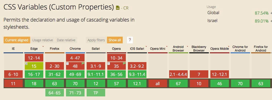
Currently, about 87% of global traffic supports CSS Variables, as seen on caniuse.com. In Israel, the percentage is slightly higher at 89% as of the time of writing this article.
However, remember to provide some fallback for those who still use IE (fallback).
Conclusion
CSS Variables won’t solve all your problems, but they can definitely make life easier for us as frontend developers. They can lead to more readable and maintainable code, and of course, more convenient for maintenance.
CSS Variables are the future of responsiveness. If you’re interested in learning more about this topic, there’s an excellent free course that provides a comprehensive overview of CSS Variables. Trust me, you’ll become CSS Variables masters sooner than you think.
If you enjoyed this post, you’ll probably also like the post on CSS Grid. So, take a look. In any case, if you have questions, comments, or corrections, feel free to let us know in the comments… 🙂