CSS Grid is a module that allows creating a layout based on a grid using columns and rows. Until recently, HTML layout was built using floats, tables, and other various CSS properties that were definitely not suitable for creating pages or a complex structure.
Then Flexbox came into the world – a type of system specially built to create responsive and robust pages. Flexbox allows us to align elements and create a simple and fast one-dimensional layout or grid, and currently, it is the preferred CSS system for most developers.
But there is a relatively new guy in town named CSS Grid as mentioned, and it’s going to change the way you create layouts, the structure of web pages, applications, and user interfaces from end to end. Let’s explain who this guy is and how to use it to your advantage.
So What is CSS Grid?

CSS Grid is a two-dimensional system that enables the creation of a grid-based layout. The purpose for which it was created is to make it easier for us to create complex Layouts and user interfaces with as little code clutter as possible.
The central concept behind CSS Grid is a method that allows us to create a grid-shaped structure that is described at the CSS level and not at the HTML level. It helps us create layouts that can be redefined through Media Queries and adapt themselves to the context.
Using CSS Grid allows a separation between the order of elements in HTML and their visual representation on the screen. As designers, this means you are free to change the location of elements on the page according to the need for different screen sizes without having to compromise on the page structure in your responsive design due to the order of element appearance in the HTML, i.e., their position in the markup itself.
It’s quite simple to make the Grid adapt itself to the available space on the screen. Since each element occupies a specific area in the Grid, there is no risk of elements overlapping each other due to changes in text size, content longer than expected, etc.
By the way, CSS has always been there for us for layout and outlining, but it never did a good job in this context. Initially, we used tables, then Floats and then Inline Blocking, etc., but all these methods were sort of makeshift solutions and did not include very important functionality, for example, vertical alignment of elements or automatic distribution of elements in a specific Container.
Flexbox greatly helped us in these cases, but it was intended and more suitable for one-dimensional layout, that is, a row or a column only, and less for two-dimensional layout and outline composed of both columns and rows together.
We will explain the intention soon, so stay with us, but in the meantime, let’s conclude that Grid is the first CSS module created to specifically solve the layout issues we all makeshifted until recently when developing websites…
Terminology – CSS Grid
It is important to understand the terminology we will use before we dive in and understand the concept of CSS Grid. This is because the meaning of those terms is not so different and it would be confusing if you do not understand the terms i’ll use throughout the post.
1. Grid Container
In CSS Grid, the term Grid Container is that parent element that contains the grid layout. It is defined by the property display: grid or the property display: inline-grid on that container.
The white part is the Grid Container.
Once a certain element is defined as a Grid Container, you can use a variety of properties to control the grid layout. Note that, similar to the behavior of Flexbox, CSS Grid will also behave oppositely according to the page direction.
Since this post is written from left to right, then the grid will look like the example above. But if the post was in Hebrew for example (RTL), then that example would look like this:
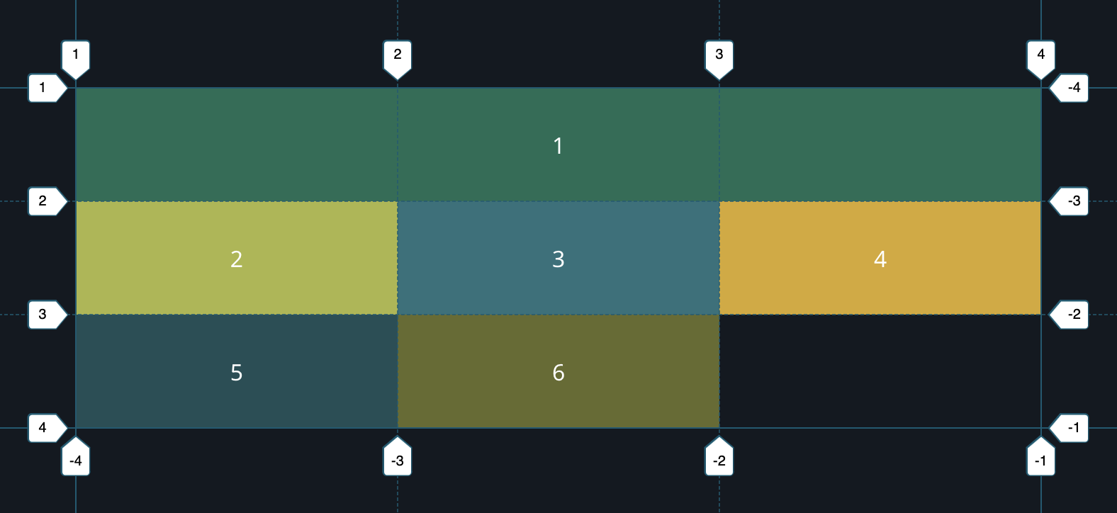
2. Grid Line
This is actually a line that divides the grid into rows and columns. Grid lines are numbered from 1 to X, where X is the number of rows or columns in the grid itself.
That Grid Line is marked in blue.
3. Grid Item
Grid Items are the direct children of that Grid Container. In other words, these are the elements that exist within the Grid Container. Grid Items can be stretched over several Grid Cells if needed (the next section).
Marked in green.
4. Grid Cell
Grid Cell is the smallest unit in the grid and can be used to position the Grid Items. It can be referred to as a cell defined by the intersection of a row and a column in the grid, so if you have a grid of 3 rows and 3 columns, you will have a total of nine Grid Cells.
Marked in blue. Grid Cell is not an HTML element or a specific class you define but rather a conceptual area where you can insert Grid Items.
5. Grid Track
This is the space between two adjacent grid lines. The size of those Grid Tracks can be determined using the properties grid-template-columns and grid-template-rows which we will discuss later.
- The space between two adjacent Grid lines in the X-axis is referred to as row tracks.
- The space between two adjacent Grid lines in the Y-axis is referred to as column tracks.
Marked in blue.
6. Grid Area
Grid Area is an area in the grid that can contain one or more Grid Cells. Grid Areas can be defined using the property grid-template-areas.
Marked in blue.
After understanding the terminology and the related terms of CSS Grid, we can move on to the more interesting part and start explaining how to create your first Grid.
Creating your first Grid
The two main components of CSS Grid are the Grid Container which is essentially the parent element, and the Grid Items, which are essentially the elements inside the container.
Here is the Markup for a Grid Container with six elements (Grid Items) inside:
<div class="wrapper">
  <div>1</div>
  <div>2</div>
  <div>3</div>
  <div>4</div>
  <div>5</div>
  <div>6</div>
</div>
To turn the container into a Grid – just add the display : grid property to it:
.wrapper {
    display: grid;
}
The result will be as the following example:
But as you can see at this stage, it simply looks like six elements stacked on top of each other, and that’s because we haven’t defined how we want the Grid to look, in other words, we haven’t created that layout, those columns and rows that are necessary for this type of structure. Let’s see how to do it…
In the case of the examples in the guide (which are live Grid examples), I added a bit of CSS so that the Grid and the elements within it would be clear and easy to understand.
Creating Columns and Rows in the Grid
To make the Grid we created two-dimensional, we need to define columns and rows. Let’s create three columns and two rows. We’ll use the property grid-template-rows and the property grid-template-columns to do this as in the following example:
.wrapper {
    display: grid;
    grid-template-columns: 33% 33% 33%;
    grid-template-rows: 60px 60px;
}
Since we wrote three values for grid-template-columns, we’ll get three columns. In the same way, since we wrote two values for grid-template-rows, we’ll get two rows. The values themselves describe the width we want each column to be (33% in this case) and the height we want each row to be (60px).
It will look something like this:
You should refer to each of the elements as Grid Items and of course when there is also the Grid Container containing those elements.
To make sure you understand the connection between the values and the appearance of the Grid, take a look at the following example and try to understand the connection between the code and the structure of the Grid:
.wrapper {
    display: grid;
    grid-template-columns: 20% 60% 20%;
    grid-template-rows: 80px 40px;
}
The result will be something like this:
It should be noted that it is not mandatory to use percentages; you can use absolute units, viewport units, and even the calc function and the like.
Moreover, it’s possible and even recommended to use a new unit called the Fractional Unit that saves a lot of headaches, which we will talk about later and explain why it’s preferable to using percentages…
Positioning Elements in the Grid
The next step is to understand how to position the elements in the Grid. This is the more interesting part where you get power over it. It’s very simple and allows you to create wonderful layouts very quickly.
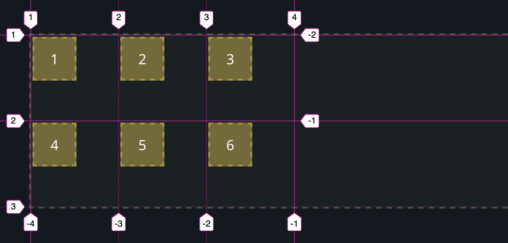
So let’s give another example and create a Grid with three rows and three columns (3X3):
<div class="wrapper">
  <div>1</div>
  <div>2</div>
  <div>3</div>
  <div>4</div>
  <div>5</div>
  <div>6</div>
</div>
We’ll add the following CSS:
.wrapper {
    display: grid;
    grid-template-columns: 33% 33% 33%;
    grid-template-rows: 60px 60px 60px;
}
The result will be something like this and I believe it’s clear to you why (if not read the previous explanations again):
Note that we see a Grid of only two rows (3X2) despite having defined it to have three rows (3X3). The reason for this is that there are only six elements filling the Grid. If we were to add three more elements to the Markup (or fewer), they would fill the third row….
To change the position of an element and even to change its size, we will target that specific element and use the following properties – grid-column-start and grid-column-end. For the purpose of the example, we will add the following CSS:
.wrapper > div:nth-child(1) {
    grid-column-start: 1;
    grid-column-end: 4;
}
This CSS defines that the first element will start at the first Grid line and end at the fourth Grid line (in terms of the column). In other words – it will span the entire row. This is how it will look on the screen:
But I suppose you might be a bit confused… Why are we talking about the fourth Grid Line when we have only three columns? Take a look at the following picture that depicts the Grid Lines and you will understand why…
The concept of Grid Lines is relevant for both columns and rows, of course.
Okay… So, in addition, there are also the properties grid-row-start and grid-row-end, and their use is done in the same manner. So, to ensure you understood the concept behind Grid Lines properly, let’s play a bit with the elements of the Grid we created, take a look at the following CSS:
.wrapper > div:nth-child(1) {
    grid-column-start: 1;
    grid-column-end: 3;
}

.wrapper > div:nth-child(3) {
    grid-row-start: 2;
    grid-row-end: 4;
}

.wrapper > div:nth-child(4) {
    grid-column-start: 2;
    grid-column-end: 4;
}
Here’s the result of this code. Stop and think for a moment why the Grid looks this way, it’s really not that complicated…
We should also note that there’s even a shorter way to write the last example using the properties grid-column and grid-row:
.wrapper > div:nth-child(1) {
    grid-column: 1 / 3;
}

.wrapper > div:nth-child(3) {
    grid-row: 2 / 4;
}

.wrapper > div:nth-child(4) {
    grid-column: 2 / 4;
}
Furthermore, we can achieve the same result by using span when followed by the number of columns or rows over which the element will stretch:
.wrapper > div:nth-child(1) {
    grid-column: 1 / span 2;
}

.wrapper > div:nth-child(3) {
    grid-row: 2 / span 2;
}

.wrapper > div:nth-child(4) {
    grid-column: 2 / span 2;
}
CSS Grid has many more features that we haven’t touched yet, and they are no less amazing. Let’s take a look at some of those features…
How to use CSS Grid properties to align elements
In CSS Grid’s layout, you can position the grid itself relative to the container as well as the Grid Items themselves using the following six properties:
- justify-items
- align-items
- justify-content
- align-content
- justify-self
- align-self
These properties are part of the Box Alignment Module of CSS and define how we can position elements with CSS Grid and also with Flexbox.
Most of the properties mentioned above affect the Grid Container, but some refer to the Grid Items themselves and to situations where you want to define specific values and apply those only on specific Grid Items.
Step A: Applying properties to the Grid Container
For the purpose of the explanation and examples, consider the following container that contains 6 elements within it:
<div class="my-container">
  <div class="item">1</div>
  <div class="item">2</div>
  <div class="item">3</div>
  <div class="item">4</div>
  <div class="item">5</div>
  <div class="item">6</div>
</div>
Add the following CSS rules:
.my-container {
  display: grid;
  grid-template-columns: 100px 100px 100px;
  grid-template-rows: auto;
  box-sizing: border-box;
  width: 100%;
  height: 200px;
  margin-left: auto;
  margin-right: auto;
  background: rgba(114, 186, 94, 0.05);
  border: 2px dashed rgba(114, 186, 94, 0.35);
}

.item {
  box-sizing: border-box;
  width: 50px;
  height: 50px;
  background: rgba(255, 213, 70, 0.4);
  border: 2px dashed rgba(236, 198, 48, 0.5);
}
This code will create a Grid layout with three columns each of 100px width. Each of the Grid Items will be 50px wide and 50px high. It looks like this:
Note that the Grid Items in this case do not fill the Grid Cell but only occupy 50x50px as we defined. The following image will help you understand my intention:
At this point, we have not defined any justification property or any alignment. By default, the Grid Items will start at the top left point.
Pages defined as RTL will start at the top right point.
The justify-items property
The justify-items property is used to align the Grid Items along the row axis (X-axis). The usable values are start, end, center, and stretch.
Here is the same example as before with the property in justify-items: center:
.my-container {
  /* ... */
  justify-items: end;
}Note that in this case, the Grid Items are aligned to the center of the column (i.e., the center of the Grid Cell on the horizontal axis).
This is what the same example looks like with the property justify-items: end:
The align-items property
The align-items property is used to align elements along the column axis (Y-axis). Here is an example of using the property align-items: center:
In this case, the Grid Items are vertically aligned to the center of the columns (to the center of the Grid Cell on the vertical axis).
Here is the same example with the property align-items: end:
.my-container {
  /* ... */
  align-items: end;
}The justify-content property
When the entire grid is smaller than the area of the Grid Container, you can use the justify-content property to align the grid along the row axis (the X-axis). You can use this property with the values that appear for you in the DropDown:
It may be hard to understand in this example, maybe the following example will help you understand better:
The align-content property
To summarize this part: The justify-items, align-items, justify-content, and align-content are four properties relevant to the entire grid.
Step B: Implementing properties on the Grid Items
The justify-self and align-self properties are kind of parallel to the justify-items & align-items properties, but these are applied directly to the Grid Items to position them differently from the rest of the Grid Items.
The justify-self property
The justify-self property is used to align a Grid Item along the horizontal row axis (the X-axis). Here is an example of using the property justify-self: end:
<div class="my-container">
  <div class="item">1</div>
  <div class="item">2</div>
  <div class="item" style="justify-self: end;">3</div>
  <div class="item">4</div>
  <div class="item">5</div>
  <div class="item">6</div>
</div>In this case, the third element is horizontally aligned to the far edge of the column (to the edge of the Grid Cell).
The align-self property
The align-self property is used to align a Grid Item along the vertical column axis (the Y-axis). Here is an example of using the property align-self: end:
<div class="my-container">
  <div class="item">1</div>
  <div class="item">2</div>
  <div class="item" style="align-self: end;">3</div>
  <div class="item">4</div>
  <div class="item">5</div>
  <div class="item">6</div>
</div>In this case, the third element is vertically aligned to the bottom of the column.
Step C: Using several properties together
It may be necessary to combine the properties we mentioned so far together to achieve the grid you are looking for. Here is an example that combines several properties together:
.my-container {
  /* ... */
  justify-content: space-evenly;
  justify-items: center;
  align-content: space-evenly;
  align-items: center;
}This code will create six Grid Items that are evenly spaced and centered in the container.
The grid-area Property
The grid-area property can serve as a shorthand for the following properties:
- grid-row-start
- grid-column-start
- grid-row-end
- grid-column-end
You might want to check a separate post that i wrote about the grid-area property.
The use of grid-area is done in the following way:
grid-area: <row-start> / <column-start> / <row-end> / <column-end>Let’s take a look at the following example and call it Example Number A. We will create a new Grid for the purpose that contains 11 elements using the following Markup:
<div class="wrapper">
    <div>1</div>
    <div>2</div>
    <div>3</div>
    <div>4</div>
    <div>5</div>
    <div>6</div>
    <div>7</div>
    <div>8</div>
    <div>9</div>
    <div>10</div>
    <div>11</div>
</div>
Let’s decide that element number 5 will receive the following property:
.wrapper {
    display: grid;
}
    .wrapper > div:nth-child(5) {
    grid-area: 1 / 2 / 5 / 7;
}
Notice that we defined through a single line of CSS that element number 5 will start at row 1 and column 2. It will also end at row 5 and column 7. The result will be as follows:
Don’t forget – the start and end of the rows and columns of the mentioned element refer to those Grid Lines we mentioned earlier.
Cool, isn’t it? Anyway, if you’re wondering how we achieved spacing between each element, the answer lies in the grid-gap property.
The grid-gap Property
The grid-gap property sets the size of the gap between the columns and rows in the Grid and is essentially a shorthand for the following properties:
It can be used in the following way and we won’t explain further since it speaks for itself, just note that the first value is the gap between the rows and the second is the gap between the columns of the Grid.
.wrapper {
    display: grid;
    grid-gap: 30px 10px;
}
The Fr Unit – Full Name Fractional Unit
The Fr unit eliminates the need to use mathematics and works based on the available space in the Container. Let’s say we want to divide our Grid into three equal columns. We can easily do this using percentages – all we need to do is write grid-template-columns: 33% 33% 33%.
But what if we wanted to use the property grid-gap : 10px?? Since we have two gaps (because there are three columns), the width of our Grid would now be 100%+20px and this would create unwanted horizontal scrolling or elements spilling out of their Container.
We could of course use the calc function to solve the problem, but using the fr unit is much simpler – grid-template-columns: 1fr 1fr 1fr. Let’s see a few examples of using the fr units.
This is the Markup we’ll use:
<div class="wrapper">
    <div>1Fr</div>
    <div>1Fr</div>
    <div>1Fr</div>
    <div>1Fr</div>
    <div>1Fr</div>
    <div>1Fr</div>
</div>
This is the CSS:
.wrapper {
    display: grid;
    grid-template-columns: 1fr 1fr 1fr 1fr 1fr 1fr;
    grid-auto-rows: 80px; /* don't mind this property just yet */
}
The result will be as follows:
The grid-auto-rows property is another CSS Grid property that simply sets the minimum height for all the rows. Similarly, grid-auto-columns sets the minimum height of columns.
By the way, this can be written in shorthand using the repeat function that allows for more readable and compact code:
.wrapper {
    display: grid;
    grid-template-columns: repeat(6, 1fr);
    grid-auto-rows: 80px;
}
Also, it’s possible to combine different unit types – if we have two elements with a fixed width of 100px and we want the third element to spread across the remaining width, we can use the following CSS:
.wrapper {
    display: grid;
    grid-template-columns: 100px 100px 1fr;
    grid-auto-rows: 80px;
}
The result will be as follows:
It’s important to note that you’re not limited to whole values when using fractional units – you can also write something like the following:
.wrapper {
    display: grid;
    grid-template-columns: 1.5fr 3fr 4.5fr;
    grid-auto-rows: 80px;
}
And this will be the result:
Here’s another post I wrote where I presented several examples of using the fr measurement unit from CSS Grid.
Creating a Website Structure Using CSS Grid
I assume I’ve delved quite a bit, but before we conclude this part of the guide I want to touch on another point which relates to a new property called grid-template-areas related to the grid-area property we touched on earlier.
For the purpose of the explanation, we will create a basic structure of a website using CSS Grid and use the following Markup:
<div class="wrapper">
    <header>header</header>
    <nav>nav</nav>
    <section>section</section>
    <aside>aside</aside>
    <footer>footer</footer>
</div>
Let’s add the following CSS:
.wrapper {
	display: grid;
	grid-template-areas:
    "header header header"
    "nav section aside"
    "footer footer footer";
	grid-template-rows: 80px 1fr 50px;
	grid-template-columns: 15% 1fr 15%;
	grid-gap: 4px;
    height: 360px;
}

header {
    grid-area: header;
}

nav {
    grid-area: nav;
}

section {
    grid-area: section;
}

aside {
    grid-area: aside;
}

footer {
    grid-area: footer;
}
This is the result:
Hold on for a moment, please – can you grasp the craziness? To start, notice the small amount of code lines we needed to write to create this structure. Likely without CSS Grid, the code would be at least 5 times longer. Additionally, notice the
grid-template-areas property we used….More information on grid-template-areas in another post I wrote, but stay here for now…
The Grid Template Areas Property
The grid-template-areas property defines areas within a Grid. You can name elements using the grid-area property and then refer to those names in grid-template-areas.
Referring to the last example we showed – you can see that there are three areas:
"header header header""nav section aside""footer footer footer"
It’s important to note that each area is defined between opening and closing quotes and you can use a period (.) to refer to unnamed elements.
It can be understood that there are three columns in total when the header spans the entire first row. The area in the second row, on the other hand, is divided into three separate parts (according to the names) where the width of each is determined by the grid-template-columns property we explained at the beginning of the guide. Also, the footer spans the entire third row.
Let’s say we wanted the navigation to span the entire height – the only change we need to make is at the CSS level and only in the grid-template-areas property as in the following example:
.wrapper {
	grid-template-areas:
    "nav header header"
    "nav section aside"
    "nav footer footer";
}
And the result as you probably guessed would be:
What about Responsiveness?
If you play with the screen size, you’ll see that our structure expands and contracts according to the width of the Container without any need for intervention. But if, for the sake of argument, we want to change the structure in mobile, we simply add the following Media Query when the only change we make will be in the grid-template-areas property:
@media (max-width: 768px) {
    .wrapper {
    grid-template-areas:
    "header header header"
    "nav nav nav"
    "section section section"
    "aside aside aside"
    "footer footer footer";
    grid-template-rows: 50px 30px 1fr 60px 30px;
    }
}
The result when the screen width is less than 768px will be as follows:
The fact that the only thing we had to change to achieve this is one CSS property is nothing short of wonderful…. By the way, in many situations, you can create a responsive layout without using Media Queries at all and that’s also through CSS Grid. Take a look at the guide I wrote on the minmax function of CSS Grid.
The difference between CSS Grid and Flexbox
As mentioned at the beginning of the post, Flexbox is designed for one-dimensional layouts and Grid for two-dimensional layouts. This means that if you’re aligning several elements in one direction, i.e., several elements in a single row or column, then you should use, or more correctly, you should use Flexbox.
Flexbox will allow you more flexibility in this case than CSS Grid, it will require less code and will even be easier to maintain.
Example of one-dimensional layout:
On the other hand – if you intend to create some structure in two dimensions, i.e., both columns and rows, it’s probably correct and recommended to use CSS Grid to do this.
Example of two-dimensional layout:
In this case – CSS Grid will allow more flexibility, will make the Markup more compact, and the code will be much simpler to maintain. Of course, you can combine the two and even should. In the last example, it would be correct to create a Grid for the layout or structure itself and use Flexbox to align the content inside the Header.
Of course, it’s possible and even desirable to combine the two and enjoy both worlds, we will see examples of this throughout the guide… So let’s start and explain the existing features of CSS Grid and how to use them.
A few words about browser support
Today, CSS Grid can be used in all modern browsers and about 85% of all users worldwide use those browsers that support CSS Grid. In any case – when there’s doubt about the support of a certain feature, I always recommend going to caniuse.com to check the browser support for such functionality.
If you go to the link you can see on the top right side of the screen the global percentage of users who use supported browsers.
You can see that there is very broad support for the CSS Grid feature by the absolute majority of modern browsers and that’s excellent news. It can also be seen that there’s only partial support in IE11 but I hope you’re not worried about that, personally – it certainly doesn’t interest me.
In conclusion
There are of course many more possibilities that we did not touch upon in the context of CSS Grid and this was definitely just the tip of the iceberg.
I can say that the more I research the topic, the more amazed I am each time by the possibilities and the number of features that exist for CSS Grid. Here’s a post in context demonstrating the power of CSS Grid and showing how to create a responsive layout without using Media Queries and through the minmax function, take a look when you have a chance…
So I hope this guide will help you start using CSS Grid, I also promise to update it and add features and examples we haven’t talked about yet. If you liked the post, you’ll probably also like the post on CSS Variables, definitely something you’ll want to learn as well.
So as always, if there are any objections, questions, or ideas about what was said, I’d be happy if you share them with us in the comments… 🙂

What a wonderful guide 🙂 Thanks!