Almost a decade into developing WordPress, I’ve noticed that identifying certain features supported by browsers is mainly done through JavaScript and libraries like Modernizer and its counterparts.
However, there’s a CSS feature that’s been around for years which allows us to check if a specific feature is supported by the browser before applying any CSS properties. This is similar to using @media for responsive design – where if the browser’s width is smaller than a specific width, the CSS properties indicated in that media query take effect.
In the same way, the existing CSS in this feature will take effect only if the browser supports the specific feature you mention. The name of the feature I’m talking about is @supports, and it’s used like this:
@supports (display: grid) {

   /* code that will only run if CSS Grid is supported by the browser.  */
   /* for example:  */

  .container {
    display: grid;
  }
}
You might not use @supports extensively, as CSS inherently has a natural fallback. If the browser doesn’t recognize a certain combination of property : value, it will ignore that property and use the property it recognizes higher up in the cascade.
Using or inheriting a property higher up in the cascade is called cascading.
Nevertheless, despite the mentioned, the @supports feature has various applications. Let’s take a look at some of them:
/* Here we gonna write the fallback as you'll see in a minute */
@supports (display: grid) {
.container {
display: grid;
grid-template-columns: 1fr 1fr;
grid-gap: 2rem;
}
}
As you can see, we’ve used CSS Grid that we all love. However, there are a few browsers or older versions of iOS that don’t support this cool feature or any of the properties indicated in the code above.
So in these cases (unless otherwise stated), you can simply let the browser use the default, so those elements within the container will receive the display : block property and stack vertically.
However, in many cases, this won’t suffice – for example, a gallery of images. In such scenarios, it might be appropriate to use a fallback that works with Flex by default, and if the browser supports CSS Grid, use Grid. It might look like this:
.container {
    display: flex;
    flex-wrap: wrap;
}

.container > div {
    flex: 200px;
    margin: 1rem;
}

@supports (display: grid) {
    .container {
        display: grid;
        grid-template-columns: 1fr 1fr;
        grid-gap: 2rem;
    }

    .container > div {
        margin: 0;
    }
}
Using the “not” Operator with @supports
There’s also the option to use the “not” logic with the @supports feature, like this:
/* Considered a BAD PRACTICE, at least if you're supporting IE 11 and iOS 8 and older */
@supports not (display: grid) {
    /* Isolated code for non-support of grid */
}
@supports (display: grid) {
    /* Isolated code for support of grid */
}
Notice the not operator we’ve used. In this case, the operator checks and applies some CSS only if there’s no support for CSS Grid. However, that doesn’t mean you should necessarily use this option, because there are browsers that don’t support the @supports feature itself, and you need to take that into account…
Various Uses of the @supports Feature
Here are some more examples of using the @supports feature, like supporting the mix-blend-mode property:
.thing {
  opacity: 0.5;
}
@supports (mix-blend-mode: multiply) {
.thing {
mix-blend-mode: multiply;
opacity: 0.75;
}
}
Another example is supporting the initial-letters property for Drop Caps:
@supports (initial-letter: 4) or (-webkit-initial-letter: 4) {
  p::first-letter {
     -webkit-initial-letter: 4;
     initial-letter: 4;
  }
}
Browser Support for @supports Feature
The @supports feature works in Chrome, Firefox, and Opera since 2013, in various Edge versions, and was supported by Safari in 2015:
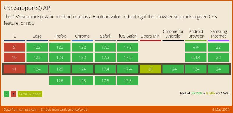
For more information on browser support for this feature, check https://caniuse.com.
That’s it! Do you use this feature in your projects? If so, share with us in the comments and let us know how… 🙂