Google PageSpeed Insights (PSI for short) is a useful tool for website developers. Its intentions are certainly good, but it can be said that it is not suitable for the average WordPress site owner. Despite the recent addition of specific recommendations for WordPress users in PageSpeed Insights, many aspects of the report it provides are too technical for the average user.
In this guide, I will attempt to “translate” and describe in simple terms what PageSpeed is talking about and explain which recommendations should be addressed and which ones should not.
This part of the guide will focus on understanding and analyzing the laboratory data when in the second part, we will discuss those suggestions and opportunities for improvement that PSI offers.
The Basic Problem That PageSpeed Insights Tries to Address
In recent years, the popularity of WordPress sites and other content management systems has grown significantly. These platforms allow users with minimal or no development knowledge to build sites that, in their construction, often violate basic website performance rules.
For those Page Builders that allow anyone, regardless of their development knowledge, to build sites, there is a significant impact. The fact is that if you build a simple and lightweight site, it will automatically receive a higher score in these tools, and importantly, it will be much faster for users, thus providing a better user experience.
Google is trying to encourage a good user experience and address these issues through various initiatives, including the now largely deprecated AMP project and more recently through Core Web Vitals as a ranking signal. Google essentially says, “Hey, if you’re adding junk to your site, at least see what you can do to minimize its impact on speed and loading time.”
Additionally, Google, whose business model is advertising and services, needs to ensure that site speed and the user experience on the web improve. Otherwise, closed platforms like Facebook, which also offers ads, may take a larger share of revenue.
How to understand the information displayed by Google PageSpeed?
Google’s current speed testing tool is based on Lighthouse and evaluates each site based on a set of rules. These rules are relevant to every site, regardless of its target audience, content, or purpose.
PageSpeed Insights provides reports on site performance on mobile and desktop and offers information on opportunities and suggestions on how to improve the tested page.
Lab Data vs. Field Data
PSI provides Lab Data and Field Data. Sites need a minimum amount of traffic to receive information in the Field Data section (Google does not disclose the exact threshold), so there is no need to worry if you don’t receive it.
We won’t go into detail about Field Data in this post, but it’s worth mentioning that Lab Data, which we will discuss, is collected in a controlled environment using predefined devices and fixed network settings.
Lab Data is relevant for monitoring issues, debugging, and optimization ideation, as these values do not change. Lab Data provides much more information than Field Data, but it does not offer information about real-world bottlenecks that can affect site performance.
How to Use Google PageSpeed?
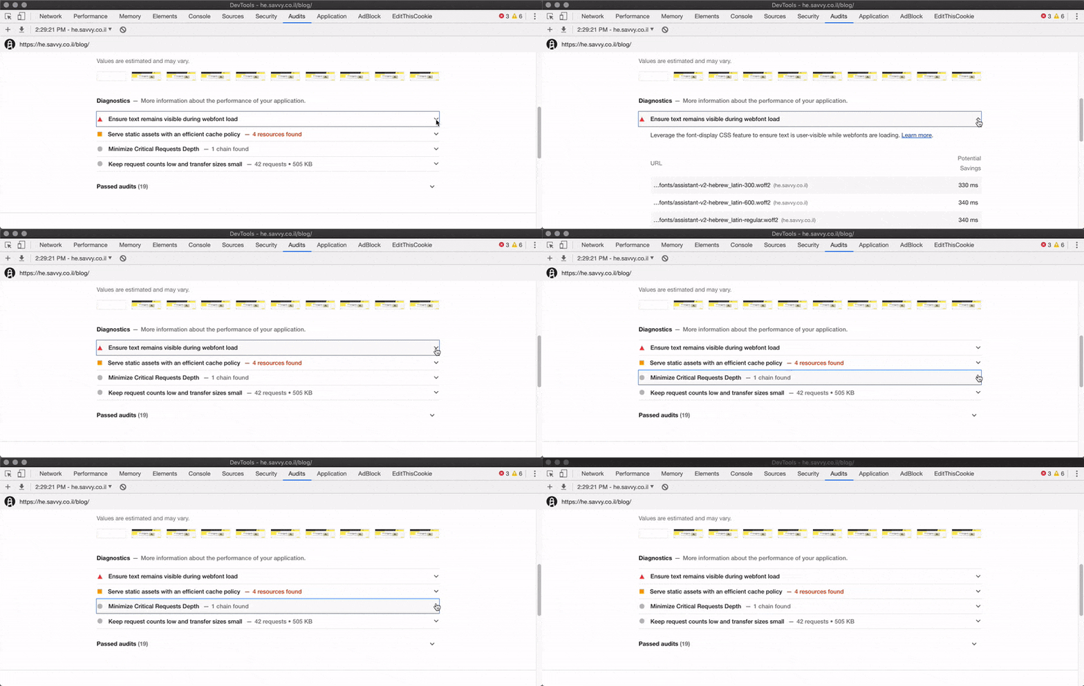
Before we begin, it’s worth mentioning that the first step in making sense of the report displayed by Lighthouse is to know that you should click the arrow next to each suggestion to get detailed information about it.

You need to dig deeper to understand and see the issues that the report presents, and I assume that’s understood. Let’s start with the general score that PSI provides, as I’m pretty sure most of you don’t exactly know what this score reflects…
Overall Score
The overall score provided by PageSpeed summarizes the page’s performance using a number and color. The score is determined by running Lighthouse and providing “sterile” lab data supposedly for the same tested page.
One problem with PageSpeed is displaying the score in some color and a number that everyone can understand. Green color = good, red color = not good. Using this method, and the lack of understanding of the meaning of the overall score, causes people to be frustrated because their site’s performance is “supposedly” low, and they don’t exactly know how to fix it.
Since most users think that anything less than a green color is not good enough, people interpret the report incorrectly. So, let’s clarify things once and for all…
If you do get a green color, it means your site is in the top percentile in terms of optimization, but it doesn’t say much about the actual speed of the site.
A score of 100 is the best score you can get and represents the top 98 percentile – a site with good performance (supposedly). A score of 50 represents a 75 percentile – meaning if you got a score of 50, the only thing it means is that your site scored higher than 75% of the sites Google checked and it doesn’t say anything about the actual speed.
A score of 90 and above is considered good, 50-90 is considered average, and below 50 is considered low. Lighthouse Scoring Guide.
So, most sites will not get a green score. An average WordPress site built by a site builder with average technical capabilities probably won’t get a high score out of the box. Despite optimizations, these sites generally have many elements negatively affecting the received score.
PSI provides comments and opportunities for improvement to help you address issues that have a negative impact. Those “lab data”, which we’ll talk about shortly, provide real-time information in terms of timings.
For example, when your page is displayed for the user and when the user can start performing actions on that page. These specific measurements affect the overall score.
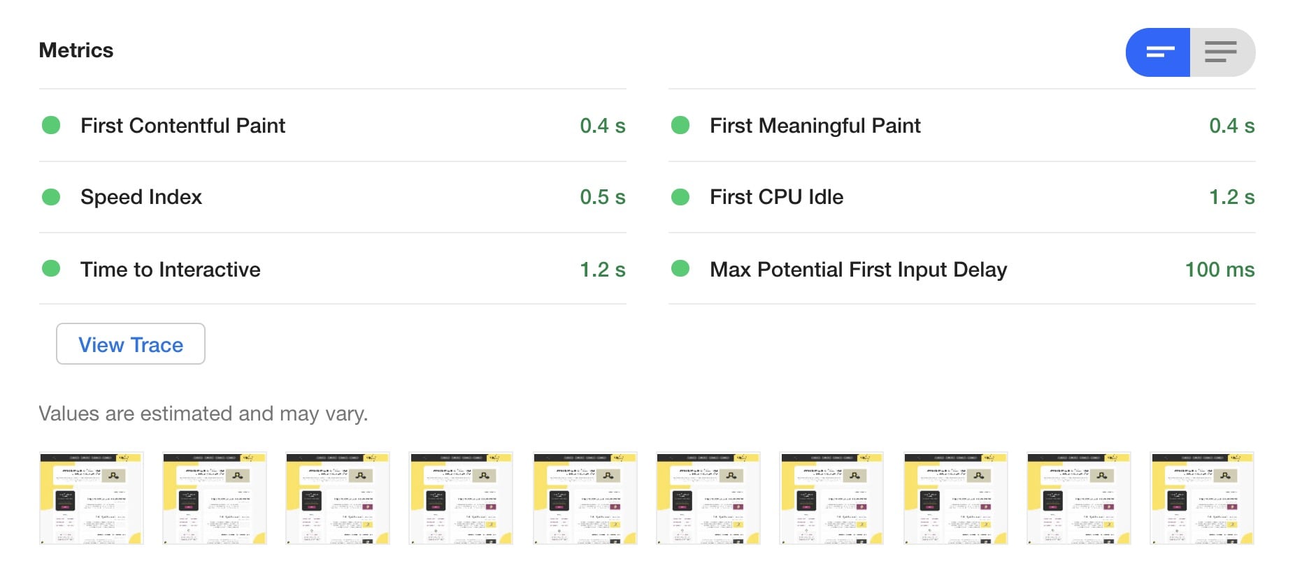
The metric Max Potential First Input Delay goes beyond this and does not affect the overall score.
Lab Data

If you intend to run a Lighthouse test via Chrome Developer Tools – make sure you are doing it in a window where no browser extensions are enabled.
Let’s expand on those lab data and describe them one by one. Generally, your goal in the context of these data is to make them as short and low as possible:
1. First Contentful Paint (FCP)
First Contentful Paint (FCP) measures the time it takes from when a user requests a page to when the browser displays the first piece of content in the DOM. This metric is a crucial milestone for users, as it signals that the page is starting to load.
Put simply, FCP tracks how quickly the browser processes and renders the initial visual elements on the screen. The term “Paint” refers to the browser’s task of rendering pixels. FCP captures the time it takes for any visible content, be it text, images, or other elements, to appear, providing immediate feedback to the user that the page is responding.
2. First Meaningful Paint
First Meaningful Paint (FMP) attempts to identify when the user feels that the main content of the page is displayed for them. Of course, this type of test cannot precisely determine what the main content is, so it is not accurate.
Generally, Lighthouse defines this as the time when the most meaningful change occurs in the critical part of the page (Above the Fold Content) in addition to the time when web fonts are loaded.
3. Speed Index
The speed index is quite similar to the two previous measurements we described. It generally shows how quickly the page’s content is displayed to the user and is weighted based on the previous mentioned measurements. Of course, a lower score = better.
4. First CPU Idle
This data (FCI) and the next data called “Time to Interactive” refer to the speed at which the user can perform actions on the page in question. If they try to perform any action while the browser is processing the code, such as clicking a button, they either have to wait a lot until the action is performed or the action won’t be performed at all.
The First CPU Idle data indicates how long it takes for the page to be interactive, meaning reaching a state where the user can interact with most elements on the page and receive a reasonable response time.
5. Time to Interactive
Time to Interactive (TTI) measures how long it takes for the page to be fully interactive when interacting with elements on the same page, such as clicking a button, results in a quick response (around 50ms).
The page’s interactivity is measured based on several factors:
- The page displays relevant content to the user (weighted according to the First Contentful Paint data).
- Event Handlers are registered for most visible elements.
- The page responds to user actions within about 50ms.
Many sites optimize to display content faster but at the expense of interactivity, which can create frustration for users. The site looks fully loaded, but when the user tries to perform any action, nothing happens.
6. Total Blocking Time
Total Blocking Time or TBT in short measures the total time the page is blocked from receiving any input from the user, such as mouse clicks, keyboard inputs, and so on.
The total time is calculated by adding all the long tasks (long tasks) between the First Contentful Paint and the Time To Interactive stages. Any task that takes more than 50ms is considered a long task. The time until the task is completed beyond those 50ms is used to calculate the time the page is blocked.
7. Max Potential First Input Delay (FID)
The Max Potential First Input Delay is related to the time it takes for the browser to perform the longest action, such as delaying the response speed to a button click by the user. For example, if the browser is busy processing certain asynchronous JavaScript on the page, you may not be able to perform certain actions until the processing is complete.
In conclusion, it is important to note that Google introduced a set of site ranking metrics called Core Web Vitals in 2021. While we did not mention them by this name in the sections above, the current Core Web Vitals are LCP (Largest Contentful Paint), INP (Interaction to Next Paint, which replaced FID in March 2024), and CLS (Cumulative Layout Shift). These metrics are an integral part of how Google evaluates page experience.
This post is still relevant, but here is a separate and comprehensive post explaining those new Core Web Vitals metrics and how to measure them. Highly recommended to take a look…
8. Interaction to Next Paint (INP)
INP replaced FID as a Core Web Vital in March 2024. While FID only measured the delay of the first user interaction, INP measures the responsiveness of all interactions throughout the entire page lifecycle. This provides a more comprehensive picture of how responsive your page feels to users.
A good INP score is 200 milliseconds or less. To improve INP, focus on reducing JavaScript execution time, breaking up long tasks, and minimizing main-thread work.
FAQs
Common questions about Google PageSpeed Insights:
In Summary…
In this part of the guide, we discussed the processing data that PageSpeed provides us and explained the meaning of each of these data points. In the next part of the guide on PageSpeed Insights, we will delve into each of the opportunities or notes that PageSpeed Insights presents to us. Here is a list of those notes we will discuss:
Notes and Opportunities to be discussed in Part 2 of the PSI guide
- Avoid multiple page redirects
- Reduce server response time
- Properly size images
- Serve images in next-gen formats
- Enable text compression
- Minify resources – HTML, JS, CSS
- Preconnect to required origins
- Server response times are low – TTFB
- Defer off-screen images
- Eliminate render-blocking resources
- Remove unused CSS
- Minimize main-thread work
- Reduce JavaScript execution time
- Serve static assets with an efficient cache policy
- Avoid enormous network payloads
- Avoid excessive DOM size
- Minimize critical requests depth
- Reduce server response time
Last words – don’t panic to achieve the highest scores. Make sure that your page loading time is reasonable and not exceptionally slow so that the impact on user experience is not significant. Remember that a score of 50 means that your site’s optimization is better than 75% of the tested sites.
And once you reach this level – focus on quality content and invest in other parameters included in Technical SEO and, of course, in On-Page SEO. Believe me, even if your site’s PageSpeed score is lower, you’ll find yourself ranked high… So good luck!


