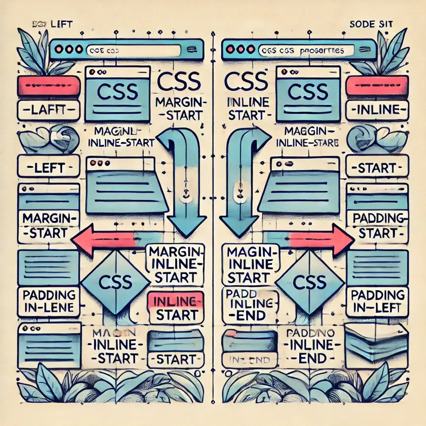
As someone who manages a website that delivers content in both left-to-right and right-to-left languages, I can’t express how excited I was when I discovered CSS Logical Properties. They have completely transformed how I approach layout design, especially when it comes to making my site fully functional and efficient for different languages.
Gone are the days of manually tweaking CSS for each direction; logical properties have made it so much easier to build a truly adaptive and responsive website.
Before, I used to rely heavily on traditional CSS properties like margin-left or padding-right, but now with logical properties, these are handled dynamically based on the writing mode of the page. No more messy workarounds or duplicated code just to make sure the design looks good in both LTR and RTL languages!
In this post, I’m going to share everything I’ve learned about logical properties and how they’ve made my web development process not only faster but also more streamlined for multilingual websites.
“Logical properties are the future of multilingual and responsive web design. They make creating adaptable layouts simpler and more intuitive.”

What Are Logical Properties?
In traditional CSS, properties such as margin-left or padding-right are known as physical properties, because they describe positions relative to the physical edges of the viewport or the element. Logical properties, on the other hand, describe layout relationships in a more flexible way, taking into account the document’s writing mode.
For example, instead of using margin-left and margin-right, you can use margin-inline-start and margin-inline-end to adapt the layout for both LTR and RTL languages. This ensures that when the writing direction changes, the layout still makes sense without needing to change the CSS.
Example of Logical vs Physical Properties:
/* Physical properties */
.element {
    margin-left: 20px;
    margin-right: 10px;
}

/* Logical properties */
.element {
    margin-inline-start: 20px;
    margin-inline-end: 10px;
}
In the second example, margin-inline-start and margin-inline-end will automatically adjust for both LTR and RTL languages, making your CSS more adaptable.
Advantages of Logical Properties
Logical properties bring many benefits to CSS, especially for websites that need to support multiple languages or complex layouts:
- Language Adaptability: Logical properties automatically adjust based on the language’s writing direction, such as LTR or RTL.
- Cleaner Code: Instead of duplicating styles for different writing directions, logical properties provide a single solution.
- Responsive to Writing Modes: They make it easier to build layouts that support vertical writing modes like Japanese or Chinese.
- Future-Proof: Logical properties future-proof your CSS code as web development trends move toward more flexible and adaptable designs.
“Logical properties reduce the need for repetitive code and make handling multi-language sites a lot more efficient.”
Let’s now dive into the actual properties of CSS logical properties and explore how they differ from their physical counterparts..
Size (Width and Height Dimensions)
The traditional way to set width and height is with width and height. Logical properties provide inline-size and block-size to allow for flexibility based on writing modes. These properties automatically adapt to the flow of text, whether it’s horizontal (like English) or vertical (like Japanese).
Logical Properties for Size:
inline-size: Equivalent to width in horizontal writing modes but adjusts in vertical ones.block-size: Equivalent to height but adapts for different writing modes.
Example:
/* Traditional method */
.element {
    width: 300px;
    height: 200px;
}

/* Logical method */
.element {
    inline-size: 300px;
    block-size: 200px;
}
Margin
Instead of using margin-left or margin-right, logical properties allow for inline margins, which work in both LTR and RTL contexts. Similarly, margin-block-start and margin-block-end handle vertical margins in a logical way.
Logical Properties for Margin:
margin-inline-start: Logical equivalent tomargin-left.margin-inline-end: Logical equivalent tomargin-right.margin-block-start: Logical equivalent tomargin-top.margin-block-end: Logical equivalent tomargin-bottom.
Example:
/* Traditional method */
.element {
    margin-left: 20px;
    margin-right: 10px;
}

/* Logical method */
.element {
    margin-inline-start: 20px;
    margin-inline-end: 10px;
}
“Using logical properties for margin makes your CSS more adaptable and efficient, reducing the need for different styles for RTL and LTR languages.”
Padding
Padding works similarly to margins in terms of logical properties. Instead of using padding-left or padding-right, logical properties provide padding-inline-start and padding-inline-end.
Logical Properties for Padding:
padding-inline-start: Logical equivalent topadding-left.padding-inline-end: Logical equivalent topadding-right.padding-block-start: Logical equivalent topadding-top.padding-block-end: Logical equivalent topadding-bottom.
Example:
/* Traditional method */
.element {
    padding-left: 20px;
    padding-right: 10px;
}

/* Logical method */
.element {
    padding-inline-start: 20px;
    padding-inline-end: 10px;
}
Inset (Positioned Elements)
When positioning elements with top, right, bottom, and left, logical properties introduce inset to work based on the writing mode. Logical properties for positioned elements ensure that the positions adjust correctly depending on the flow of the document.
Logical Properties for Inset:
inset-inline-start: Equivalent toleftin LTR andrightin RTL.inset-inline-end: Equivalent torightin LTR andleftin RTL.inset-block-start: Equivalent totop.inset-block-end: Equivalent tobottom.
Example:
/* Traditional method */
.element {
    top: 10px;
    left: 20px;
}

/* Logical method */
.element {
    inset-block-start: 10px;
    inset-inline-start: 20px;
}
Borders
Just like margin and padding, logical properties allow for borders to be applied in a more flexible way using border-inline-start, border-inline-end, border-block-start, and border-block-end. This ensures that borders adapt to the flow direction automatically.
Logical Properties for Borders:
border-inline-start: Logical equivalent toborder-left.border-inline-end: Logical equivalent toborder-right.border-block-start: Logical equivalent toborder-top.border-block-end: Logical equivalent toborder-bottom.
Example:
/* Traditional method */
.element {
    border-left: 1px solid black;
    border-top: 1px solid black;
}

/* Logical method */
.element {
    border-inline-start: 1px solid black;
    border-block-start: 1px solid black;
}
Border Radius
Just as logical properties apply to borders, they also extend to border-radius, with properties like border-start-start-radius and border-end-end-radius.
Logical Properties for Border Radius:
border-start-start-radius: Logical equivalent toborder-top-left-radius.border-start-end-radius: Logical equivalent toborder-top-right-radius.border-end-start-radius: Logical equivalent toborder-bottom-left-radius.border-end-end-radius: Logical equivalent toborder-bottom-right-radius.
Example:
/* Traditional method */
.element {
    border-top-left-radius: 10px;
    border-bottom-right-radius: 5px;
}

/* Logical method */
.element {
    border-start-start-radius: 10px;
    border-end-end-radius: 5px;
}
Floating and Clearing
Logical properties can even be applied to floats. Instead of using float: left or float: right, you can use float: inline-start and float: inline-end. Similarly, clearing floats can be done with clear: inline-start and clear: inline-end.
Example:
/* Logical method */
.element {
    float: inline-start;
    clear: inline-start;
}
Text Alignment
Text alignment can also adapt to writing modes. Instead of using text-align: left, you can use text-align: start to have it adjust automatically for both LTR and RTL languages.
Example:
/* Logical method */
.element {
    text-align: start; /* Aligns left in LTR, right in RTL */
}
Overflow
Just like resizing, overflow properties also have logical equivalents. Instead of overflow-x and overflow-y, you can use overflow-inline and overflow-block to handle overflow based on writing mode.
Example:
/* Logical method */
.element {
    overflow-inline: auto;
    overflow-block: hidden;
}
Overscroll-behavior
Logical properties extend to overscroll behavior as well. Instead of specifying scroll behavior on physical axes, you can use logical properties to control the behavior for inline and block flows.
Example:
/* Logical method */
.element {
    overscroll-behavior-inline: contain;
    overscroll-behavior-block: none;
}
Writing Mode Property
Logical properties shine when combined with the writing-mode property in CSS. The writing-mode property defines whether text flows horizontally or vertically, which can affect how logical properties are applied.
Example of Writing Mode:
/* Change writing mode to vertical */
.element {
    writing-mode: vertical-rl;
    inline-size: 200px;
    block-size: 500px;
}
In the example above, logical properties like inline-size and block-size will automatically adapt to the vertical writing mode without needing to use width and height properties.
Browser Support
Logical properties are widely supported in modern browsers, including Chrome, Firefox, Safari, and Edge. However, for older browsers, you may need to provide fallbacks using traditional properties.
Fallback Example:
/* Fallback for older browsers */
.element {
    margin-left: 20px;
    margin-right: 10px;

    /* Logical properties */
    margin-inline-start: 20px;
    margin-inline-end: 10px;
}
Fallback Strategies for Older Browsers
Although logical properties are supported in most modern browsers, older browsers might not support them. To ensure your website works correctly across all browsers, it’s essential to provide fallbacks for these logical properties.
Strategies for Handling Older Browsers:
- Use Traditional Properties: Provide physical property fallbacks before your logical properties.
- Graceful Degradation: Make sure that even without logical properties, the page still functions correctly, even if the layout might not be fully optimal.
Real-World Use Cases
Logical properties are particularly useful for websites that need to support multiple languages or that may be viewed in different orientations.
For example, a global e-commerce website could benefit from using logical properties to easily support both English and Arabic layouts without writing separate CSS rules for each language.
Examples of Real-World Applications:
- Multilingual Websites: Easily switch between LTR and RTL layouts with logical properties.
- Responsive Design: Ensure that text and layout elements flow correctly when switching between landscape and portrait modes on mobile devices.
- Complex Layouts: Simplify the CSS needed for websites with vertical writing modes (e.g., Japanese, Chinese).
“Logical properties simplify the complexity of global web development, enabling developers to support more languages and writing modes with less effort.”
Best Practices
When using logical properties in your CSS, there are a few best practices to keep in mind:
- Use Logical Properties Early: Start using logical properties from the beginning of your project, especially if you know the website will support multiple languages or complex layouts.
- Provide Fallbacks: Always include traditional CSS properties as fallbacks for older browsers that don’t support logical properties.
- Test in Different Writing Modes: Ensure that your layout works correctly in both horizontal (LTR/RTL) and vertical writing modes.
Conclusion
“Adopting logical properties in CSS today prepares you for future web development challenges, making your code cleaner and more adaptable.”
Logical properties in CSS provide a modern and flexible approach to building layouts that adapt to different writing modes and languages. By using these properties, you can simplify your CSS, create more resilient designs, and easily support multiple languages and orientations. Logical properties are the future of responsive web design, allowing developers to create more adaptable and future-proof layouts.


