Media queries apply CSS only when a condition is true, such as a minimum screen width, a dark mode preference, or a mouse as the pointing device. Nearly every responsive site uses them, and most tutorials still teach the same pattern: max-width: 767px for phones and min-width: 768px for everything bigger.
The catch is that a browser window doesn’t have to be a whole number of pixels wide. On a laptop with 125% display scaling, it can be 767.2px wide. Neither query matches. I tested this in the Chrome, Firefox and Safari engines and found the same gap in WordPress core. Then I ran the usual build tools to see how they handle the fix.
I’ll walk you through the modern range syntax, explain why it closes the gap, and show you how to spot gaps in your own CSS.
Jump straight to the gap finder
Media Query Basics
A media query sets a condition. The CSS inside it applies only when that condition is true:
@media (min-width: 768px) {
  .sidebar {
    display: block;
  }
}
Here the condition tests a media feature: the viewport width. You can add a media type like screen or print and combine conditions with and, or and not. A comma works like or:
@media screen and (min-width: 768px) and (hover: hover) { }
@media print { }
@media (orientation: portrait), (width < 600px) { }
If you’re new to CSS, start with the CSS beginners guide.
The Range Syntax
With Media Queries Level 4, you can write width conditions using comparison operators instead of the min- and max- prefixes:
/* min- and max- prefixes */
@media (min-width: 768px) { }
@media (max-width: 767px) { }
@media (min-width: 768px) and (max-width: 1023px) { }

/* Range syntax */
@media (width >= 768px) { }
@media (width < 768px) { }
@media (768px <= width < 1024px) { }
Here’s how the two forms map to each other:
| Prefix form | Range form | Matches |
|---|---|---|
(min-width: 768px) |
(width >= 768px) |
768px and wider |
(max-width: 768px) |
(width <= 768px) |
Up to 768px, including 768px |
| No equivalent | (width > 768px) |
Wider than 768px, not 768px itself |
| No equivalent | (width < 768px) |
Anything below 768px, fractions included |
The last two rows show the difference. Prefixes always include the boundary, so they can’t express “below 768px”. The range syntax can.
These operators work with any range feature, not just width:
@media (height < 500px) { }
@media (aspect-ratio > 16/9) { }
@media (resolution >= 2dppx) { }
Mistakes That Fail Silently
I ran each of these through matchMedia() in Chromium 158, Firefox 159 and WebKit 27.2. I got false every time, but not one of the three engines threw an error:
(400px <= width >= 1000px): both operators need to point the same way.(width < = 768px): don’t put a space inside<=.(width => 768px): the operator is>=, not=>.(min-width >= 768px): don’t mix a prefix with an operator.(width >= 768): lengths need a unit.
The value can go on either side. (768px <= width) is valid and means the same thing as (width >= 768px).
The Gap Between 767px and 768px
Here’s the pair most sites use:
@media (max-width: 767px) {
  /* phones */
}

@media (min-width: 768px) {
  /* tablets and up */
}
It looks airtight because it covers every whole number. The catch is that browsers don’t measure the viewport in whole pixels.
With display scaling, you get the CSS width by dividing the physical width by the scale. A window 959 physical pixels wide at 125% scaling is 767.2 CSS pixels wide. That’s more than 767, so max-width fails. It’s also less than 768, so min-width fails. Neither block applies.
The spec warns about exactly this in its section on the prefixes:
“It does not take into account the possibility of fractional viewport sizes which can occur as a result of non-integer pixel densities (e.g. on high-dpi displays or as a result of zooming/scaling). Any viewport widths that fall between 320px and 321px will result in none of the styles being applied.”
Media Queries Level 4, section 2.4.4
I reproduced it at four common scale factors. Each row shows a real Chromium window. I saw the same behavior in Firefox at 125%:
| Display scaling | Window (physical px) | CSS width | 767px / 768px pair | (width < 768px) |
|---|---|---|---|---|
| 110% | 844 | 767.27px | Neither matches | Matches |
| 125% | 959 | 767.2px | Neither matches | Matches |
| 150% | 1151 | 767.33px | Neither matches | Matches |
| 175% | 1343 | 767.43px | Neither matches | Matches |
At 125%, the CSS width is a whole number only when the physical width is divisible by 5. That leaves four out of five window widths with a fractional CSS width.
Most of those widths fall safely on one side of a breakpoint. The ones between 767 and 768 get no breakpoint styles at all. If you resize the window, you pass through the gap. If your window happens to sit in that gap, though, you see the broken layout until you resize it.
Browser zoom changes that same ratio. The demo below measures your viewport the way media queries see it. Try zooming in and out and watch the numbers:
Measuring...
How the Range Syntax Closes the Gap
(width < 768px) matches every width below 768px, including fractional widths. Pair it with (width >= 768px) and every possible width matches exactly one rule:
@media (width < 768px) {
  /* phones */
}

@media (width >= 768px) {
  /* tablets and up */
}
Drag the slider to a width between 767 and 768 to see how the three approaches compare:
The slider sets a simulated width and applies each rule set using the same comparisons as the browser. In the gap, the cards fall back to their base styles, just as they do on a real page.
WordPress Core Has the Same Gap
On small screens, the Columns block in WordPress 7.1.3 stacks its columns using this pair from wp-includes/blocks/columns/style.css:
@media (max-width: 781px) {
  .wp-block-columns:not(.is-not-stacked-on-mobile) > .wp-block-column {
    flex-basis: 100% !important;
  }
}

@media (min-width: 782px) {
  .wp-block-columns:not(.is-not-stacked-on-mobile) > .wp-block-column {
    flex-basis: 0;
    flex-grow: 1;
  }
}
I loaded that exact CSS in Chromium at 781px, 781.09px and 782px. In the gap, the columns don’t stack, but they don’t share the width equally either. Each takes its width from its text, and the columns wrap when they run out of room:
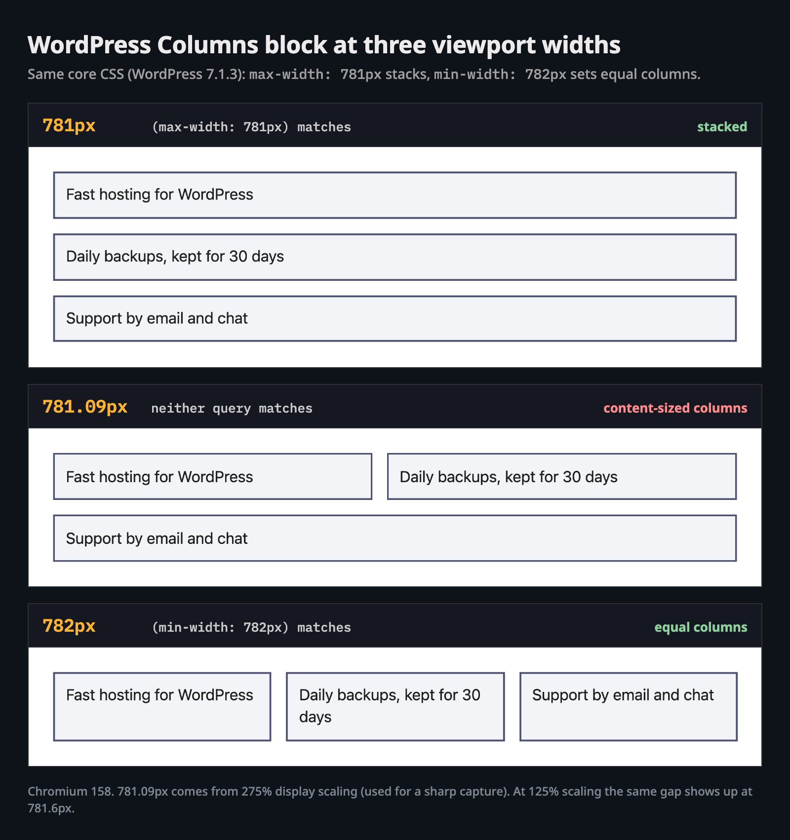
The actual WordPress 7.1.3 Columns CSS at three widths. Only the middle width falls between the two queries.
Across the 244 stylesheets in WordPress core, I counted 27 pairs like this: a max-width and a min-width 1px apart in the same file. I didn’t find any range syntax.
The newer code tells a different story. For the responsive block styles added in WordPress 7.1, class-wp-theme-json.php builds the queries using range syntax. With the default 480px and 782px viewports, the tablet query is (480px < width <= 782px) and the desktop query is (width > 782px). There’s no gap between them.
What About 767.98px?
Bootstrap works around the gap by subtracting 0.02px from every max value. That gives it a pair of max-width: 767.98px and min-width: 768px.
In practice, that worked: I got a match at every fractional width I produced. But the gap is still there, even if it’s only 0.02px wide, and you have to remember to subtract it in every query you write. With range syntax, there’s no gap to account for.
Media Queries in JavaScript: Use matchMedia, Not innerWidth
window.innerWidth gives you a whole number, but CSS can work with fractional widths. In Chromium at a 781.6px viewport, innerWidth returned 782 while (min-width: 782px) was false.
So if your script checks innerWidth >= 782, it runs the desktop code while the CSS still shows the small-screen layout. Instead, ask the browser the same question your CSS asks:
const wide = window.matchMedia('(width >= 782px)');

function apply(query) {
  document.body.classList.toggle('is-wide', query.matches);
}

apply(wide);
wide.addEventListener('change', apply);
matchMedia() accepts the range syntax and compares values the same way the stylesheet does, so your JavaScript and CSS can’t disagree. The change event fires only when the result flips, so it’s cheaper than a resize listener.
em and rem in Media Queries Ignore Your html font-size
Many sites use html { font-size: 62.5% } so that 1rem equals 10px. This blog’s theme sets its root font size to 10px too. But media queries ignore that setting:
html {
  font-size: 62.5%; /* 1rem = 10px in your rules */
}

@media (width >= 40rem) {
  /* starts at 640px, not 400px */
}
I tested this in all three engines with a 500px viewport and a 10px root. (width >= 40rem) didn’t match, but (width >= 30rem) did. So inside the query, 1rem was 16px.
The spec puts it this way: relative units in media queries are “relative to the initial value of font-size, defined by the user agent or the user’s preferences, not any styling on the page.” That’s handy because em-based breakpoints follow the reader’s own default font size.
That same rule explains what happens in Tailwind. Tailwind CSS 4.3.5 compiled md: to (width >= 48rem) and max-md: to (width < 48rem). Its md breakpoint is still 768px, even in a theme with a 10px root. For the setup, see installing Tailwind CSS v4 in a WordPress theme.
One more thing to watch for: you can’t use CSS variables in a media query. (width >= var(--bp)) never matches. calc() works, though: (width >= calc(700px + 10px)) matched at 800px.
Browser Support and How Build Tools Handle Range Syntax
Range syntax works in every current browser. According to MDN’s compatibility data and caniuse, that covers about 96% of global usage:
| Browser | Range syntax since |
|---|---|
| Chrome and Edge | 104 |
| Firefox | 102 (63 to 101 only accepted the name-first form, like (width > 500px)) |
| Safari and iOS Safari | 16.4 |
An older browser doesn’t read part of a range query and ignore the rest. The spec says a query that doesn’t match the grammar “must be replaced by not all”, so the browser skips the whole block.
That’s why build tools offer to rewrite range syntax for older targets. I ran the same three queries through each tool. Here’s what each one did with (width < 768px):
| Tool and version | Output for (width < 768px) |
|---|---|
| Dart Sass 1.108.1 | Unchanged |
| cssnano 9.9.0, clean-css 5.6.3 | Unchanged (minified) |
| esbuild 0.28.2, no target | Unchanged |
esbuild 0.28.2, --target=chrome100,safari15 |
not (min-width: 768px) |
| Lightning CSS 1.33.0, Safari 15 target | not (min-width: 768px) |
| postcss-preset-env 11.6.2, default browsers | (max-width: 767.98px) |
| postcss-media-minmax 5.0.0 | (max-width: 767px) |
| Tailwind CSS 4.3.5 | Writes range syntax itself |
Two of these quietly undo the fix. postcss-media-minmax takes you right back to the 767px version, gap and all. postcss-preset-env gave me Bootstrap’s 0.02px version, and that was with its default browser list, not an old one.
The Lowering Trap: not (min-width) in Older Browsers
esbuild and Lightning CSS take a different route. not (min-width: 768px) means exactly the same thing as (width < 768px). No gap.
Here’s the catch: not in front of a bare condition is also Media Queries Level 4 syntax. Chrome shipped it in version 104 as part of the same feature as the range syntax. In Chromium 103’s media query parser, not inside @media sits behind the same CSSMediaQueries4 flag. That flag only came on in 104.
So the rewritten rule is invalid in the very browsers it’s meant to help. It never applies there. Someone has already reported this for Lightning CSS on iOS 16.3 and older (issue #1361, still open). I couldn’t find a report for esbuild.
I got that detail from Chromium 103’s source code. I couldn’t run Chrome 103 itself because old builds no longer launch on current macOS.
If you still support Chrome 103 or Safari 16.3 and older, don’t count on automatic rewriting of < and >. Either of these works everywhere:
/* 1. Mobile first, min-width only: one direction can't leave a gap */
.card { flex-basis: 100%; }

@media (min-width: 768px) {
  .card { flex: 1 1 0; }
}

/* 2. "below 768px" in syntax older browsers understand */
@media not all and (min-width: 768px) {
  .card { flex-basis: 100%; }
}
not followed by a media type has been valid since Media Queries Level 3. At a viewport width of 767.2px in current Chromium and Firefox, not all and (min-width: 768px) matched, but the 767px version didn’t.
Find the Gaps in Your Own CSS
Paste a stylesheet below or scan the CSS this page has loaded. The finder flags max/min pairs up to 1px apart because they leave a gap. It also flags pairs with the same value because both queries match at that width. The finder rewrites each query using range syntax and compares em and rem values at 16px. Results update as you type.
Findings
Range syntax version
The finder only reads min- and max- width and height. Use its rewrite as a starting point, then check each result. If a rule only looked right because of the gap, it’ll behave differently once you close that gap.
Click “Scan this page’s CSS” and you’ll see one in this blog’s own theme: a 1122px/1123px pair. When I scanned all the theme’s stylesheets, the finder turned up four pairs, including 767px/768px.
To check any live site, open the browser console on one of its pages and paste this in:
(() => {
  const queries = new Set();
  const walk = (rules) => {
    for (const rule of rules) {
      if (rule.media && rule.cssRules) queries.add(rule.media.mediaText);
      if (rule.cssRules) walk(rule.cssRules);
    }
  };
  for (const sheet of document.styleSheets) {
    try { walk(sheet.cssRules); } catch (e) { /* cross-origin sheet */ }
  }
  const re = /\((min|max)-width:\s*([\d.]+)px\)/g;
  const min = new Set(), max = new Set();
  for (const q of queries) {
    for (const [, kind, value] of q.matchAll(re)) (kind === 'min' ? min : max).add(+value);
  }
  for (const hi of max) for (const lo of min) {
    if (lo - hi > 0 && lo - hi <= 1) console.log(`gap: max-width ${hi}px / min-width ${lo}px`);
  }
})();
Scripts can’t read stylesheets served from another domain, so both the snippet and the “scan” button above skip them.
Beyond Width: Preference and Input Queries
Width gets most of the attention, but some of the most useful media features tell you about the reader, not the screen:
/* Respect the system "reduce motion" setting */
@media (prefers-reduced-motion: reduce) {
  .hero {
    animation: none;
  }
}

/* Follow the system dark mode */
@media (prefers-color-scheme: dark) {
  :root {
    --bg: #0e1219;
    --text: #eceaea;
  }
}

/* Hover effects only for a real mouse or trackpad */
@media (hover: hover) and (pointer: fine) {
  .card:hover {
    transform: translateY(-2px);
  }
}

/* Combine them with the range syntax */
@media (width >= 768px) and (hover: hover) {
  .menu-item:hover > .submenu {
    display: block;
  }
}
hover and pointer describe the primary input device. any-hover and any-pointer match if any connected device qualifies, not just the primary one. That distinction is handy on laptops with touch screens.
Media Queries or Container Queries?
Media queries answer the question “How big is the screen?” Container queries answer a different one: “How big is the box this component sits in?”
I use media queries for page-level layout and container queries when a component needs to fit into spaces of different sizes. Container queries use the same range syntax, as in @container (width > 500px). The container queries guide shows how they work with live examples.
Sometimes you don’t need either. A grid with auto-fit and minmax() reflows on its own. You can see how in responsive layouts with CSS Grid without media queries.
FAQs
Here are a few common questions about media queries and the range syntax:
(width >= 768px) or (400px <= width < 1024px), instead of min-width and max-width. It also allows exclusive bounds like (width < 768px), which the prefixes can't express.
(min-width: 768px) and (width >= 768px) match the same widths, and (max-width: 767px) equals (width <= 767px). The difference shows up with < and >, which have no prefix equivalent.
max-width: 767px / min-width: 768px pair matches neither at that width, so the page gets no breakpoint styles. Writing the pair as (width < 768px) and (width >= 768px) fixes it.
(width >= var(--bp)) never matches, because custom properties aren't allowed in media queries. calc() with fixed values does work. To share breakpoints, use a preprocessor variable or your build tool.
html { font-size: 62.5% }, (width >= 40rem) still starts at 640px.
< and > into, because some rewrites bring the gap back or produce syntax those browsers can't read.
Summary
Pair max-width: 767px with min-width: 768px and neither rule applies at widths like 767.2px. Display scaling and zoom create those widths. WordPress core’s Columns block has the same gap.
Range syntax closes the gap: write (width < 768px) and (width >= 768px). In scripts, use matchMedia() instead of innerWidth. Keep in mind that rem in a media query means 16px. If you rewrite the syntax for older browsers, check your build tool’s output. Two of the tools I tested bring the gap back.
Try the gap finder on your own stylesheet. If you’ve ever had a “breaks only on my client’s laptop” bug, there’s a fair chance you’ll find a gap there.