The background-clip property allows us to control how far the background image (or background color) extends beyond the Padding or the content itself of an element.
I assume that this explanation is challenging to understand without some examples and a look at the code. So let’s see some examples, but before that, take a look at the following live example to encourage you to continue reading the post:
The
background-clip property is written as follows:.element {
background-clip: padding-box;
}Possible Values for the background-clip Property
border-box– The default value. The background extends to the outer edge of the element’s border.padding-box– Clips the background at the outer edge of the element’s padding. The border area gets no background.content-box– Clips the background at the edge of the element’s content box. Both the padding and border get no background.text– Clips the background to the foreground text. Requires-webkit-text-fill-color: transparentto reveal the background through the text.
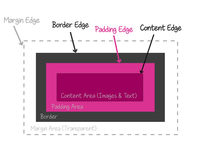
Box areas of an element – Credit – Codrops.com
The first three values map directly to the three areas of the CSS box model shown above. The text value is different – it clips to the shape of the text itself. Let’s see them all in action.
Box Model Values: border-box, padding-box, content-box
Each example below uses the same setup: a div with a blue background, generous padding, and a semi-transparent gold border. The only thing that changes is the background-clip value. Watch how it affects where the blue fills.
border-box (default)
The blue background stretches all the way to the outer edge of the border. Notice the mixed tint on the border – that’s the blue background blending through the semi-transparent gold.
border-box - background fills border + padding + content
padding-box
The background stops at the padding edge. The semi-transparent border now shows its true gold color since there’s no blue underneath.
padding-box - background fills padding + content only
content-box
The background only fills the content area. Both the padding and the border are left without background, so you can clearly see the three distinct zones of the CSS box model in action. If you want to clip the element’s shape itself rather than its background, check out CSS clip-path.
content-box - background fills content area only
content-box with margin: 0
Same as above, but with margin: 0 on the paragraph. The blue area shrinks because the paragraph’s default margins were contributing to the content box size.
content-box + margin: 0 on the paragraph
Interactive Playground
Toggle between the three box model values and adjust the padding and border width in real time:
Content area
The text Value
The text value clips the background to the foreground text shape. It used to require the -webkit- prefix, but the unprefixed background-clip: text now works in Chrome, Firefox, Safari, and Edge. For older browser versions you can still include the prefix:
background-clip: text;
-webkit-background-clip: text;
-webkit-text-fill-color: transparent;
The -webkit-text-fill-color: transparent part makes the text fill transparent so the background shows through.
In older browsers you may need
display: inline-blockon the element for the clipping to render. Modern versions of Chrome, Firefox, and Safari handle it on block elements too.
Image Through Text
Take a look at the following example:
The CSS we used is:
.image-mask {
    background-size: cover;
    background-image: url('https://savvy.co.il/wp-content/themes/thesis/images/clip2.jpg');
    background-position: center;
    text-align: center;
    -webkit-background-clip: text;
    -webkit-text-fill-color: transparent;
    font: 900 134px 'Heebo', sans-serif;
}
The HTML is straightforward:
<div class="image-mask">Savvy Blog</div>The text value clips the background to the foreground of the text, which is set as transparent using the -webkit-text-fill-color property.
Fixed Background Through Text
It can also be done with a fixed background, so that when you scroll, the background remains in place. For example (probably won’t work on mobile):
The CSS:
.image-mask-fixed {
    background: url('image.jpg') fixed;
    background-size: cover;
    background-position: center;
    -webkit-background-clip: text;
    -webkit-text-fill-color: transparent;
    font: 900 134px 'Heebo', sans-serif;
}
Hover Reveal on Clipped Text
The background-clip property also works with the :hover pseudo-class. Here, the text starts at low opacity and fades in on hover:
The CSS:
.image-mask-hover {
    background: url('image.jpg') fixed;
    background-size: cover;
    -webkit-background-clip: text;
    -webkit-text-fill-color: transparent;
    font: 900 134px 'Heebo', sans-serif;
    transition: all 3s;
    opacity: 0.3;
}

.image-mask-hover:hover {
     opacity: 1;
}
Animated Gradient Text
Combining background-clip: text with an animated gradient creates eye-catching headings with no images and no JavaScript. For a different approach to text effects, see my post on CSS text-shadow. Here, the gradient shifts position using a CSS @keyframes animation:
The CSS:
.animated-gradient-text {
    background: linear-gradient(
        90deg, #f7971e, #ffd200, #ff6b6b, #c471ed, #12c2e9, #f7971e
    );
    background-size: 300% 100%;
    background-clip: text;
    -webkit-background-clip: text;
    -webkit-text-fill-color: transparent;
    animation: gradient-shift 4s linear infinite;
    font-weight: 900;
    font-size: 48px;
}

@keyframes gradient-shift {
    0% { background-position: 0% 50%; }
    100% { background-position: 300% 50%; }
}
The oversized background-size: 300% gives the gradient room to travel. The animation slides it across the text continuously – a shimmering effect that is pure CSS.
Creative Techniques
The four values above are the foundation, but background-clip really shines when you combine it with gradients, patterns, and multiple background layers. For a related approach that controls visibility through shapes and gradients, see my post on CSS mask-image.
Gradient Border Effect
I use this technique often. By pairing background-clip: padding-box on the main background with background-clip: border-box on a gradient layer, you get a gradient that only shows through a transparent border. No extra wrapper elements needed. I wrote a full post about gradient borders in CSS covering this and other techniques.
This box has a gradient border created entirely with background-clip and two background layers - no extra elements needed.
The CSS:
.gradient-border-box {
    border: 4px solid transparent;
    padding: 24px;
    background:
        linear-gradient(var(--dark-bg), var(--dark-bg)) padding-box,
        linear-gradient(135deg, #f7971e, #ffd200, #f7971e) border-box;
}
The first linear-gradient is clipped to padding-box (the solid fill). The second is clipped to border-box (the gradient that peeks through the transparent border).
Dotted Notebook Background
By clipping a repeating dot pattern to only the content area, you create a notebook-style dotted background that respects your padding – a writing area that floats inside the element.
The dot grid only fills the content box. The padding zone stays clean, framing the content like a notebook margin.
The CSS:
.dotted-notebook {
    padding: 32px;
    border: 2px solid rgba(255, 182, 54, 0.3);
    background:
        radial-gradient(circle, rgba(255,182,54,0.35) 1px, transparent 1px);
    background-size: 18px 18px;
    background-clip: content-box;
}
Knockout Card with Layered Clipping
This one stacks three background layers, each clipped to a different box area. The border gets a diagonal stripe pattern, the padding gets a solid dark fill, and the content area gets a radial glow. All from a single element with zero extra markup.
Three layers, three clip values, one element. The stripe border, dark padding, and radial glow each live on a separate background layer.
The CSS:
.knockout-card {
    border: 12px solid transparent;
    padding: 32px;
    background:
        radial-gradient(circle at 30% 40%,
            rgba(255,182,54,0.25), transparent 70%) content-box,
        linear-gradient(var(--dark-bg), var(--dark-bg)) padding-box,
        repeating-linear-gradient(
            45deg,
            #f7971e 0, #f7971e 6px,
            transparent 6px, transparent 12px
        ) border-box;
}
Each layer targets a different zone of the box model through background-clip. The repeating diagonal stripes fill the border area. The solid fill covers the padding zone and masks the stripes inside it. And the radial glow sits only in the content area, giving the text a warm spotlight effect.
FAQs
Common questions about the CSS background-clip property:
background-clip property controls how far an element's background (color or image) extends within its box. By default the background fills everything including the border area. You can restrict it to the padding area with padding-box, the content area with content-box, or clip it to the shape of the text with background-clip: text.background-clip: padding-box the background fills both the padding and the content area but stops before the border. With content-box the background only fills the content area - the padding zone is left empty too. The difference is visible when the element has padding, since content-box leaves that space transparent.background-clip: text since version 49 (released in 2016). The unprefixed syntax works in all current versions of Firefox, Chrome, Safari, and Edge. You can still include the -webkit-background-clip: text prefix as a fallback for very old browser versions.background-clip: text is supported in Chrome 120+, Firefox 49+, Safari 14+, and Edge 120+. For broader compatibility you can declare both: -webkit-background-clip: text followed by background-clip: text. Pair it with -webkit-text-fill-color: transparent to make the text fill transparent.transparent, then use two background layers. The first layer is a solid color clipped to padding-box (the inner fill). The second layer is a gradient clipped to border-box. The gradient shows only in the border area because the solid layer covers the inside. Example: background: linear-gradient(#fff, #fff) padding-box, linear-gradient(90deg, gold, orange) border-box;That’s it. Hope you learned something new… See you in the next post! 🙂