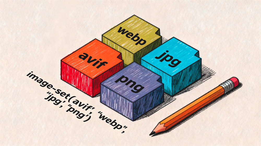
The CSS image-set() function allows you to provide multiple versions of an image so browsers can automatically choose the most optimal one. This improves performance, ensures compatibility with older devices, and avoids manual detection logic.
In modern web development, image-set is one of the best ways to serve next-gen formats like AVIF and WebP with reliable fallbacks.
What is CSS image-set and Why It Matters
The image-set() function works similarly to srcset in HTML. You define several image sources, and the browser selects the best match based on format support, device pixel ratio, and performance considerations.
This is extremely useful when working with modern image formats.
AVIF and WebP offer much smaller file sizes compared to JPG or PNG, but not all browsers support them. The image-set() function handles that gracefully without needing JavaScript or user-agent detection.
It is ideal for improving Core Web Vitals, especially for background images where srcset is not available.
Basic Usage of image-set
The simplest implementation provides the same image in multiple formats. The browser picks the first format it supports.
background-image: image-set(
    url("../img/hero.avif") type("image/avif"),
    url("../img/hero.webp") type("image/webp"),
    url("../img/hero.jpg") type("image/jpeg")
);
This ensures that AVIF is used when available, WebP when AVIF is not supported, and JPEG as a guaranteed fallback.
Using image-set for Retina and High-DPI Screens
You can also specify different image resolutions using the 1x, 2x, or 3x syntax. This lets high-resolution screens load sharper images without forcing everyone to download heavy files.
background-image: image-set(
    url("../img/banner@1x.webp") type("image/webp") 1x,
    url("../img/banner@2x.webp") type("image/webp") 2x
);
Browsers automatically pick the correct version based on device pixel density.
When Should You Use image-set?
The image-set function becomes extremely powerful in several scenarios that affect compatibility, performance, and responsive design.
1. When You Want Format Fallbacks
This is the most common use case. You want to serve AVIF or WebP when possible, but still support browsers like older Safari or legacy mobile browsers.
Using image-set ensures your design never breaks because a browser cannot display a modern image format.
background-image: image-set(
    url("../img/card.avif") type("image/avif"),
    url("../img/card.webp") type("image/webp"),
    url("../img/card.png") type("image/png")
);
2. When You Need Higher Quality on Retina Devices
High-resolution devices display blurry backgrounds if the image is too small. With multiple density values, image-set serves crisp images only when needed.
3. When Using Background-Image in CSS Instead of IMG Tags
HTML srcset cannot help when images are purely decorative and set via CSS. This is why image-set is essential for:
- Hero sections with CSS backgrounds
- Section dividers
- Card backgrounds
- Sliders or Splide slides with CSS images
4. When You Want Better Page Speed Scores
Modern formats like AVIF dramatically reduce file size, which leads to better LCP, lower bandwidth usage, and faster perceived rendering. Using image-set helps deliver the right asset without extra logic.
Practical Example: Hero Background With Full Fallback Support
This example uses AVIF, WebP, and JPG fallback with responsive sizes.
.hero {
    background-image: image-set(
        url("../img/hero-large.avif") type("image/avif") 2x,
        url("../img/hero-large.webp") type("image/webp") 2x,
        url("../img/hero.avif") type("image/avif") 1x,
        url("../img/hero.webp") type("image/webp") 1x,
        url("../img/hero.jpg") type("image/jpeg")
    );
    background-size: cover;
    background-position: center;
}
This gives maximum compatibility and maximum performance across all screens.
Browser Support
The image-set() function is supported in all major browsers.

Legacy browsers will simply use the last fallback format if they don’t recognize the image-set syntax.
FAQs
Common questions about CSS image-set():
image-set() is a CSS function that lets you provide multiple image sources (e.g. AVIF, WebP, JPEG) or resolutions (1x, 2x). The browser picks the best option based on format support and device pixel ratio. It works like srcset but for CSS properties such as background-image.background-image) and want format fallbacks (AVIF, WebP, JPEG) or resolution switching (1x, 2x) for retina. For <img> tags, use HTML srcset instead.image/avif, image/webp, and image/jpeg or image/png. List them in order of preference; the browser picks the first it supports. Always include a final fallback (e.g. JPEG or PNG) for older browsers.image-set() and use the last listed source if it's a valid fallback. For very old browsers, a -webkit- prefixed fallback can help; otherwise keep a JPEG or PNG as the last entry.srcset applies to <img> (and <picture>). image-set() is for CSS properties like background-image, content, or list-style-image. Use srcset for content images in HTML; use image-set() for images set in CSS.Conclusion
The CSS image-set() function is essential for modern web development. It improves loading performance, ensures compatibility, optimizes for retina displays, and simplifies how you handle multiple image formats.
Whether you’re using AVIF, WebP, or traditional formats, image-set lets the browser choose the perfect option automatically, creating faster and more reliable experiences.