If you’ve ever built a full-screen hero section on mobile and watched it overflow behind the address bar, you already know the problem.
I’ve dealt with this on dozens of projects, and it’s one of those bugs that makes you question whether vh units were ever designed for phones. (If you’re still getting familiar with CSS units like vh, vw, and rem, the beginners guide covers them all.)
CSS now has a proper fix. Three new viewport unit variants (svh, lvh, and dvh) give you explicit control over how mobile browser chrome affects your layouts.
Browser chrome means the address bar, toolbar, tabs, and other UI elements that frame the webpage content – not Google Chrome the browser.
The Problem with 100vh on Mobile
Setting an element to height: 100vh works perfectly on desktop. The element fills the browser window, and nothing overflows.
On mobile, it breaks.
Mobile browsers have dynamic toolbars (the address bar and bottom navigation) that appear when the page loads and collapse as you scroll.
When you write 100vh, the browser calculates that value against the largest possible viewport (with all toolbars hidden). But when the page first loads, the toolbars are visible, so the actual visible area is smaller.
The result: your “full-screen” element is taller than what the user can see. Content gets clipped behind the address bar. A CTA button at the bottom of a hero section disappears off-screen.
.hero {
    height: 100vh; /* Overflows on mobile! */
    display: flex;
    align-items: center;
    justify-content: center;
}
The old workaround was a JavaScript hack using window.innerHeight:
document.documentElement.style.setProperty(
    '--vh', window.innerHeight * 0.01 + 'px'
);
// Then in CSS: height: calc(var(--vh, 1vh) * 100);
This worked, but it was fragile, required a resize listener, and felt wrong. CSS should handle this natively.
The Three New Viewport Unit Types
The CSS Working Group introduced three viewport measurement strategies to replace the single vh behavior. Each one defines “100% of the viewport height” differently.
| Unit | Measures | Best for |
|---|---|---|
svh | Smallest viewport (toolbars visible) | Hero sections, splash screens, above-the-fold content |
lvh | Largest viewport (toolbars hidden) | Immersive layouts, full-screen galleries, app shells |
dvh | Current dynamic viewport (changes in real-time) | Adaptive layouts, sticky footers, chat widgets |
Each unit type also has width, inline, and block counterparts. The inline and block variants follow the same axis logic as CSS logical properties:
| Dimension | Small | Large | Dynamic |
|---|---|---|---|
| Height | svh | lvh | dvh |
| Width | svw | lvw | dvw |
| Inline | svi | lvi | dvi |
| Block | svb | lvb | dvb |
| Min | svmin | lvmin | dvmin |
| Max | svmax | lvmax | dvmax |
The small viewport-percentage units (sv*) are defined with respect to the small viewport size: the viewport sized assuming any UA interfaces that are dynamically expanded and retracted to be expanded.
The large viewport-percentage units (lv*) are defined with respect to the large viewport size: the viewport sized assuming any UA interfaces that are dynamically expanded and retracted to be retracted.
How Dynamic Viewport Height (dvh) Works
dvh behaves differently from the other two. While svh and lvh are static values, dvh updates in real-time as the address bar and toolbar show or hide.
When the address bar is visible, 100dvh equals the smaller visible area. When the user scrolls and the address bar collapses, 100dvh expands to fill the newly available space.
.adaptive-panel {
    height: 100dvh;
    /* Shrinks when address bar appears */
    /* Grows when address bar hides */
}
This sounds perfect, but there’s a trade-off. Because dvh triggers a layout recalculation every time the toolbar animates, it can cause visible reflow on elements that depend on it.
Use dvh carefully on elements with complex children. The constant resizing during scroll can cause layout shifts and janky animations. For most full-screen sections, svh is the safer choice.
When to use dvh
- Sticky footers or bottom-anchored elements that need to stay at the actual bottom of the visible area
- Chat interfaces or toolbars that must always fill exactly the visible space
- Modal overlays that should resize with the browser chrome
When to avoid dvh
- Hero sections and splash screens. Use
svhinstead for a stable, no-overflow result - Elements with heavy content or animations that would jank during reflow
- Any layout where a fixed height on initial load is more important than live adaptation
Interactive Demo: vh vs svh vs lvh vs dvh
All four units render side by side. Toggle the address bar and watch which phones change height and which ones stay put. Only one of them adapts in real time.
Practical Use Cases
Here’s how each unit fits into real layouts.
Hero sections with svh
For full-screen hero sections, svh is the right choice. It guarantees the element fits within the visible area even with the address bar showing. This matters especially for scroll-snapping layouts where each section is meant to fill exactly one screen.
.hero {
    min-height: 100svh;
    display: flex;
    align-items: center;
    justify-content: center;
}
Sticky footer with dvh
If you need a page layout where the footer sticks to the bottom of the visible viewport, dvh keeps it anchored correctly as the browser chrome changes.
.page-wrapper {
    min-height: 100dvh;
    display: flex;
    flex-direction: column;
}

.main-content {
    flex: 1;
}

.footer {
    /* Always at the bottom of the visible area */
}
Full-screen overlay with lvh
For modal overlays that should cover every pixel of the screen – even if the user has scrolled and the toolbar is gone – use lvh.
.overlay {
    position: fixed;
    inset: 0;
    height: 100lvh;
    background: rgba(0, 0, 0, 0.8);
}
The Fallback Pattern
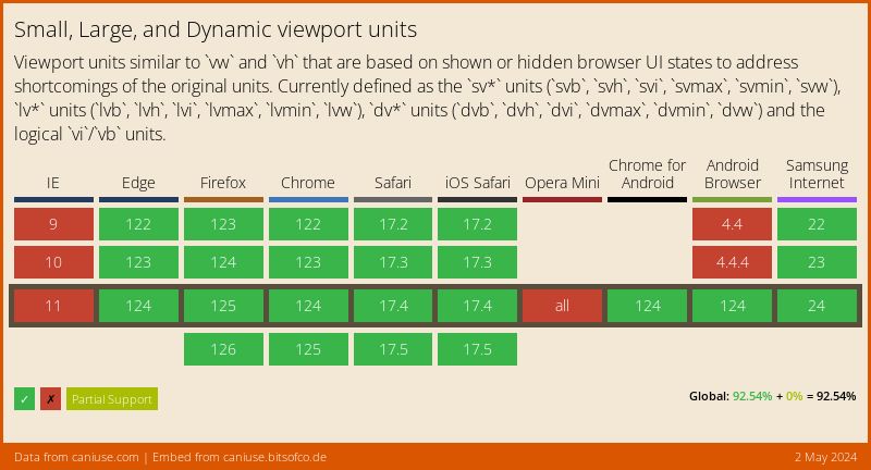
These units are supported in all modern browsers (Chrome 108+, Safari 15.4+, Firefox 101+), but older browsers will ignore them entirely. Always include a vh fallback.
.hero {
    height: 100vh;        /* Fallback for older browsers */
    height: 100svh;       /* Modern browsers use this */
}
CSS cascading handles this cleanly. Browsers that understand svh override the first declaration. Browsers that don’t keep the vh value.
You can also use @supports for more complex fallback logic:
.hero {
    height: 100vh;
}

@supports (height: 100svh) {
    .hero {
        height: 100svh;
    }
}
Common Mistakes
These are the pitfalls I see most often when developers start using the new viewport units.
Using dvh for hero sections
dvh resizes during scroll, which causes a visible “jump” on hero sections as the address bar collapses. Use svh for heroes. It stays stable.
Assuming dvh handles virtual keyboards
None of the new viewport units account for the on-screen keyboard. When a user taps an input field, the keyboard pushes content up, and 100dvh does not shrink to compensate.
For input-heavy layouts, you need additional JavaScript or the interactive-widget viewport meta tag:
<meta name="viewport"
    content="width=device-width, initial-scale=1,
    interactive-widget=resizes-content">
Forgetting the fallback
Even though support is strong, about 5% of global traffic still comes from browsers without svh/dvh support. Always declare height: 100vh before the modern unit.
Using dvh in animations or transitions
Since dvh changes value during scroll, animating an element’s height from 0 to 100dvh can produce unexpected jitter. Use fixed units or svh/lvh in animations.
Browser Support
All three unit types reached Baseline Widely Available status in June 2025, meaning they’re supported across every major browser engine.
As of early 2026, approximately 95% of global users are on browsers that support these units. The remaining gap is mostly older Samsung Internet and UC Browser versions.
FAQs
Common questions about CSS dynamic viewport height:
vh is equivalent to lvh in modern browsers. It uses the largest viewport size (with toolbars hidden). dvh changes in real-time as the browser chrome appears or disappears, matching the actual visible area at any given moment.svh. It represents the smallest viewport (with the address bar visible), so your hero will fit on screen without overflow when the page first loads. dvh would cause the hero to resize as the user scrolls, which can feel janky.dvh, svh, and lvh all resolve to the same value as vh. The difference only matters on mobile browsers with collapsible toolbars.interactive-widget=resizes-content value in your viewport meta tag, or handle it with JavaScript.calc(). For example, height: calc(100svh - 60px) gives you the small viewport height minus a 60px header.vh fallback for the small percentage of users on older browsers.dvh triggers layout recalculations each time the browser toolbar changes size. For simple elements this is negligible, but applying it to complex layouts with many children can cause visible jank. svh and lvh are static values with zero performance overhead.Summary
The 100vh mobile bug is solved. Use svh for stable full-screen sections that fit on initial load, lvh for immersive layouts that fill the maximum space, and dvh when you need real-time adaptation to toolbar changes. Always pair them with a vh fallback for older browsers.
I’ve been using svh as my default for hero sections since Chrome 108 shipped, and it eliminates the overflow problem completely. For most layouts, svh is the unit you actually want – dvh is useful but only for specific cases like sticky footers and flexbox-based page wrappers.