Cascading Style Sheets (CSS) is the language that controls how websites look. While HTML defines the structure and content of a page, CSS handles everything visual – colors, fonts, spacing, layouts, and animations.
This guide walks you through every essential CSS concept from the ground up. Whether you are writing your first line of CSS or filling in gaps in your knowledge, you will find clear explanations and practical examples for each topic.
What is CSS?
CSS (Cascading Style Sheets) is a stylesheet language used to define the presentation of HTML or XML documents. It controls the appearance of elements on a web page by applying styles like color, size, spacing, and layout.
CSS allows developers to separate content (HTML) from design (CSS), which makes websites easier to maintain and scale.
Here is the basic syntax of CSS:
selector {
    property: value;
}
A CSS rule has three parts. The selector tells the browser which HTML element to style. The property is the aspect you want to change (like color or font size). The value is what you want to set it to.
You can add multiple properties inside the same rule, each on its own line and ending with a semicolon:
p {
    color: blue;
    font-size: 16px;
    text-align: center;
}
This rule targets every <p> element on the page and makes the text blue, 16 pixels tall, and centered.
CSS Comments
Comments let you leave notes in your CSS that the browser ignores. They start with /* and end with */:
/* This is a comment - the browser will skip it */
p {
    color: blue; /* You can also comment inline */
}
Use comments to explain why you wrote a rule, not what it does. This helps you (and others) understand your code later.
How to Add CSS to HTML
There are three ways to apply CSS to an HTML page. Understanding the difference is important because it affects how you organize and maintain your code.
1. Inline CSS
Inline CSS is written directly on an HTML element using the style attribute. It only affects that single element:
<p style="color: red; font-size: 18px;">This paragraph is red.</p>
Inline styles are useful for quick one-off changes, but they are hard to maintain. If you want to change the color of 50 paragraphs, you would need to edit each one individually.
2. Internal CSS
Internal CSS is placed inside a <style> tag in the <head> section of your HTML file. It applies to all matching elements on that page:
<head>
    <style>
        p {
            color: blue;
            font-size: 16px;
        }
    </style>
</head>
This is better than inline styles because you define the rule once and it applies everywhere on the page. However, the styles only work on that single HTML file.
3. External CSS (Recommended)
External CSS lives in a separate .css file that you link to your HTML using a <link> tag. This is the recommended approach for real projects:
<head>
    <link rel="stylesheet" href="styles.css">
</head>
And in your styles.css file:
p {
    color: blue;
    font-size: 16px;
}
External stylesheets keep your HTML clean and let you share the same styles across every page on your site. Change the CSS file once, and every page updates automatically.
For anything beyond a quick experiment, use external CSS. It keeps your HTML and CSS separate, makes your code easier to maintain, and allows browsers to cache the stylesheet for faster page loads.
CSS Selectors
CSS selectors are used to “select” HTML elements and apply styles to them. There are several types of selectors you can use:
1. Universal Selector
* {
    margin: 0;
    padding: 0;
}
This applies styles to all elements on the page.
2. Element Selector
h1 {
    font-size: 24px;
    color: green;
}
This targets a specific HTML element (e.g., <h1>).
3. Class Selector
.box {
    background-color: lightgray;
    padding: 10px;
}
Class selectors target elements that have a specific class attribute.
4. ID Selector
#header {
    background-color: black;
    color: white;
    padding: 15px;
}
ID selectors target elements with a specific ID. They are more specific than class selectors. (more about CSS specificity later in the post ).
5. Grouping Selectors
To apply the same style to multiple selectors, you can group them:
h1, h2, p {
    font-family: Arial, sans-serif;
}
6. Attribute Selectors
Attribute selectors target elements based on their attributes or attribute values. They are written inside square brackets:
/* Any input with a type attribute */
input[type="text"] {
    border: 1px solid gray;
}

/* Links that open in a new tab */
a[target="_blank"] {
    color: orange;
}
This is useful when you need to style form elements by type, or target links based on their href value.
7. Combinator Selectors
Combinators let you target elements based on their relationship to other elements in the HTML tree:
/* Descendant: any p inside .article, at any depth */
.article p {
    line-height: 1.6;
}

/* Child: only direct p children of .article */
.article > p {
    margin-bottom: 16px;
}

/* Adjacent sibling: the p right after an h2 */
h2 + p {
    font-weight: bold;
}

/* General sibling: all p elements after an h2 */
h2 ~ p {
    color: #555;
}
The descendant selector (space) is the most common, but the child selector (>) is more precise when you only want to target direct children.
CSS Properties
CSS properties are the key attributes that define how elements are displayed. Let’s explore some fundamental CSS properties:
1. Colors
You can set colors using color names, hex codes, RGB, or HSL values.
p {
    color: #ff5733; /* Hex */
    background-color: rgb(255, 255, 255); /* RGB */
}
Try it yourself – adjust the sliders to mix your own color:
2. Fonts
Font properties control the appearance of text on the page.
body {
    font-family: Arial, sans-serif;
    font-size: 18px;
    font-weight: bold;
}
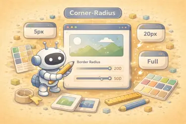
3. Borders
Border properties define the style, width, and color of an element’s outline.
div {
    border: 1px solid black;
    border-radius: 5px;
}
4. Padding and Margin
Padding controls the space inside an element, while margin controls the space outside it.
div {
    padding: 20px;
    margin: 30px;
}
For example, if we take an element with dimensions of 120×40 pixels and give it a padding of 20px, a border of 2px, and a margin of 10px, it would look like this:
5. Backgrounds
Background properties are used to style the background of an element.
body {
    background-color: #f0f0f0;
    background-image: url('background.jpg');
    background-size: cover;
    background-position: center;
}
6. Text Properties
CSS gives you fine control over how text appears beyond just font and color:
p {
    text-align: center;       /* left, center, right, justify */
    text-decoration: underline; /* none, underline, line-through */
    text-transform: uppercase;  /* none, uppercase, lowercase, capitalize */
    line-height: 1.6;          /* Controls spacing between lines */
    letter-spacing: 1px;       /* Space between characters */
}
The line-height property is especially important for readability. A value between 1.4 and 1.8 is generally comfortable for body text.
7. Width and Height
The width and height properties set the size of an element’s content area:
.box {
    width: 300px;
    height: 200px;
}
You can also set limits using min-width, max-width, min-height, and max-height. These are useful for responsive designs where you want an element to be flexible but not too small or too large:
.container {
    width: 100%;       /* Takes full width of parent */
    max-width: 1200px; /* But never wider than 1200px */
}
8. Opacity
The opacity property controls how transparent an element is. A value of 1 means fully visible, and 0 means completely invisible:
.faded {
    opacity: 0.5; /* 50% transparent */
}
Note that opacity affects the entire element and all of its children. If you only want a semi-transparent background, use an rgba or hsla color value instead:
.overlay {
    background-color: rgba(0, 0, 0, 0.5); /* Semi-transparent black */
}
9. Overflow
The overflow property controls what happens when content is too large for its container:
.box {
    width: 200px;
    height: 100px;
    overflow: hidden; /* Clips content that overflows */
}
The most common values are:
visible(default): Content spills outside the box.hidden: Content is clipped and not visible.scroll: Always shows scrollbars.auto: Shows scrollbars only when needed.
10. List Styles
The list-style property controls how list items are displayed. You can change or remove the bullet markers:
ul {
    list-style-type: square; /* disc, circle, square, none */
}

ol {
    list-style-type: lower-roman; /* decimal, lower-alpha, upper-roman */
}

/* Remove bullets entirely */
.clean-list {
    list-style: none;
    padding-left: 0;
}
Setting list-style: none and removing the default padding is a common pattern for navigation menus and card layouts where you use a <ul> but do not want visible bullets.
11. Cursor
The cursor property changes the mouse pointer when hovering over an element:
.clickable {
    cursor: pointer;   /* Hand icon */
}

.loading {
    cursor: wait;      /* Spinner */
}

.drag-area {
    cursor: grab;      /* Grab hand */
}

.no-action {
    cursor: not-allowed; /* Circle with line */
}
The most common value is pointer, which signals that an element is clickable. Use not-allowed for disabled buttons or elements that cannot be interacted with.
CSS Units
Every size value in CSS needs a unit. Choosing the right unit matters for accessibility and responsive design. Here are the most common ones:
Absolute Units
px (pixels) is the most common absolute unit. One pixel is a fixed size on screen. Use it for borders, shadows, and small details where you want a precise, unchanging value:
border: 1px solid black;
font-size: 16px;
Relative Units
Relative units scale based on something else, making them ideal for responsive designs:
% (percentage) is relative to the parent element. If a parent is 800px wide, a child with width: 50% will be 400px:
.child {
    width: 50%; /* Half the parent's width */
}
em is relative to the font size of the current element. If the element’s font size is 16px, then 1em equals 16px. It is useful for padding and margins that should scale with the text:
.button {
    font-size: 16px;
    padding: 0.5em 1em; /* 8px top/bottom, 16px left/right */
}
rem (root em) is relative to the root <html> element’s font size (usually 16px by default). Unlike em, it does not compound when elements are nested, making it more predictable:
h1 {
    font-size: 2rem;   /* 32px if root is 16px */
    margin-bottom: 1rem; /* 16px */
}
vh and vw stand for viewport height and viewport width. 1vh equals 1% of the browser window’s height. These are great for full-screen sections:
.hero {
    height: 100vh; /* Full screen height */
    width: 100vw;  /* Full screen width */
}
One thing to watch out for: on mobile browsers, 100vh can be taller than the visible area because it includes space behind the address bar and bottom navigation. CSS now provides dynamic viewport units – dvh, svh, and lvh – that account for collapsible browser chrome. Use svh for hero sections that need to fit on screen without overflow.
A good rule of thumb: use
remfor font sizes,pxfor borders and shadows,%for widths, andvh/vwfor full-screen layouts.
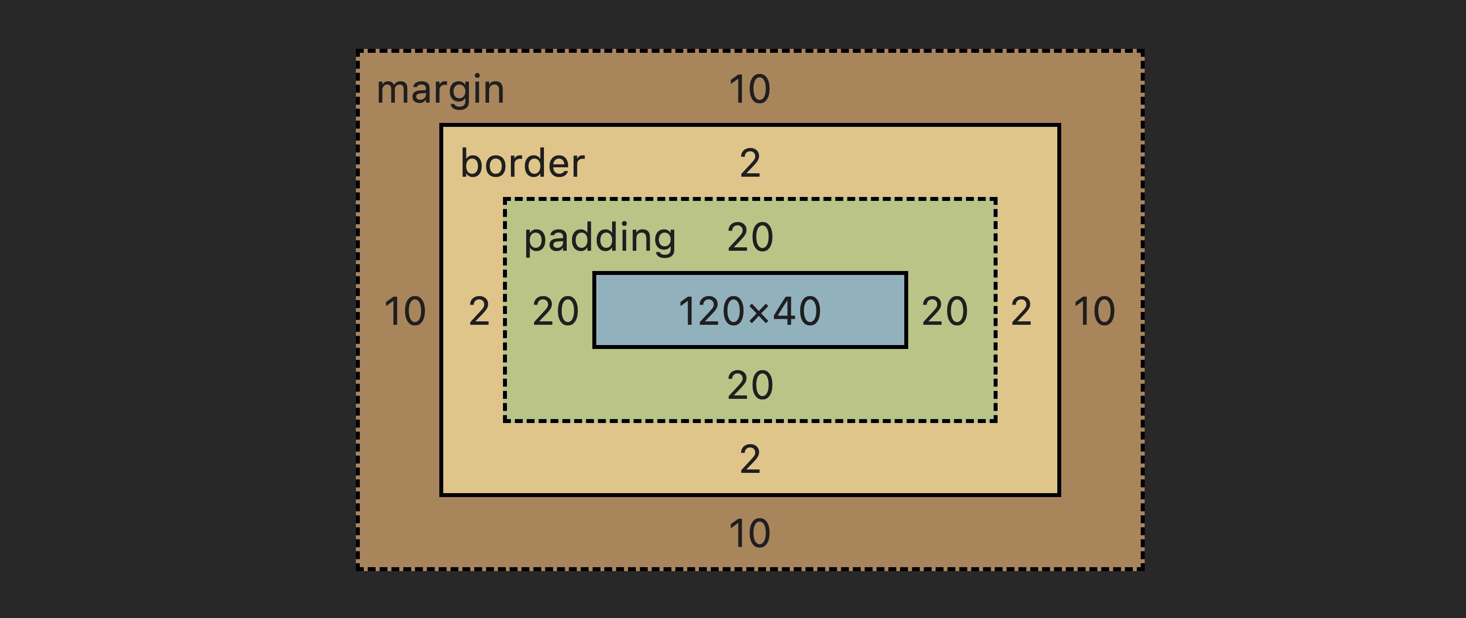
The Box Model
The box model is one of the most important concepts in CSS. Every element on a page is treated as a rectangular box made up of four layers, from inside to outside:
- Content: The actual text, image, or other content inside the element.
- Padding: Space between the content and the border. Padding is inside the element.
- Border: A line around the padding (and content).
- Margin: Space outside the border that separates the element from other elements.
div {
    width: 200px;
    padding: 10px;
    border: 2px solid black;
    margin: 20px;
}
With the default behavior, the total width of this element is not 200px. It is actually 200 (content) + 10 + 10 (left and right padding) + 2 + 2 (left and right border) = 224px. The margin adds space outside but does not affect the element’s own size.
This math can be confusing, which is why most developers change the default behavior.
Box-Sizing Property
By default, width and height only apply to the content area. Padding and border are added on top, making elements wider than you expect.
The box-sizing: border-box property changes this so that width and height include the padding and border. If you set width: 200px, the element will be exactly 200px wide no matter how much padding or border you add:
/* Apply border-box to all elements - a common best practice */
*, *::before, *::after {
    box-sizing: border-box;
}
Most CSS resets and frameworks apply box-sizing: border-box globally. It is considered a best practice because it makes sizing elements much more intuitive. If you are starting a new project, add this rule at the top of your stylesheet.
Use the sliders below to see how content, padding, border, and margin interact:
The Display Property
The display property is one of the most fundamental properties in CSS. It controls how an element behaves in the page layout.
Block Elements
Block elements take up the full width available and start on a new line. Examples include <div>, <p>, <h1>, and <section>:
.box {
    display: block;
    width: 300px;
    height: 100px;
    background-color: lightblue;
}
Even if you set a width smaller than the container, a block element still forces a line break before and after it.
Inline Elements
Inline elements only take up as much width as their content needs and do not start on a new line. Examples include <span>, <a>, and <strong>:
.highlight {
    display: inline;
    background-color: yellow;
}
Inline elements ignore width and height properties. You cannot set a specific size on them.
Inline-Block
inline-block combines the best of both. The element sits on the same line as its neighbors (like inline), but you can set width and height on it (like block):
.badge {
    display: inline-block;
    width: 80px;
    height: 30px;
    background-color: coral;
    text-align: center;
}
None
display: none removes the element from the page entirely. It takes up no space and is invisible:
.hidden {
    display: none;
}
This is different from visibility: hidden, which hides the element but still reserves its space in the layout.
Click the buttons below to see how each display value affects the three boxes:
CSS Layout Techniques
CSS offers several layout techniques to help you position and organize elements on your page. The two most important modern tools are Flexbox and Grid.
1. Flexbox
Flexbox is a one-dimensional layout model. It arranges items in a row or a column and gives you control over how they are spaced and aligned.
To use Flexbox, set display: flex on the parent container. The direct children become “flex items”:
.container {
    display: flex;
    justify-content: space-between; /* Distributes items with equal space between them */
    align-items: center;            /* Vertically centers items */
}
The key Flexbox properties on the container are:
justify-content: Controls horizontal alignment (start, center, space-between, space-around).align-items: Controls vertical alignment (stretch, center, flex-start, flex-end).flex-direction: Sets the direction –row(default, horizontal) orcolumn(vertical).gap: Adds space between flex items without using margins.
Play with Flexbox properties to see how items rearrange:
2. Grid
CSS Grid is a two-dimensional layout system. While Flexbox handles one direction at a time (row or column), Grid lets you control both rows and columns simultaneously:
.grid-container {
    display: grid;
    grid-template-columns: repeat(3, 1fr);
    gap: 10px;
}
This creates a grid with three columns of equal width and 10px space between them. The 1fr unit means “one fraction of the available space” – so three 1fr columns divide the space equally into thirds.
Drag the sliders to adjust the grid layout:
3. Positioning
The position property controls how an element is placed on the page. Once you set a position other than static, you can use top, right, bottom, and left to move it:
static(default): The element follows the normal document flow. No offset properties apply.relative: The element stays in its normal position, but you can nudge it with offsets. Other elements are not affected.absolute: The element is removed from the normal flow and positioned relative to its nearest positioned ancestor (an ancestor withposition: relative,absolute, orfixed).fixed: The element is positioned relative to the browser window and stays in place when the user scrolls.sticky: The element behaves likerelativeuntil the user scrolls past a threshold, then it “sticks” in place likefixed.
/* Nudge the element 10px down and 20px right from its normal position */
div {
    position: relative;
    top: 10px;
    left: 20px;
}
Select a position value and drag the sliders to move the element:
4. Z-Index
When elements overlap (due to positioning), the z-index property controls which one appears on top. Higher values are displayed in front of lower values:
.popup {
    position: absolute;
    z-index: 100; /* Appears above elements with lower z-index */
}

.background {
    position: relative;
    z-index: 1;
}
The z-index property only works on elements that have a position value other than static.
Both Grid and Flexbox are powerful layout tools in CSS. Use Flexbox for one-dimensional layouts (a row of cards, a navigation bar) and Grid for two-dimensional layouts involving both rows and columns (a full page layout, a photo gallery).
Responsive Design
Responsive design ensures that your website looks good on all devices, from desktops to mobile phones. This is achieved using media queries.
Example:
@media (max-width: 768px) {
    .container {
        flex-direction: column;
    }
}
This changes the layout to a single-column layout when the screen width is less than 768px.
Viewport Meta Tag
The viewport meta tag is crucial for responsive design as it ensures the page scales correctly on mobile devices.
<meta name="viewport" content="width=device-width, initial-scale=1.0">
You might want to check the post about responsive designs without media queries.
CSS Animations
CSS animations make it easy to animate transitions between styles. You can define keyframes to specify the changes that will occur at different points during the animation.
Example:
@keyframes fadeIn {
    from { opacity: 0; }
    to { opacity: 1; }
}

div {
    animation: fadeIn 2s;
}
This example fades in a div over a period of 2 seconds.
Transitions
CSS transitions allow you to animate changes to CSS properties smoothly over a given duration.
button {
    background-color: blue;
    transition: background-color 0.3s;
}

button:hover {
    background-color: green;
}
Transformations
CSS transforms allow you to rotate, scale, skew, or translate elements.
div {
    transform: rotate(45deg);
}
This example rotates a div by 45 degrees.
Pseudo-Classes and Pseudo-Elements
Pseudo-classes and pseudo-elements allow you to style elements in specific states or parts of an element. Let’s explore some examples:
1. Pseudo-Class Example:
/* Change link color on hover */
a:hover {
    color: red;
}
This example changes the color of a link when the user hovers over it.
2. Pseudo-Element Example (First Letter):
/* Style the first letter of a paragraph */
p::first-letter {
    font-size: 24px;
    color: red;
    font-weight: bold;
}
This example targets the first letter of a paragraph and applies special styles to it.
3. Pseudo-Element Example (Before and After with Content):
Pseudo-elements like ::before and ::after allow you to insert content before or after an element using the content property.
/* Add a quotation mark before a blockquote */
blockquote::before {
    content: open-quote;
    font-size: 32px;
    color: gray;
    margin-right: 10px;
}

/* Add a signature after a blockquote */
blockquote::after {
    content: " - John Doe";
    font-size: 14px;
    color: gray;
    display: block;
    text-align: right;
    margin-top: 10px;
}
In this example, a quotation mark is added before the blockquote, and a signature is added after the blockquote.
HTML Example:
<blockquote>
    This is a sample quote.
</blockquote>
This will render with an opening quotation mark before the quote and a signature after it, thanks to the use of ::before and ::after pseudo-elements.
Here’s an additional post about CSS ::marker pseudo element.
The Cascade and Inheritance
The “C” in CSS stands for “Cascading” – and understanding the cascade is key to understanding why your styles sometimes do not work as expected.
The Cascade
When multiple CSS rules target the same element and set the same property, the browser needs to decide which rule wins. It uses three factors, in this order of priority:
- Importance: Rules marked with
!importantoverride everything else. - Specificity: More specific selectors win over less specific ones (covered in the next section).
- Source order: If two rules have equal importance and specificity, the one that appears last in the CSS wins.
p {
    color: blue;
}

p {
    color: red; /* This wins because it comes last */
}
Inheritance
Some CSS properties are inherited from parent elements to their children. This means if you set a property on a parent, its children automatically get the same value unless they override it.
Properties that are typically inherited include text-related ones like color, font-family, font-size, line-height, and text-align:
body {
    color: #333;
    font-family: Arial, sans-serif;
}

/* All text inside body inherits these values automatically.
   No need to repeat them on every element. */
Properties related to the box model – like margin, padding, border, width, and background – are not inherited. Each element starts with its own defaults for these.
CSS Specificity
CSS specificity determines which styles are applied when multiple rules target the same element. Each type of selector has a different specificity value, and the rule with the highest specificity will take precedence.
Think of specificity as a scoring system. Each type of selector has a different weight, and the rule with the highest total score wins:
- Inline Styles: Inline styles have the highest specificity (e.g.,
<h1 style="color: red;">). - ID Selectors: Each ID selector adds a higher specificity weight (e.g.,
#header). - Class Selectors, Attributes, Pseudo-classes: These contribute less than IDs but still have more weight than element selectors (e.g.,
.container,[type="text"],:hover). - Element Selectors and Pseudo-elements: These have the lowest specificity (e.g.,
p,::before).
A simple way to think about it: inline styles beat IDs, IDs beat classes, and classes beat element selectors. When two selectors have the same type, the one with more selectors of that type wins.
Type any CSS selector below and see its specificity score calculated in real time:
Example of Specificity:
/* Specificity: (0, 1, 0, 1) */
#header p {
    color: blue;
}

/* Specificity: (0, 0, 1, 1) */
.header p {
    color: red;
}
In this example, the first rule has higher specificity because it uses an ID selector, so the text color will be blue, even though there is a competing rule targeting the same element using a class selector.
How to Override Specificity:
In some cases, you may want to override high-specificity rules. To do this, you can:
- Use more specific selectors: Increase the specificity of your new rule to ensure it overrides the previous one.
- Use
!important: The!importantdeclaration will override any other rules, but use it sparingly, as it can make your CSS harder to maintain.
/* Using !important to override specificity */
p {
    color: red !important;
}
However, using !important should be a last resort. It makes your CSS harder to debug because it breaks the normal cascade. If you find yourself using !important often, it usually means your selectors need to be reorganized.
Advanced CSS Features
CSS also provides advanced features for more complex and interactive designs. Some of these include variables, custom properties, and advanced layout techniques.
1. CSS Variables
CSS variables allow you to define reusable values throughout your stylesheet.
:root {
    --main-color: #3498db;
}

h1 {
    color: var(--main-color);
}
CSS variables is an important topic. Check out the full post explaining what are CSS variables & how to use them.
2. CSS Transitions
Transitions allow you to animate the change of properties over time.
button {
    background-color: blue;
    transition: background-color 0.3s;
}

button:hover {
    background-color: green;
}
3. CSS Repeat Function
The repeat() function simplifies repetitive patterns, especially in CSS Grid layouts. It allows you to repeat a set of values multiple times.
.grid-container {
    display: grid;
    grid-template-columns: repeat(3, 1fr);
}
This example creates three equal columns using repeat(3, 1fr), where each column takes up one fraction of the available space.
4. CSS Logical Properties
Logical properties allow you to handle layout changes for different writing modes. For example, margin-inline-start can replace margin-left to support both left-to-right (LTR) and right-to-left (RTL) languages.
div {
    margin-inline-start: 20px;
}
5. CSS Clipping and Masking
Clipping and masking let you define which parts of an element are visible. The clip-path property can create custom shapes for elements.
img {
    clip-path: circle(50%);
}
6. CSS Mix-Blend Mode
The mix-blend-mode property allows you to control how an element’s content blends with the content of the background or its parent element. This can be useful for creating visually interesting effects like overlays or complex color interactions.
Example of mix-blend-mode
.image {
    mix-blend-mode: multiply;
}
In this example, the multiply blend mode combines the colors of the image with the background, creating a layered effect.
The mix-blend-mode property supports various blending modes like screen, overlay, and difference, allowing for creative and dynamic visual designs.
7. CSS Functions (calc())
CSS functions such as calc() allow you to perform calculations and use dynamic values in your stylesheets.
Example of calc()
div {
    width: calc(100% - 50px);
}
8. CSS Filters
The filter property applies visual effects like blur, brightness, and grayscale to any element. It works on images, text, and backgrounds alike:
.blurred {
    filter: blur(4px);
}

.bright {
    filter: brightness(150%);
}

.old-photo {
    filter: grayscale(100%) sepia(30%);
}
You can chain multiple filters in a single declaration. The browser applies them in the order you list them.
Adjust the sliders to see how filters change the appearance of the element:
Best Practices for Writing CSS
Writing efficient, maintainable CSS is crucial for the long-term success of any project. Here are a few best practices to keep in mind:
1. Use Meaningful Class Names
Choose class names that describe the purpose of the element, not its appearance. Meaningful names make your code more readable and maintainable.
/* Bad practice: Vague, appearance-based class names */
.red-text {
    color: red;
}

/* Good practice: Meaningful class names */
.alert-message {
    color: red;
}
In the second example, .alert-message tells you the purpose of the element, rather than just describing how it looks.
2. Avoid Using IDs for Styling
IDs have a higher specificity than classes, which makes it harder to override their styles. It’s better to use classes for styling purposes, as they are more flexible and reusable.
/* Bad practice: Using IDs for styling */
#header {
    background-color: blue;
}

/* Good practice: Using classes for styling */
.header {
    background-color: blue;
}
By using classes instead of IDs, you make it easier to reuse the styles and override them when needed without having to deal with specificity issues.
3. Minimize Use of Inline Styles
Inline styles can make your HTML cluttered and are harder to maintain in the long run. It’s better to separate your styles into external CSS files.
<button style="background-color: green; color: white;">Click Me</button>


<button class="btn-primary">Click Me</button>

<!-- External CSS -->
.btn-primary {
    background-color: green;
    color: white;
}
By using external stylesheets or internal styles, you can manage and maintain your CSS more effectively.
4. Organize Your CSS
Group related styles together, and use comments to make your CSS more readable and easier to maintain.
/* Good practice: Organizing CSS and using comments */
/* Global Styles */
body {
    font-family: Arial, sans-serif;
}

/* Navigation Styles */
.navbar {
    background-color: #333;
}

.navbar a {
    color: white;
    text-decoration: none;
}

/* Footer Styles */
.footer {
    background-color: #f1f1f1;
    padding: 20px;
    text-align: center;
}
Organized CSS makes it easier to navigate, update, and maintain as your project grows.
Additional Information
Here are some additional best practices and tools to help you write more efficient, cross-browser-compatible, and performant CSS.
I. CSS Preprocessors (Sass, LESS)
CSS preprocessors like Sass and LESS add features such as variables, nesting, and mixins, making CSS more powerful and maintainable.
Using Sass
Sass allows you to write more efficient CSS by using variables and nesting.
// SCSS code
$main-color: #3498db;

body {
    background-color: $main-color;
}
This Sass code, when compiled, becomes regular CSS:
body {
    background-color: #3498db;
}
II. CSS Frameworks (Bootstrap, Tailwind)
CSS frameworks like Bootstrap and Tailwind CSS provide pre-defined classes to make responsive design and layout simpler.
Bootstrap Example
Bootstrap’s grid system allows you to create responsive layouts easily:
<div class="container">
    <div class="row">
        <div class="col-md-6">
            <p>Column 1</p>
        </div>
        <div class="col-md-6">
            <p>Column 2</p>
        </div>
    </div>
</div>
Tailwind CSS Example
With Tailwind CSS, you can achieve the same layout using utility-first classes:
<div class="grid grid-cols-2 gap-4">
    <div class="p-4 bg-gray-200">Column 1</div>
    <div class="p-4 bg-gray-200">Column 2</div>
</div>
Tailwind’s utility classes make it easy to customize spacing, colors, and other styles directly in your HTML, streamlining the design process.
III. CSS Resets and Normalize.css
CSS resets like Normalize.css ensure that browsers render all elements more consistently, making it easier to build cross-browser-compatible websites.
<link rel="stylesheet" href="https://cdnjs.cloudflare.com/ajax/libs/normalize/8.0.1/normalize.min.css">
IV. CSS Performance Optimization
Optimizing CSS for performance can significantly speed up page load times. Minifying CSS, removing unused styles with PurgeCSS, and using efficient selectors are common techniques.
/* Minified CSS */
body{margin:0;padding:0;font-family:Arial,sans-serif;}
This is a wider topic. Check out the post on 14 proven ways to optimize CSS for better performance.
V. Browser Developer Tools
Most browsers come with developer tools that allow you to inspect and debug CSS. In Chrome, you can right-click any element and choose “Inspect” to view and edit its styles live. This is the fastest way to understand why an element looks the way it does and to experiment with changes before writing them in your stylesheet.
FAQs
Common questions from beginners learning CSS:
.box) can be used on multiple elements and is the preferred way to style things. An ID (selected with a hash, like #header) should be unique on the page - only one element should have a given ID. IDs have higher specificity than classes, which makes them harder to override. For styling purposes, use classes.rem for font sizes. It is relative to the root element's font size (usually 16px), so it scales consistently across your entire site and respects the user's browser font size preferences. Use px for borders and small fixed details. Use em when you want padding or margins to scale with the element's own font size.box-sizing: border-box do?
width: 200px, padding and border are added on top of that, making the element wider than 200px. With box-sizing: border-box, the width includes padding and border, so the element is exactly 200px wide. Most developers apply this globally to all elements because it makes sizing much more predictable.Conclusion
CSS is a vast and powerful language that forms the foundation of modern web design. From basic styling to complex layouts and animations, mastering CSS gives you full control over the look and feel of your web projects.
This guide covered the essential concepts: how to add CSS to HTML, selectors, properties, units, the box model, the display property, layout techniques with Flexbox and Grid, responsive design, animations, the cascade, specificity, and advanced features. The best way to learn is to build things – start with a simple page and experiment with each property until you understand what it does.