The Contact Form 7 plugin is one of the most popular form plugins for WordPress, with over five million active installations. Its description – “Simple but Flexible” – is spot on.
However, the plugin has no built-in design interface. The forms it generates inherit CSS from the active theme only, and many developers don’t realize how much customization is possible with CSS alone.
This post collects tips, ideas, and lesser-known tricks for styling Contact Form 7 forms. Some are straightforward, some are hidden features – but all of them are useful.
Understanding the HTML Structure of Contact Form 7
Before styling anything, it’s important to understand the HTML structure CF7 generates. Every CF7 form is wrapped in a .wpcf7 class, and the form element itself gets the .wpcf7-form class.
Each field in the form is wrapped in a <span> with the class .wpcf7-form-control-wrap. Knowing these classes is the key to precise styling.
Here are the main classes worth knowing:
.wpcf7– The outer wrapper of every CF7 form.wpcf7-form– The form element itself.wpcf7-form-control– Every individual field (input, textarea, select).wpcf7-submit– The submit button.wpcf7-spinner– The loading animation after submission.wpcf7-response-output– The response message after submission
Styling Input Fields and Textarea
CF7 fields inherit theme styles by default, which sometimes leads to an inconsistent look. Here is CSS that creates a clean, minimal appearance:
.wpcf7 input:not([type="submit"]),
.wpcf7 textarea {
    border: none;
    border-bottom: 1px solid #545454;
    background: transparent;
    outline: none;
    border-radius: 0;
    width: 100%;
    padding: 8px 0;
    font-size: 16px;
    transition: border-color 0.3s;
}

.wpcf7 input:focus:not([type="submit"]),
.wpcf7 textarea:focus {
    border-bottom-color: #a3316f;
}
The approach here is to remove all borders and keep only a bottom line. When the user clicks on the field, the line color changes to provide visual feedback.
Setting
font-size: 16pxon input fields prevents automatic zoom on iOS devices. Below 16px, Safari zooms in on the field when it receives focus.
Textarea That Grows on Focus
A nice trick that saves screen space – the textarea starts small and expands when the user clicks on it:
.wpcf7 textarea {
    resize: none;
    height: 46px;
    transition: height 0.4s ease;
}

.wpcf7 textarea:focus {
    height: 120px;
}
Disabling resize prevents the user from manually dragging the field. Instead, the transition creates a smooth animation that expands the field on focus.
Styling the Submit Button
The CF7 submit button gets the class .wpcf7-submit. You can style it however you want, but it’s good practice to include hover and focus states for accessibility:
.wpcf7 input[type="submit"] {
    background: #a3316f;
    color: #fff;
    border: none;
    padding: 12px 32px;
    font-size: 16px;
    cursor: pointer;
    transition: background 0.3s;
}

.wpcf7 input[type="submit"]:hover,
.wpcf7 input[type="submit"]:focus {
    background: #8a2a5e;
}
Tip: Adding a Custom Class to the Submit Button
You can add classes directly through the CF7 shortcode tag. Instead of writing [submit "Send"], write:
[submit class:my-custom-btn "Send"]This lets you target the button specifically with .my-custom-btn without affecting other buttons on the site.
Adding Custom Classes and IDs to Individual Fields
Something many developers don’t know – you can add custom classes and IDs directly to CF7 shortcode tags:
[text* your-name class:my-input id:name-field placeholder "Full Name"]
[email* your-email class:email-input id:email-field placeholder "Email"]
This allows targeting specific fields in CSS without relying on CF7’s generic classes. Especially useful when you have multiple forms on the same page and want to style each one differently.
Styling the Placeholder
In CF7, you can set a placeholder directly in the shortcode tag. To change the placeholder text color, use the ::placeholder pseudo-element:
.wpcf7 input::placeholder,
.wpcf7 textarea::placeholder {
    color: #999;
    opacity: 1;
}
The opacity: 1 declaration is important because some browsers (notably Firefox) display placeholders with reduced opacity by default.
Example: Two-Column Form with Submit Button at the Bottom
A common layout is a contact form where the fields are arranged in two columns, with a full-width message field and a centered submit button at the bottom. Here is what it looks like:
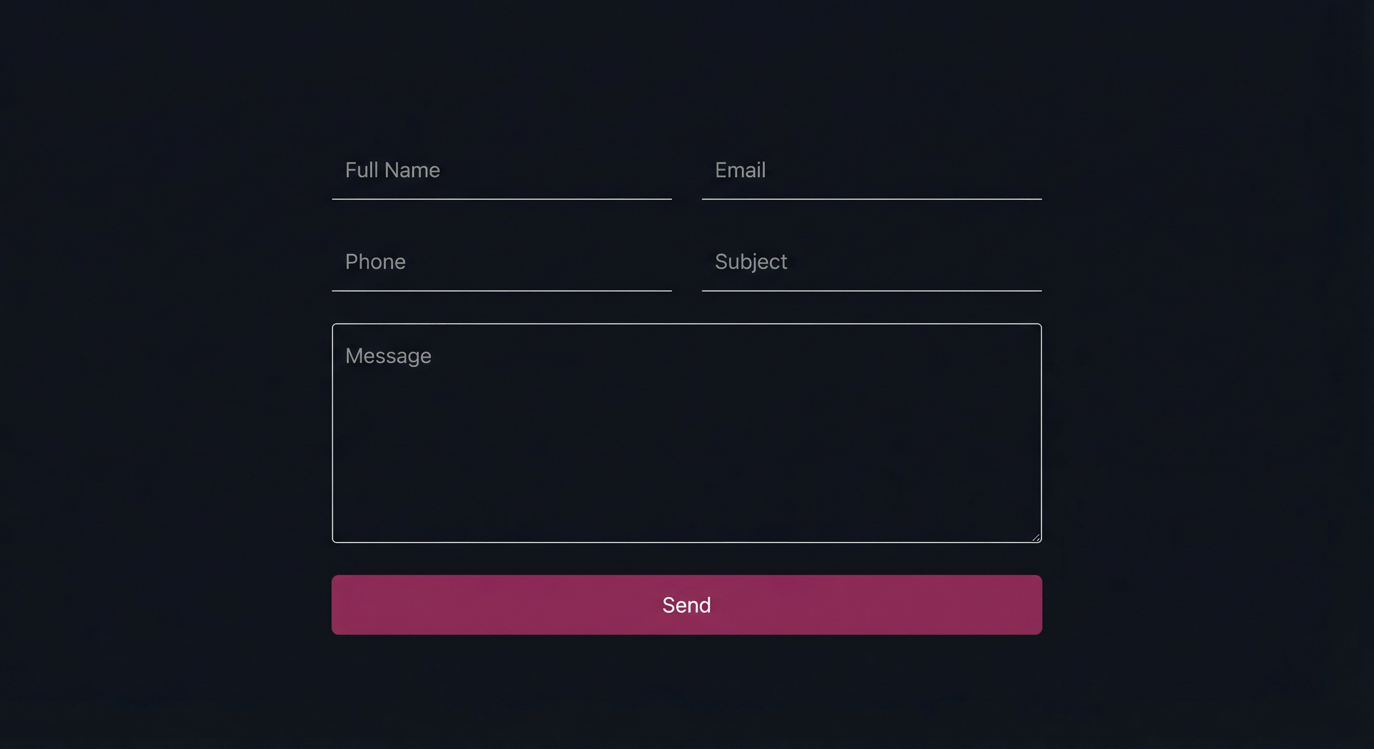
Form Code in the CF7 Editor
The following code goes directly into the form editor in the CF7 admin panel:
<div class="cf7-two-cols">
    <div>[text* your-name placeholder "Full Name"]</div>
    <div>[email* your-email placeholder "Email"]</div>
    <div>[text your-phone placeholder "Phone"]</div>
    <div>[text your-subject placeholder "Subject"]</div>
</div>

[textarea your-message placeholder "Message"]

<div class="cf7-submit-wrap">
    [submit class:cf7-btn "Send"]
</div>
The CSS
Add the following CSS to your child theme. It uses Flexbox to arrange the fields in two columns and center the submit button:
.cf7-two-cols {
    display: flex;
    flex-wrap: wrap;
    gap: 0 20px;
}

.cf7-two-cols > div {
    flex: 1 0 calc(50% - 10px);
    max-width: calc(50% - 10px);
    margin-bottom: 16px;
}

.cf7-submit-wrap {
    text-align: center;
    margin-top: 10px;
}

.cf7-btn {
    background: #a3316f;
    color: #fff;
    border: none;
    padding: 12px 40px;
    font-size: 16px;
    cursor: pointer;
    transition: background 0.3s;
}

.cf7-btn:hover,
.cf7-btn:focus {
    background: #8a2a5e;
}

@media screen and (max-width: 768px) {
    .cf7-two-cols > div {
        flex: 1 0 100%;
        max-width: 100%;
    }
}
In the media query, the fields switch to a single column on mobile for readability.
Example: Inline Email Form with Button
This layout is perfect for newsletters, signups, or anywhere you need a compact form with a single field and a button next to it. Here is what it looks like:

Form Code in the CF7 Editor
The following code creates a single-line form with an email field and a button side by side:
<div class="cf7-inline-form">
    <div class="cf7-inline-field">
        [email* your-email placeholder "Your Email"]
    </div>
    <div class="cf7-inline-btn">
        [submit class:cf7-subscribe-btn "Subscribe"]
    </div>
</div>
The CSS
The CSS uses Flexbox to align the field and button on the same row:
.cf7-inline-form {
    display: flex;
    max-width: 480px;
}

.cf7-inline-field {
    flex: 1;
}

.cf7-inline-field input {
    width: 100%;
    border: none;
    border-bottom: 1px solid #545454;
    background: transparent;
    padding: 10px 0;
    font-size: 16px;
    outline: none;
}

.cf7-inline-field input:focus {
    border-bottom-color: #a3316f;
}

.cf7-subscribe-btn {
    background: #a3316f;
    color: #fff;
    border: none;
    padding: 10px 24px;
    font-size: 16px;
    cursor: pointer;
    white-space: nowrap;
    transition: background 0.3s;
}

.cf7-subscribe-btn:hover,
.cf7-subscribe-btn:focus {
    background: #8a2a5e;
}

@media screen and (max-width: 480px) {
    .cf7-inline-form {
        flex-direction: column;
    }
    .cf7-subscribe-btn {
        width: 100%;
        margin-top: 10px;
    }
}
The white-space: nowrap on the button prevents the button text from wrapping. In the media query, the layout switches to a vertical stack on narrow screens.
Floating Validation Tips (Built-in Feature)
This is one of the least known features of CF7. By default, a validation error message appears below the field and pushes everything below it down, breaking the form layout.
CF7 includes a built-in solution – add the use-floating-validation-tip class to the form shortcode:
[[contact-form-7 id="xxx" html_class="use-floating-validation-tip" title="My Form"]]This makes error messages appear as floating tooltips next to the field instead of pushing the layout. The plugin itself has built-in CSS that handles the tooltip positioning.
Styling the Error Messages
You can change the appearance of error messages using the .wpcf7-not-valid-tip class:
.wpcf7-not-valid-tip {
    color: #e74c3c;
    font-size: 13px;
    font-weight: 400;
}

.wpcf7 .wpcf7-not-valid {
    border-bottom-color: #e74c3c;
}
The .wpcf7-not-valid class is automatically added to fields that fail validation. You can use it to mark them with a red border.
Styling Response Messages After Submission
Something many don’t realize – CF7 adds different classes to the form element itself based on the submission status. You can use these to create different styles for each state:
.wpcf7-form.sent– Submission succeeded.wpcf7-form.invalid– Validation errors exist.wpcf7-form.spam– Detected as spam.wpcf7-form.failed– Submission failed
For example, to style the success message differently from the error message:
.wpcf7-form.sent .wpcf7-response-output {
    border-color: #27ae60;
    color: #27ae60;
    background: rgba(39, 174, 96, 0.05);
}

.wpcf7-form.invalid .wpcf7-response-output {
    border-color: #e74c3c;
    color: #e74c3c;
    background: rgba(231, 76, 60, 0.05);
}
Hiding the Form After Successful Submission
An advanced tip – you can hide all form fields after a successful submission and show only the success message:
.wpcf7-form.sent .wpcf7-form-control-wrap,
.wpcf7-form.sent .wpcf7-submit {
    display: none;
}

.wpcf7-form.sent .wpcf7-response-output {
    text-align: center;
    font-size: 18px;
    padding: 20px;
    margin-top: 0;
}
All of this is done with CSS only, no JavaScript needed.
Styling Checkboxes and Radio Buttons
CF7 wraps each checkbox and radio button in a <span> with the class .wpcf7-list-item. You can use this to create a custom look:
.wpcf7 .wpcf7-list-item {
    display: block;
    margin: 8px 0;
}

.wpcf7 .wpcf7-list-item label {
    cursor: pointer;
    display: flex;
    align-items: center;
    gap: 8px;
}
Customizing the Spinner (Loading Animation)
After clicking the submit button, CF7 displays a spinner. You can change its appearance or hide it entirely:
.wpcf7-spinner {
    display: none;
}
Or, if you want to change its position:
.wpcf7-spinner {
    position: absolute;
    margin: 0;
}
Additional Shortcode Tag Attributes
CF7 supports additional attributes in shortcode tags that not everyone knows about:
size:40– Sets the visible width of the fieldminlength:3andmaxlength:100– Limits text lengthautocomplete:name– Enables browser autocompletedefault:value– Sets a default value for the field
A combined example:
[text* your-name minlength:2 maxlength:50 autocomplete:name class:styled-input placeholder "Full Name"]Using html_class and html_id in the Shortcode
You can add any class or ID to the form wrapper through the shortcode itself:
[[contact-form-7 id="xxx" html_class="my-form dark-theme" html_id="main-contact" title="My Form"]]This allows styling each form uniquely when there are multiple forms on the site. For instance, a footer form can get a footer-form class with different styling from a contact page form.
FAQs
Common questions about styling Contact Form 7 forms:
Summary
Although Contact Form 7 does not include a design interface, it provides a predictable HTML structure with specific classes that allow full design customization through CSS. From built-in features like floating validation tips to dynamic classes that change based on submission status – there is much more here than meets the eye.
For more CF7 tips, check out the guide on optimizing CF7 for performance, and the explanation on redirecting to a different URL after form submission. It’s also recommended to protect your forms from spam using Akismet.