Since forever, the use of grids has been an integral part of the world of design and website development.
As Frontend developers, you’ve likely encountered websites built on some CSS Framework like Bootstrap, Tailwind CSS and others, which allow (among other things) the use of pre-made classes for creating grids composed of rows and columns.
However, like most developers, I also prefer to minimize reliance on libraries and external assets when developing a website. And if I do decide to use a framework, it’s likely that the only part I’ll utilize is the CSS referring to the grid itself, specifically the part that provides alignment options.
But if we choose to create those alignments, that same layout, or grid ourselves – what’s the easy and proper way to do it? How can we easily and quickly place, align, and organize elements within any container?
Flexbox is almost always the answer. Flexbox provides an excellent solution for creating layouts, especially when it comes to one-dimensional layouts, i.e., either rows or columns. This in contrast to CSS Grid, that we all love, which is more suitable for two-dimensional layouts – like grids or layouts involving rows and columns together.
In this guide, we will explain in detail how to use flexbox and its justification and alignment properties (among other things).
We will cover most of the existing properties for this model, all with the hope that by the end of the guide, you’ll feel comfortable and ready to implement what you’ve learned… Let’s get started 💪.
What is Flexbox – General Overview
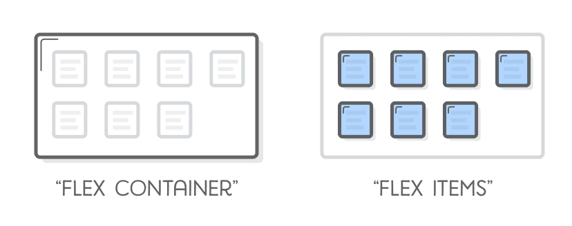
The Flexbox model presents two types of “boxes” – one is the Flex Container and the other is the Flex Item (direct child – an element within the same container).
In general, you can say that the role of the Flex Container is to group multiple Flex Items together and determine how they are positioned along the container’s axes.
Flexbox allows direct manipulation of those Flex Items (more on that later), but in most cases, it will be the role of the Flex Container to establish the layout.
By adding the display: flex property to an element, it practically becomes a Flex Container, and its direct children will become default Flex Items arranged in a row.
For example, the code below will lead to the following result:
<div class="flex-container">
    <div>Flex Item</div>
    <div>Flex Item</div>
    <div>Flex Item</div>
</div>
.flex-container {
display: flex;
}You should understand what Flex Item and Flex Container mean for this post to be clear. I may refer to the Flex Container as a “container” and to Flex Items as “elements” for simplicity.
X-axis and Y-axis
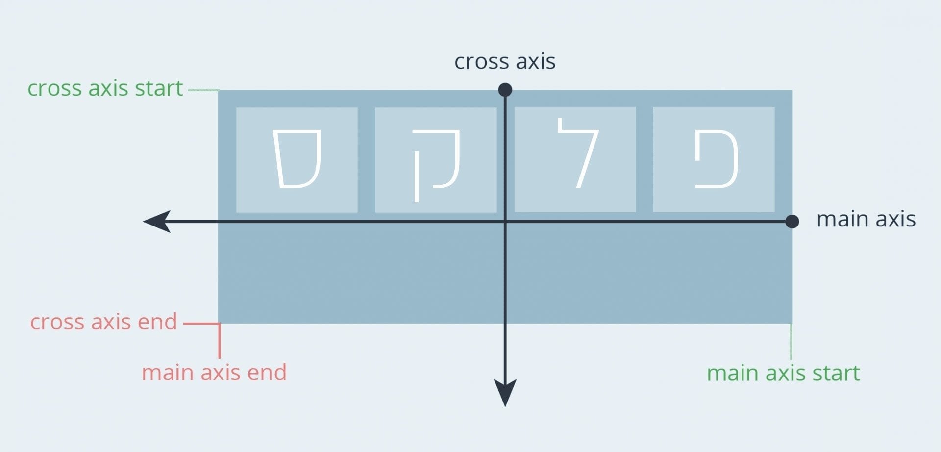
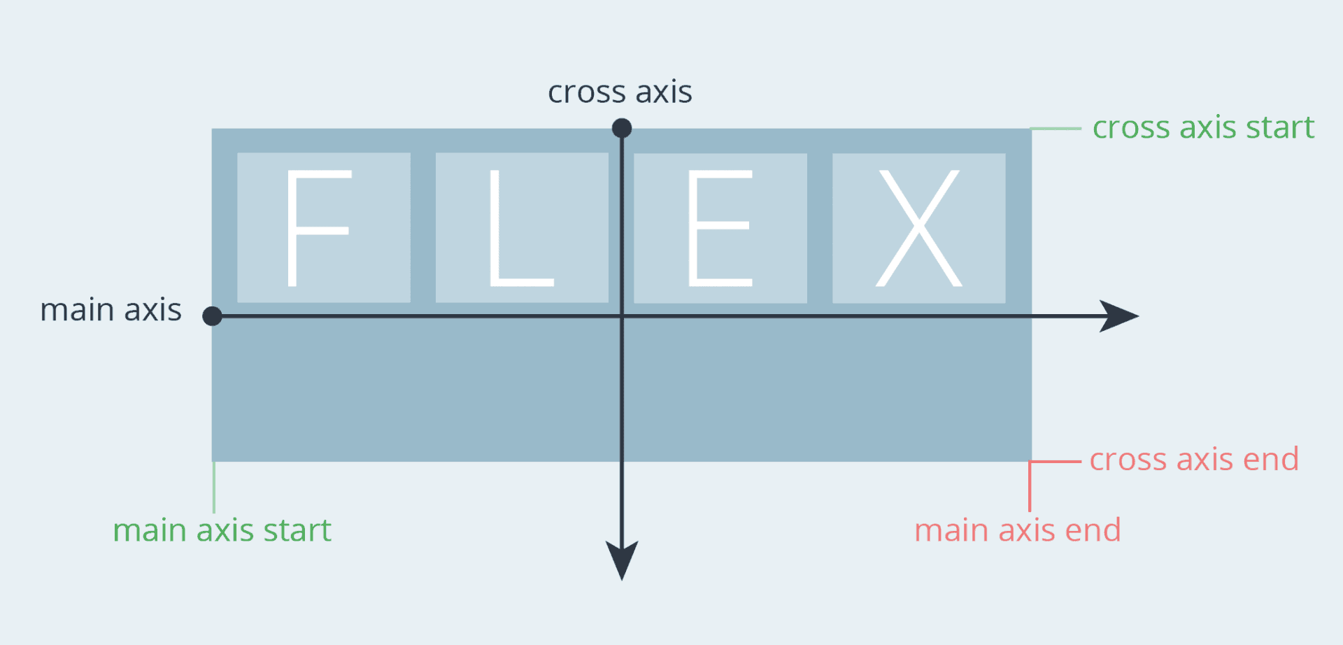
To better illustrate and understand how Flexbox works optimally, it’s important to grasp the model’s relation to the X-axis, also known as the Main-Axis, and the Y-axis, known as the Cross-Axis.
Take a look at the following images depicting these axes:
If your site in Hebrew or any other right to left language, the X-axis direction changes, starting from the right and ending on the left:

Positioning and Alignment of Elements along the Y-axis
It’s safe to say that one of the reasons Flexbox has generated so much interest among web developers is because it first provided them with a very straightforward way to position elements within a container.
For example, to play around with the vertical alignment of elements along the Y-axis, we will use the align-items property.
On the other hand, to horizontally align an element along the X-axis, we will use the justify-content property.
1. The align-items Property
The align-items property defines the default behavior for how elements are placed or aligned along the Y-axis, and it looks like this:
.flex-container {
    align-items: stretch;
}
In the following example, the elements within the container will stretch to the container’s height by default, as the value of the align-items property is set to stretch. It looks like this:
Of course, there are additional options for positioning these elements along the vertical axis. Experiment with different values to see their impact on the alignment of this unit of elements:
If you are interested in understanding the difference between flex-start and baseline, take a look at this link…
Note that the container is taller than the elements it contains in this example, meaning that for the align-items property to have an effect, the container should be taller than the elements themselves.
But what should we do if multiple rows of elements exist within a specific container and we want to control the alignment of these rows along this axis (Y-axis)?
2. The align-content Property
The align-content property is very similar to the align-items property, but instead of affecting the position of the elements themselves, it affects the multiple rows of elements together and therefore the spacing between those rows.
.flex-container {
    align-content: stretch;
}
The default value for this property is align-content: stretch, and using this property is not relevant if there is only one row of elements.
Take a look at the following example and experiment with the values to understand what I’m talking about:
In this case as well, the
align-contentproperty requires the container to be taller than the rows themselves.
Let’s move forward and take a look at how we can position elements along the horizontal axis (X-axis)…
Positioning and Alignment of Elements on the Horizontal (X) Axis
1. The justify-content Property
On the horizontal (X) axis, we have only one property to consider, which is justify-content.
.flex-wrapper {
    justify-content: flex-start;
}
The justify-content property allows us to control the position of elements on the X-axis, and as a result, it determines the spacing between and around the elements in this axis.
In a Flex Container, elements are arranged in a row, and the start of the X-axis is from the flex-start direction by default.
Experiment with the available options for the justify-content property in the following example and observe its impact on the alignment of the elements:
There is no
justify-itemsproperty for us in Flexbox (more on that later).
With this, we have concluded the topic of positioning elements along axes. Before we move on to properties that address individual elements, let’s take a look at another container-level property called flex-wrap…
Two Important Properties Also Applied to the Container and Not to an Individual Element
Before we delve into the properties applied to flex items, it’s important to understand two additional properties applied to the container:
A. The flex-wrap Property
The flex-wrap property determines the behavior of flex items when there isn’t enough space in the container to accommodate them.
It’s important to note that by default, elements won’t wrap to a new row if there’s insufficient space in the containing element. So, if they occupy more space than what’s available, they will cause an “overflow” outside the container.
This behavior can be changed using the flex-wrap property. By using this property, you can set the behavior to make items wrap to a new row when there’s not enough space to fit them in the container.
Keep in mind that in the following example, the three elements have a width of 50%, but this width won’t be expressed unless the flex-wrap: wrap property is applied to the container. Take a look:
While this is a straightforward property to understand, I’ve written a more detailed post about how to use the flex-wrap property.
B. The gap Property
You can create spacing between elements within a container using margins, but a better way to achieve this is by using the gap property in CSS.
This property is now supported in modern browsers and is applied to the container, not individual elements (unlike the properties we’ll see in the next section).
However, I won’t expand on this property here, as I’ve written a separate post that provides a more in-depth explanation of CSS Gap with Flexbox.
Properties of an Individual Flex Item
Flexbox allows us to control the position and behavior of a specific and unique element within a Flex Container. Here are some properties that apply to individual elements only:
1. The align-self Property
The align-self property allows us to change the position of a specific element within the container. It lets us override the default align-items setting for a specific element within this container.
align-items, which we discussed earlier, essentially sets thealign-selfproperty for all elements within the container.
In the example below, the container has align-items: start, causing all elements to be positioned at the beginning of the Y-axis.
However, in this case, we’ve set the first element to have align-self: stretch, and the third element to have align-self: center, which breaks the rule we set at the container level:
.flex-wrapper {
    align-items: flex-start;
    display: flex;
}

.flex-wrapper > div:nth-child(1) {
    align-self: stretch;
}

.flex-wrapper > div:nth-child(3) {
    align-self: center;
}
The result will be something like this:
Play around with the align-self property of the first element to understand its effect on the example below:
2. The order Property
Flexbox allows us to place elements in any direction or order we want. However, concerning the order of elements, we need to differentiate between Ordering and Reordering.
Ordering refers to changing the order of elements using the flex-direction (which we’ll discuss shortly) and flex-wrap properties we’ve already talked about.
In this section, we’ll only discuss reordering, which is done by adding the order property to a specific element within the container. You can use the order property to change the default order defined on the container itself using the flex-direction and flex-wrap properties.
I assume it’s unnecessary to mention that the
orderproperty changes only the visual positioning of elements on the screen and has no effect on the markup or how external tools interpret that markup.
The order property can take only an integer value, and its default value is 0. In the following example, we use this property to move the third element to the beginning of the X-axis.
Since the other elements have the default property order: 0, setting a lower value than this for Element 3 will cause it to move to the beginning of the row, becoming the first element in the container visually, of course.
See the Pen
Untitled by Roee Yossef (@roeey)
on CodePen.
Certainly, you’ve noticed that you can use the same logic to move Element 3 to the end of the X-axis, making it appear visually as if it’s the last element. All you need to do is change the value of order to 1.
Here’s a handy tip! There’s a property called flex-flow that provides a shortcut to define both
flex-directionandflex-wrapproperties together in a single CSS line.
3. The flex-grow property
Using the flex-grow property, you can control the amount of space a specific element occupies relative to others.
This property takes a numeric value representing a fraction of the available space, and this value depends on the same property in the other elements within the same container.
The default value is 0, which ensures that the element won’t expand into empty space if available.
In the following example, the first element has the default value, the second element has a value of 1, and the third element has a value of 2:
By the way, since the value is relative, if you set
flex-grow: 200 for all elements, it will be exactly as if you set the value to 1 for all of them—hopefully, this is clear…Take a look at a neat trick that allows you to attach elements to the bottom of a Flex Container using the flex-grow property.
4. The flex-shrink property
The flex-shrink property is the opposite of the flex-grow property and defines the shrinking options of an element relative to other elements in the container. The default value is 0, meaning that elements can shrink.
We won’t delve further into the flex-shrink property here, but come back in the near future as I update this post regularly… 🙂
5. The flex-basis property
The flex-basis property defines the initial space an element occupies, but it’s not obligatory and depends on the available space. Take a look at the two following examples:
First, all elements have the property flex-basis : 25%:
In the second, the first element has flex-basis : 55%, and the other two elements have flex-basis : 15%:
We won’t expand further on this property right now…
6. The flex property
The flex property is a kind of shorthand and combination of the flex-grow, flex-shrink, and flex-basis properties.
For example, here’s the syntax corresponding to an element with flex-grow : 2, flex-shrink : 0, and flex-basis : 2rem:
.item {
  flex: 2 0 2rem;
}
Flipping Axes – The flex-direction Property
Flexbox allows us to flip the X-axis and the Y-axis. We previously described align-items as controlling the vertical alignment of elements, but that’s due to the default value of flex-direction: row for Flexbox containers.
Take a look at the following code:
.flex-container {
    display: flex;
    flex-direction: row; /* default value */
    align-items: flex-start; /* default value */
}

.flex-container > div:nth-child(1) {
    align-self: flex-start;
}

.flex-container > div:nth-child(2) {
    align-self: center;
}

.flex-container > div:nth-child(3) {
    align-self: flex-end;
}On the other hand, when using
flex-direction: column, the align-items property (which is set to flex-start by default) will control the elements’ alignment on the X-axis:Similarly, if
flex-direction: column is set, the justify-content property will determine the alignment along the Y-axis, as long as the container’s height is greater than the combined height of the elements.Setting Element Orientation
So far, we’ve seen that the flex-direction property defines which axis is considered the main axis. But you can also set the orientation of elements (normal or reversed) using this property. Play with the options of this property:
Remember that the
flex-directionproperty is affected by the site’s writing direction (RTL or LTR).
Appendix A: How to Center an Element in a Flex Container
Using Flexbox allows us to vertically and horizontally align elements easily, allowing quick centering within any container. If this concept isn’t clear, take a look at the following example:
.flex-wrapper{
  display: flex;
  align-items: center;
  justify-content: center;
}
<div class="flex-wrapper">
<div class="grid-item">1</div>
</div>If the element has a defined and fixed width and height (e.g., 60px in this example), the result will be a centered element within the container:
Appendix B: Using Auto Margins for Element Alignment
For our purposes, there is no justify-items or justify-self for the X-axis, and we need to treat elements as a group in this axis.
However, we can separate an element or a group of elements from others using auto margins.
A common situation is navigation menus in a website where some elements are aligned to the left while another group is aligned to the right. Take a look at the following example:
.flex-wrapper {
    display: flex;
}

.flex-wrapper > div:nth-child(4) {
    margin-right: auto;
}All we did was add
margin-right: auto to the fourth element, which pushes this element and the ones following it to the left edge of the main axis (the horizontal axis in this case).Appendix C: The place-items and place-content Properties
By the way, there are shorthand properties for these. The place-items property is equivalent to using place-content together:
.flex-wrapper {
  display: flex;
  place-content: center center;
}


.flex-wrapper {
  display: flex;
  place-items: center center;
}
The place-content property combines the effects of align-content and justify-content, allowing you to declare both in a single declarative statement.
Similarly, place-items is a shortcut for align-items and justify-items.
Wait, but didn’t we say that there is no justify-items in Flexbox….??
I’m sticking by that statement. The justify-items property is not part of the Flexbox specification as it’s unnecessary. Using it won’t have any effect on a Flexbox Container.
The justify-items property, if you don’t know, sets the justify-self property for a group of elements within a certain container, and its effect varies based on the layout you’re using (block elements, tables, etc.). In Flexbox, this property won’t do anything…
Let’s not dwell on that, and the truth is, it’s a bit unclear why the place-items property exists when justify-items is not part of the Flex specifications and is not relevant… Do you have any idea why? Share in the comments…
Common Alignments in Flexbox with Code Examples
Using Flexbox is extremely convenient in theory for creating layouts, whether they’re more complex or simple.
However, I often find myself adding the display: flex property to a specific element and then spending quite a bit of time figuring out how to make that container behave exactly as I want it to.
If you’re in a similar situation, here are several examples of alignments in Flexbox that you can easily copy and paste into your own project, at least as a starting point.
Each of these examples assumes that the HTML contains an element with the class container, and inside it, there are multiple children with the class item (the number of children varies between examples, of course).
<div class="container">
  <div class="item"></div>
  <div class="item"></div>
  <div class="item"></div>
  ...
</div>
Example A – Stretch all, fixed spacing
.container {
  display: flex;
}
.item {
flex-grow: 1;
height: 100px;
}

.item + .item {
margin-right: 2%;
}
Example B – Stretch middle, fixed spacing
.container {
  display: flex;
  gap: 20px;
}

.item {
  height: 100px;
  width: 60px; /* A fixed width as the default */
}

.item-center {
  flex-grow: 1; /* Set the middle element to grow and stretch */
}
As you can see in the above example we are using the flexbox gap css property for the spacing between the elements
Example C – Alternating Grid
.container {
  display: flex;
  flex-wrap: wrap;
  justify-content: space-between;
}
.item {
width: 48%;
height: 100px;
margin-bottom: 2%;
}

.item:nth-child(3n) {
width: 100%;
}
Example D – Grid 3×3
.container {
  display: flex;
  flex-wrap: wrap;
  justify-content: space-between;
}
.item {
flex: 0 32%;
height: 100px;
margin-bottom: 2%; /* (100-32*3)/2 */
}
Example E – Grid 3×3: constrained proportions | 1:1
.container {
  display: flex;
  flex-wrap: wrap;
  justify-content: space-between;
}
.item {
width: 32%;
padding-bottom: 32%; /* Same as width, sets height /
margin-bottom: 2%; / (100-32*3)/2 */
position: relative;
}
Example F – Grid 3×3: constrained proportions | 16:9
.container {
  display: flex;
  flex-wrap: wrap;
  justify-content: space-between;
}
.item {
width: 32%;
padding-bottom: 18%; /* 32:18, i.e. 16:9 /
margin-bottom: 2%; / (100-32*3)/2 */
}
Example G – Vertical Bars
.container {
  display: flex;
  height: 300px;
  justify-content: space-between;
  align-items: flex-end;
}
.item { width: 14%; }
.item-1 { height: 40%; }
.item-2 { height: 50%; }
.item-3 { height: 60%; }
.item-4 { height: 20%; }
.item-5 { height: 30%; }
Example H – Horizontal Bars
.container {
  display: flex;
  height: 300px;
  justify-content: space-between;
  flex-direction: column;
}
.item { height: 14%; }
.item-1 { width: 40%; }
.item-2 { width: 50%; }
.item-3 { width: 60%; }
.item-4 { width: 20%; }
.item-5 { width: 30%; }
Example I – Vertical stack (centered)
.container {
  display: flex;
  flex-direction: column;
  align-items: center;
}
.item {
height: 40px;
margin-bottom: 10px;
}
Example J – Masonry (or mosaic)
/* Re-order items into rows */
.item:nth-child(3n+1) { order: 1; }
.item:nth-child(3n+2) { order: 2; }
.item:nth-child(3n)   { order: 3; }
/* Force new columns */
.container::before,
.container::after {
content: "";
flex-basis: 100%;
width: 0;
order: 2;
}
Summing Up
In this post we’ve covered the main properties of Flexbox. We explained how Flexbox deals with axes, saw how to position elements on the horizontal and vertical axes, how to center elements, how to reverse axis directions, and we’ve also delved into various properties for individual elements within a container.
Don’t hesitate to create your own grid when developing websites for your clients. It’s not mandatory, and you truly don’t need to use a complex framework with bloated code.
Moreover, even though this post is quite lengthy, don’t overthink it when using flexbox to create any layout. It’s simpler and easier than it might seem.
Keep in mind that in the future, we’ll be able to use additional properties that will come with the specifications of Box Alignment Level 3.
I assume that soon we’ll be able to utilize properties like column-gap and row-gap that already exist in CSS Grid Layout, which make work easier and optimize the spacing between elements.
So, I hope this post helped, even a little. Subscribe to the mailing list to stay updated, and if you have questions, comments, or just positive feedback, feel free to let us know in the comments… 🙂


