If you’ve ever used Photoshop, you already know what blending modes do – they control how two layers combine their colors. CSS brings the same concept to the browser with two properties: mix-blend-mode and background-blend-mode.
The mix-blend-mode property blends an element with whatever sits behind it in the DOM. The background-blend-mode property, on the other hand, blends multiple background images or a background-image with a background-color on the same element.
I’ve been using these properties in various projects, and they can produce results that would otherwise require image editing software.
Some of the static examples below were inspired by other posts on the web. I lost the original sources, so I can’t give proper credit.
The Most Useful Blend Modes
Both mix-blend-mode and background-blend-mode accept the same set of 16 keyword values. In practice, you’ll use a handful of them 90% of the time. Click through this demo to see what each one does to a real photo:
.overlay {
    background-color: #e63946;
    mix-blend-mode: multiply;
}
Multiply darkens by removing white, screen lightens by removing black, overlay boosts contrast, darken keeps only the darker pixels, soft-light applies a subtle tint, and difference inverts colors based on the overlay. Try changing the overlay color to see how each mode responds differently.
Using mix-blend-mode
The mix-blend-mode property is the more versatile of the two. It blends any DOM element with whatever is visually behind it, making it perfect for text effects, image compositing, and creative overlays.
Text and Shape Blending
In the example below, a circle sits behind a text element. Adding mix-blend-mode: overlay to the text makes it merge with the circle’s color:
Text Blend
The code for this example:
<div class="circle"></div>
<p class="blend-me">Blend Me</p>
.blend-me {
mix-blend-mode: overlay;
margin-top: -50px;
}Text on Image
A popular use case is blending text with a background image:
Green Forest
The CSS applied to the text element:
.title {
  color: #000;
  mix-blend-mode: overlay;
}
You can also use the text-stroke property to make the text fill transparent:
Shadow
Double Exposure Effect
Blend modes really shine when you layer two completely different images. Take a look at these two photos side by side:

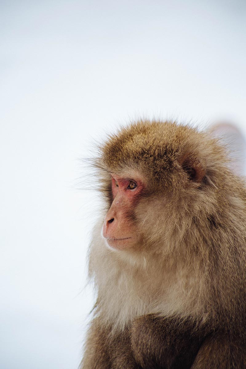
When you stack the monkey image on top and apply mix-blend-mode: soft-light, you get a double-exposure effect:
<div class="blend-me-4">
  <img src="monkey.jpg" width="300" height="450">
  <img src="sky.jpg" width="300" height="450">
</div>
.blend-me-4 img:first-child {
position: absolute;
mix-blend-mode: soft-light;
}Removing a White Background
If you have a logo or image on a white background and no transparent PNG version, mix-blend-mode: multiply removes the white instantly.
Look at this example:
Both images above use the same JPEG file. The right one has a single CSS rule applied:
img {
    mix-blend-mode: multiply;
}
Note: It’s not recommended to use this unless necessary. Also, note that the blue color is not exactly the same 100%.
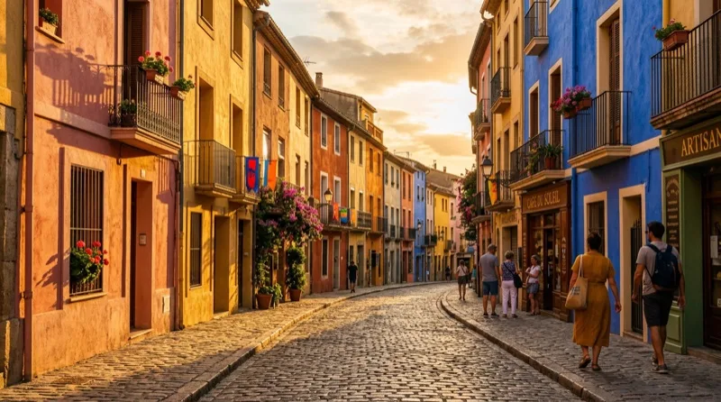
Blending Text with a Landscape Image
Another technique I like is using mix-blend-mode to reveal a photo through bold text. Type your own word and switch between multiply and screen to see how each approach works:

With multiply, the text element has a black background and white text – the black disappears and the text area reveals the landscape. Switch to screen for the inverse: white background, black text, and the dark areas disappear instead. If you’re interested in more CSS masking techniques, I covered mask-image in a separate post.
Using background-blend-mode
While mix-blend-mode blends separate DOM elements, background-blend-mode works within a single element – blending its background-image with a background-color, or blending multiple background layers together. This makes it ideal for image color effects and gradients.
Blending an Image with a Solid Color
In this example, a dark portrait is combined with a pink background color using background-blend-mode: screen:
The image is set as a background-image on the element, paired with a background-color:
.blend {
    width: 300px;
    height: 450px;
    max-width: 100%;
    background-blend-mode: screen;
    background-image: url(pregnant.jpg);
    background-color: #fa8072;
    background-size: cover;
}
Blending an Image with a Gradient
The background-blend-mode property can also blend multiple background images together. Since CSS treats linear and radial gradients as background images, you can blend a photo with a gradient like this:
.blend {
    width: 300px;
    height: 450px;
    max-width: 100%;
    background-blend-mode: overlay;
    background-image: url("parrot.jpg"),
    linear-gradient(to bottom, #efe8f5, #8845e0);
    background-size: cover;
}
Duotone Image Effect
A duotone effect maps the light and dark areas of an image to two specific colors. You’ve probably seen this style on music streaming services and modern landing pages. CSS makes it possible with just background-blend-mode and no image editor.
Use the color presets below or pick your own color to see the effect change in real time:
The luminosity blend mode strips the original colors from the photo and replaces them with your chosen background-color. Adding a filter: contrast() on top punches up the result.
Upgrading Image Appearance with Blend Modes
Beyond text effects and layer compositing, blend modes can improve how product images look on colored backgrounds – without touching the original files.
The best quality

The best quality
The best quality
FAQs
Common questions about CSS blend modes:
mix-blend-mode blends a DOM element with the elements behind it, including other HTML elements. background-blend-mode blends multiple backgrounds (images, gradients, colors) within the same element.mix-blend-mode: multiply. The multiply value makes white pixels transparent because white (255) multiplied by any color returns that color unchanged. Dark pixels remain visible.mix-blend-mode and background-blend-mode properties themselves are not animatable since they use keyword values. However, you can animate surrounding properties like opacity, background-color, or filter to create transitions between blended states.background-image, add a background-color with your desired tone, and use background-blend-mode: luminosity. The blend mode strips the original colors and replaces them with your chosen color. Increase contrast with filter: contrast() for a punchier result.multiply (darkens, removes white), screen (lightens, removes black), overlay (boosts contrast), soft-light (subtle contrast), and difference (inverts colors). Each targets a specific visual effect.Summary
CSS blend modes give you Photoshop-level compositing directly in the browser. The two properties – mix-blend-mode for DOM elements and background-blend-mode for background layers – cover everything from subtle image enhancements to dramatic duotone effects and text reveals. With full browser support across Chrome, Firefox, Safari, and Edge, there’s no reason to hold back.
Images from unsplash.com. Inspiration and some of the examples from various sources around the web.