One aspect in which websites lag behind native applications is the smooth user experience. The perception of a smooth experience largely comes from the user interface’s responsiveness to user interactions, with the action of scrolling content being a crucial part of those interactions.
Given these limitations, frontend developers, out of necessity, turned to JavaScript libraries to alter and maneuver the scrolling experience of a web page. However, as you probably know, additional libraries also contribute to bloated code and additional JS computations that negatively affect website performance in most cases.
But with the introduction of CSS Scroll Snap specifications, we developers have the option to control the scrolling behavior of a web page (to a certain extent) by using web standards and without relying on heavy external libraries. Let’s explain and see how to use CSS Scroll Snap…
CSS Scroll Snap – Basic Usage
As you know, we can scroll a page or any element in several ways: using a mouse, a keyboard, or touch gestures on touch screens.
Unlike the standard, i.e., linear scrolling experience where the scroll reflects directly the frequency of the device with which you performed the scroll, scroll snapping allows you to “jump” (!Snap) to a specific point during the scroll.
For the sake of writing convenience, we will refer to these points as snap points.
Scroll snapping is done by setting the scroll-snap-type property on a container (parent) and the scroll-snap-align property on the elements inside that container (child elements).
When we scroll the container, it will jump to those children according to the settings we determined, namely it will snap to those elements located in the same container. The code in its most basic form looks like this:
<div class="snap-container">
  <section class="child"></section>
  <section class="child"></section>
  <section class="child"></section>
</div>
.snap-container {
scroll-snap-type: y mandatory;
}
.child {
scroll-snap-align: start;
}As noted, the scroll snapping properties are applied both to the container and to the elements within it. One could say that the operation is similar to Flexbox or to CSS Grid in which the parent element becomes a flex container or a grid container. In this case, it can be said that the parent element becomes a snap container.
For the sake of writing convenience, we will refer to that parent element as a container or snap container.
Now let’s explain the main feature that refers only to the parent element, namely the container…
The scroll-snap-type feature
scroll-snap-type determines how “strict” those snap points will be, or in other words, how rigidly they will be enforced. Beyond the first value that indicates the directionality of the scroll, namely horizontal or vertical scroll (x or y), there is a second value that can be either mandatory or proximity.
“mandatory” vs. “proximity”
The value mandatory indicates that the browser must jump to a snap point once the user stops scrolling. The value proximity is less strict and indicates that the browser may jump to a snap point if it deems it appropriate.
In general, it can be said that proximity comes into play when a user stops scrolling a few pixels away from the snap point.
I’m sure an example will explain this better than words. Click on the code at the top to set the property and play with the scroll bar in the element below, can you see and understand the differences?
CSS Demo: scroll-snap-type
scroll-snap-type: none;scroll-snap-type: x mandatory;scroll-snap-type: x proximity;If you’re wondering how we styled the scrollbars, take a look at the post Styling Scrollbars with CSS.
The scroll-snap-align feature
The scroll-snap-align feature refers only to the elements inside the container (child elements). It allows you to determine which part of the element is supposed to snap to the container. The property can take four values: none, start, center, & end.
These are of course relative to the direction of the scroll. If you are scrolling vertically, start refers to the top edge of the element. If you are scrolling horizontally, it refers to the left edge. The values end & center follow the same principle.
Be aware! Changing the document’s direction also affects this property. On right-to-left (RTL) websites, the start value refers to the right edge.
Let’s see examples that really well explain the operation of this feature (recommended on desktop, on mobile it might be hard to understand the principle).
Heads up: It doesn't look like your browser supports scroll snapping! Check Can I use for current browser support. Maybe try opening this CodePen in a different browser, like Chrome?
CSS Demo: scroll-snap-align
scroll-snap-align: start;scroll-snap-align: start;scroll-snap-align: start;scroll-snap-align: start;scroll-snap-align: start;scroll-snap-align: end;scroll-snap-align: end;scroll-snap-align: end;scroll-snap-align: end;scroll-snap-align: end;scroll-snap-align: center;scroll-snap-align: center;scroll-snap-align: center;scroll-snap-align: center;scroll-snap-align: center;scroll-snap-align: none;scroll-snap-align: none;scroll-snap-align: none;scroll-snap-align: none;scroll-snap-align: none;Before we conclude with this feature, note that you can set a different value for vertical and horizontal directions in the following way:
.child {
  scroll-snap-align: start end;
}
Let’s create a more practical example to understand the capabilities.
Example of Using Scroll Snap on a Full Screen
Let’s provide a more practical example. Take a look at the following HTML:
<div class="scroll-container">
  <section>
    <h2>Section 1</h2>
  </section>
  <section>
    <h2>Section 2</h2>
  </section>
  <section>
    <h2>Section 3</h2>
  </section>
  <section>
    <h2>Section 4</h2>
  </section>
</div>
As you should already know, scroll snapping requires two main CSS properties: the first is scroll-snap-type on the container—in our case, the element with the class scroll-container. The second is scroll-snap-align for the elements within the container (the direct children)—in our case, the section elements.
Beyond that, we also need to define the height of the container and, of course, set the property overflow: scroll to allow scrolling. The CSS looks like this:
.scroll-container {
  height: 100vh;
  overflow-y: scroll;
  scroll-snap-type: y mandatory;
}

section {
  height: 100vh;
  scroll-snap-align: center;
}
In this example, we set the scroll-snap-type property to y (i.e., vertical scrolling) and the second value as mandatory. This means that once the user stops scrolling, the scroll position will always jump to the nearest snap point.
Alternatively, we could set the value to proximity, which would determine that the scroll position will only snap to a snap point if the user stopped scrolling near any snap point.
Setting precise animations or physics to enforce these snap points is not performed by this feature but is determined by the User Agent (the browser) used.
If there is a situation where your content might be taller than the container (in this case 100vh), then using mandatory can be problematic and cause parts of the content to be hidden above or below the visible area, hence it is not recommended.
But if you know that the content will always fit the viewport, then using the mandatory value can create a more consistent user experience:
See the Pen
Full Screen scroll-snap Demo by Roee Yossef (@roeey)
on CodePen.
Intersection Observer API
You’ll agree with me that with CSS, our page now feels more like a native application. To further enhance this, you can add some animations or transitions based on scrolling. This can be done by implementing a parallax scrolling effect or alternatively, you can use the Intersection Observer API.
This allows us to create an observer that watches how our elements intersect with the viewport, triggering a function whenever such an intersection occurs.
It’s much more efficient than libraries that rely on a constant listening to the scroll event.
We can create an observer that watches when each of our sections enters and exits the viewport, for example:
const sections = [...document.querySelectorAll('section')]

const options = {
  rootMargin: '0px',
  threshold: 0.25
}

const callback = (entries) => {
  entries.forEach((entry) => {
    if (entry.intersectionRatio >= 0.25) {
      target.classList.add("is-visible");
    } else {
      target.classList.remove("is-visible");
    }
  })
}

const observer = new IntersectionObserver(callback, options)

sections.forEach((section, index) => {
  observer.observe(section)
})
In this example, a callback function is triggered each time a section intersects or actually when 25% of it intersects with the viewport (threshold). In other words, when 25% of the section enters the viewport we add a class named is-visible to that section and remove this class when the section does not meet this criterion.
We simply add our animation, for example, the following CSS:
section .content {
  opacity: 0;
}

section.is-visible .content {
  opacity: 1;
  transition: opacity 1000ms;
}
And here is the demo of the final result:
See the Pen
Full Screen scroll-snap Demo – Intersection Observer by Roee Yossef (@roeey)
on CodePen.
What About Browser Support?
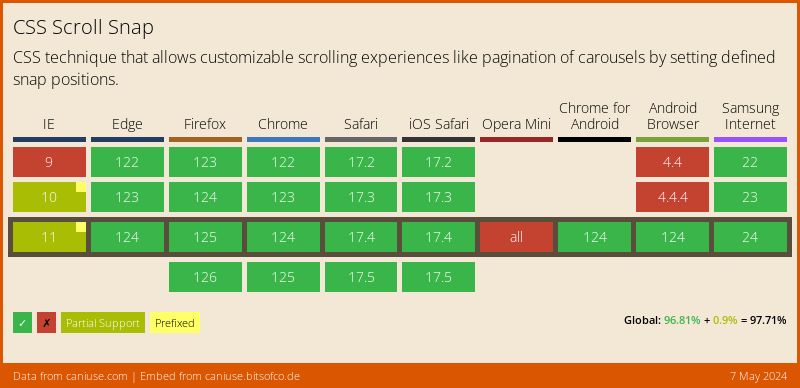
The features scroll-snap-type and scroll-snap-align are supported quite well, as is the Intersection Observer. If we wrap all these with a feature query (i.e., @supports), we can provide a fallback browsing experience for older browsers that do not support these features.
@supports (scroll-snap-type: y mandatory) {
  .scroll-container {
    height: 100vh;
    overflow-y: scroll;
    scroll-snap-type: y mandatory;
  }

  section {
    height: 100vh;
    scroll-snap-align: center;
  }
}
Summary
If you thought CSS Scroll Snap ended with the two features we mentioned, you’re mistaken. There are features named scroll-padding and scroll-snap-stop that we didn’t even talk about, continue exploring on your own.
To summarize, the world of web is increasingly approaching that of native apps and offers an open and accessible alternative to them. And while these CSS features are not a complete replacement for JavaScript libraries that allow more control, they offer a significant advantage: simplicity and reliability.
By adopting web standards where possible, we can enjoy the best of both worlds: impressive and smooth websites that meet client expectations, while maintaining excellent site performance.