If you follow this blog, you’ve probably noticed that I’m gradually improving its appearance and functionality. In general, I’m trying to make the blog as readable and visually pleasing as possible to enhance the user experience and encourage you to return.
Recently, I’ve been focusing mainly on typography and discovered some interesting things. Some of them I already knew from my experience, some I knew intuitively, and some I didn’t. In any case, I decided to share with you a few important points related to typographic hierarchy, which ultimately aims to improve readability and user experience on your website.
What is Typographic Hierarchy?
Before we dive into explanations and examples, let’s answer the question of what exactly is typographic hierarchy?
In simpler terms, typographic hierarchy is practically implemented by arranging and presenting elements in a way that implies their importance using color, contrast, shape, position, and font size. Designers organize these elements so that users perceive the visual importance of elements relative to each other and in relation to the overall page content.
In traditional reading materials, chapters are divided into sections and subsections, with each of these books having its own minor variations. In our modern world, which is centered around the web, we still adhere to these principles for books. Chapters are individual pages, table of contents serves as navigation menus, and subsections remain as they were.
Regardless of the medium, the experience of reading well-structured pages feels smooth and effortless. But to achieve this, designers need to consider several aspects, from images to buttons, and in the context of this post, text and typography on the website.
“Typographic hierarchy is an organization of text based on its importance in content, and when done correctly, it allows the viewer to locate, navigate, and scan text much more easily. Typographic hierarchy defines a division into types of information – where a chapter or specific topic begins and ends, thus creating a separation between different types of content. Designers use hierarchy to guide reading and to emphasize and focus on specific messages.” Alef Alef Alef
Example of Basic Typographic Hierarchy
Take a look at the image below. This is a classic example of a 3-level typographic hierarchy, an approach that is still used today in the digital world as well. You can see that the three examples on the left can benefit from additional variations in fonts as well as clearer spacing.
On the other hand, the human brain will analyze the content in the right example faster, as the changes prioritize certain content and visual elements over others. Thus, the concept of their importance, priority, and hierarchical level becomes clearer and easier to understand.

Credit: www.canva.com The right example is clearer and more visually readable.
Before we explore some points for improving typographic hierarchy, it’s worth mentioning that the use of hierarchy is an essential tool for designers and one of the fundamental principles taught in design and art.
9 Steps to Improve Hierarchy and Typography on Websites
Let’s remind and state that in order to create a successful typographic hierarchy, it’s important that you understand the necessary elements for the written page as well as their relative importance compared to other elements. Beyond that, here are several important points to consider:
1. Analyze the Text Content and Make Adjustments Accordingly
As designers and web developers, you’ve probably received text from content writers for embedding on a website or for creating a design based on that text. Instead of copy-pasting, invest a small effort, take a few moments to read the text, and grasp what it’s saying. Very quickly, you’ll find yourself with ideas about the proper structure and design for the text.
Consider whether it would be appropriate to divide this text into paragraphs in terms of design and readability. Will emphasizing an expression or title contribute to the element’s design and the viewer’s perception of it? Sometimes minor changes can make all the difference between excellent typographic design and a lackluster one.
Here’s an illustrative example describing two elements on an imaginary page, one with correct hierarchical typography and the other without. You’ll agree with me that the difference in this case lies in the text’s readability and extreme visibility between the two.

First-Level Title
This could be a second-level title
Lorem ipsum dolor sit amet, consectetur adipiscing elit. Fusce a elit eu nisi malesuada mollis quis vel augue. Integer et urna ut tellus facilisis pharetra. Nulla facilisi. Donec quis ipsum id lectus sagittis vehicula at et nulla. Nullam efficitur lacinia arcu, in vulputate sem iaculis nec.
“Lorem ipsum dolor sit amet, consectetur adipiscing elit. Fusce a elit eu nisi malesuada mollis quis vel augue. Integer et urna ut tellus facilisis pharetra. Nulla facilisi. Donec quis ipsum id lectus sagittis vehicula at et nulla. Nullam efficitur lacinia arcu, in vulputate sem iaculis nec.”
First-Level Title
This could be a second-level title
Lorem ipsum dolor sit amet, consectetur adipiscing elit. Fusce a elit eu nisi malesuada mollis quis vel augue. Integer et urna ut tellus facilisis pharetra. Nulla facilisi. Donec quis ipsum id lectus sagittis vehicula at et nulla. Nullam efficitur lacinia arcu, in vulputate sem iaculis nec. “Lorem ipsum dolor sit amet, consectetur adipiscing elit. Fusce a elit eu nisi malesuada mollis quis vel augue. Integer et urna ut tellus facilisis pharetra. Nulla facilisi. Donec quis ipsum id lectus sagittis vehicula at et nulla. Nullam efficitur lacinia arcu, in vulputate sem iaculis nec.”
2. Separate Sections from Paragraphs
The examples below may look identical to the untrained eye, but the reading experience differs between the two. Why? In the left example , there is no distinct separation between individual sections and paragraphs. The margins are the same between sections and paragraphs, making the text feel like an endless reading marathon that might cause the reader to lose focus.
In contrast, in the right example , you can see how even a small space between sections, though subtle, provides the necessary structure for comfortable reading. The spacing between the paragraphs themselves is also different and smaller in this case, aiming to provide presence and emphasize the spacing between different sections. These changes create a more visually harmonious page and enhance the reading experience.”
First Title
Lorem ipsum dolor sit amet, consectetur adipiscing elit. Vestibulum at urna quis tellus scelerisque posuere. Phasellus volutpat dictum aliquet. Pellentesque habitant morbi tristique senectus et netus et malesuada fames ac turpis egestas. Morbi ac lacinia mauris.
Lorem ipsum dolor sit amet, consectetur adipiscing elit. Vestibulum at urna quis tellus scelerisque posuere. Phasellus volutpat dictum aliquet. Pellentesque habitant morbi tristique senectus et netus et malesuada fames ac turpis egestas. Morbi ac lacinia mauris.
Second Title
Lorem ipsum dolor sit amet, consectetur adipiscing elit. Vestibulum at urna quis tellus scelerisque posuere. Phasellus volutpat dictum aliquet. Pellentesque habitant morbi tristique senectus et netus et malesuada fames ac turpis egestas. Morbi ac lacinia mauris.
3. Choose a Font for the Body Text and Use Modular Scale for Headings
The font size significantly affects the reading experience of specific text. Text that is too small will strain the eyes and discourage the reader, leading to skipping parts/paragraphs and many sentences in order to avoid effort.
Before we continue, it’s worth mentioning that in this post, we will use the term “font” interchangeably with its Hebrew translation, “גופן” (meaning font).
However, text that is too large can also cause problems by attracting too much attention and generally drawing focus away from the content. Therefore, always start with a comfortable font size for the body text.
What is a Comfortable Reading Font?
There is no fixed font size that suits all situations, and the choice of font size for body text depends on the selected font family. Nevertheless, starting with a font size of 16px for body text is a good choice. It’s not for nothing that this is the default size for most browsers…
It’s not too large and is comfortable to read on most screens and situations. However, don’t hesitate to use a font larger than this! There’s a growing trend of using larger body text, often standing at 18px. Generally, font sizes between 16-18px are what you’ll see on most websites for body text.
This blog, by the way, uses 16px for body text with the Assistant font. The examples in this post use narrow and wide dummy fonts provided by A.A.A, featuring great fonts in Hebrew.
What About Headings and Other Text Elements on the Page?
After you’re done with the body text, you need to choose sizes for the various heading tags on the site and other elements. This choice can be challenging, but there’s a technique called Modular Scale designed to help with this task.
Using this technique means that the font size for each level of heading will be based on a specific ratio, relative to the font size of the body text. This modular scale works with the em unit of measurement and consists of a series of values calculated mathematically to maintain a harmonious relationship between different font sizes.
You start by choosing a font size for the body text (Base), and then you select a ratio from a variety of options (Ratio). The Major Third, Major Second, and Perfect Fourth scales are good places to start, as the difference in font size between the <h1> and <h6> tags isn’t too drastic.
However, you’re welcome to experiment and find what works best for your site and design. In this blog, for example, I use the Minor Third scale, which I find works well. And yes, I’m totally minor (musically!)🎼
4. Set Proper Line Height
In typography, there’s a term called “leading.” It’s essentially the same as the line-height we’re familiar with from CSS or graphic design software. The line height, or the vertical spacing between lines of text, is the vertical distance between rows of text.
The line height has an immediate impact on the design’s conveyance of a certain look and carries significant importance, not less than the chosen font size. By increasing the line height, you can improve text readability (at the expense of density). However, it’s essential to note that too much line height can create the opposite effect and cause a sense of disconnection between lines.
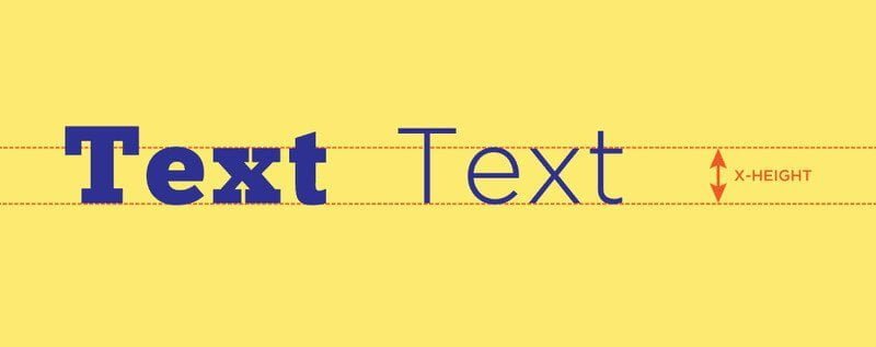
As a guideline, the line height should be about 30-50% larger than the x-height of the font. If you’re not familiar, the x-height is the height of lowercase letters in a specific font as shown in this image.
Note that text set in larger fonts (like those used in headings) can handle smaller line spacing relatively.
Good
Lorem ipsum dolor sit amet, consectetur adipiscing elit. Vestibulum at urna quis tellus scelerisque posuere. Phasellus volutpat dictum aliquet. Pellentesque habitant morbi tristique senectus et netus et malesuada fames ac turpis egestas. Morbi ac lacinia mauris.
Too Much
Lorem ipsum dolor sit amet, consectetur adipiscing elit. Vestibulum at urna quis tellus scelerisque posuere. Phasellus volutpat dictum aliquet. Pellentesque habitant morbi tristique senectus et netus et malesuada fames ac turpis egestas. Morbi ac lacinia mauris.
Too Little
Lorem ipsum dolor sit amet, consectetur adipiscing elit. Vestibulum at urna quis tellus scelerisque posuere. Phasellus volutpat dictum aliquet. Pellentesque habitant morbi tristique senectus et netus et malesuada fames ac turpis egestas. Morbi ac lacinia mauris.
5. Limit Line Length
The number of letters in each line has a considerable impact on text readability. Note that you’re not designing the line length but rather optimizing the user’s reading comfort.
Line length that is too short will force the eye to travel back to the right many times, and the reading pace will be disrupted. In addition, lines that are too short tend to pressure readers and cause them to move to the next line before finishing the current one.
On the other hand, a paragraph with excessively long line length will lead to disorientation, and the eye will struggle to focus on the text. This is because an overly long line makes it difficult for the reader to determine where the line begins and ends. Furthermore, this situation might make it challenging for the reader to transition to the correct line when reading large blocks of text.
Based on research and conducted tests, it can be understood that a line should contain about 50-60 characters to provide an optimal reading experience. For mobile devices and small screens, the ideal line length is around 30-40 characters per line.

Image credit: Material Design
6. Maintain a Minimal Number of Fonts
Avoid using too many font families. Using more than 3 font families can make your website appear unprofessional, lack coherent structure, and also affect the page loading time.
Of course, this is not set in stone, and it doesn’t mean that you can’t use more font families, but there should be a good reason for it, and it’s reasonable to assume that a highly skilled designer is required to make it look good.
Tips for Choosing Fonts
- Stay consistent. Using a different font for each title creates inconsistency and a sense of disorder.
- Choose one font family for the main text and use bold, italics, and different variations of the same font for captions, subtitles, and other design elements.
- Consider using a separate font for H1-H6 heading tags.
- Avoid sudden changes within a paragraph. Use a single font for the main text and utilize bold and italics for specific emphasis.
- If significant emphasis is required, you can use pull-quotes and style them separately.
- Don’t hesitate to mix Serif and Sans Serif fonts; they complement each other.
- Using one font family with multiple weights (light, bold, extra bold) and possibly styles (condensed, expanded) is a safe bet as they are designed to work together.
To summarize this section, limit the number of font families on your website to a minimum. In most cases, two font families are enough. If you decide to use more than one font family, make sure they complement each other, as mentioned in the next section…
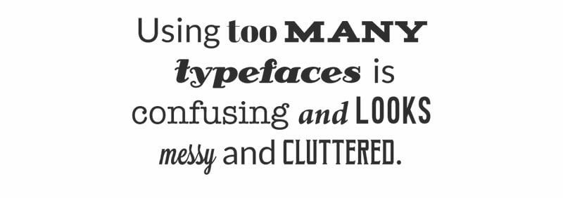
Image credit: www.canva.co
7. Evaluate Font Combinations and Find a Harmonious Pairing
Beyond using too many font families, a significant part of good typography lies in selecting fonts that work harmoniously together. Fonts that do not harmonize or clash with each other distract the reader’s attention and divert the focus from the content.
It can be said that font combination is somewhere between science and art. It depends on proper usage and understanding the fundamentals of typography, as well as personal preference and intuition. Choosing one Serif font and one Sans Serif font can be a good starting point.
In any case, let’s look at some tips that can help you when choosing font combinations…
Tips for Harmonious Font Pairing
- Choose fonts that complement each other. The decision here can feel intuitive, and in many cases, you will rely on your gut feeling and instinct (which is okay).
- Consider the context. The content of the text and even the media in which it will be published influence your choice.
- Create contrast. One reason Serif fonts work well with Sans Serif fonts is the contrast between the two.
- Contrast can also be achieved by changing size, weight, spacing, and color differences, among others.
- Font families with the same x-height tend to work harmoniously together.
- Avoid using very similar fonts that resemble each other too much.
Here are some examples of successful Hebrew font pairings. By the way, I would be happy if you could leave a comment with font combinations you like, and I’ll try to add them to this list:
8. Display Images Above Relevant Content
Our natural reading direction is from right to left and from top to bottom. However, our brain processes and absorbs images much faster than text, and hence, we naturally first notice images and then proceed to read the text underneath.
When you write a description above an image, the brain doesn’t process the information naturally, and as a result, the reading experience is not optimal. For this reason, content that accompanies an image should appear beneath the image itself.
First Title

Lorem Ipsum dolor sit amet, consectetur adipiscing elit. Vestibulum mattis urna non nisi auctor, eu volutpat lorem suscipit. Mauris ut tellus ac nisi ullamcorper cursus. Phasellus a vulputate orci, nec consectetur justo.
Second Title
Lorem Ipsum dolor sit amet, consectetur adipiscing elit. Vestibulum mattis urna non nisi auctor, eu volutpat lorem suscipit. Mauris ut tellus ac nisi ullamcorper cursus. Phasellus a vulputate orci, nec consectetur justo.
First Title
Lorem Ipsum dolor sit amet, consectetur adipiscing elit. Vestibulum mattis urna non nisi auctor, eu volutpat lorem suscipit. Mauris ut tellus ac nisi ullamcorper cursus. Phasellus a vulputate orci, nec consectetur justo.
Second Title
Lorem Ipsum dolor sit amet, consectetur adipiscing elit. Vestibulum mattis urna non nisi auctor, eu volutpat lorem suscipit. Mauris ut tellus ac nisi ullamcorper cursus. Phasellus a vulputate orci, nec consectetur justo.
9. Create Mockups for Content-Rich Projects
Let’s conclude with a small tip – in most cases, you can experiment and play with fonts when there are additional elements in the background. This is because there are no elements beyond the page title, subheadings, and body text.
However, if a specific project includes more complex typography (such as an online newspaper or magazine), it would be advisable to create a mockup to start with and experiment on it.
Creating a mockup will allow you to play with various font combinations without being constrained by existing elements on the page. Sketching is a simple way to examine different parts of the content and its typographic arrangement.
Summary
Typography choices are not to be taken lightly. Proper typography can significantly enhance the design of your website and improve the user experience for visitors. On the other hand, poor typographic choices can distract visitors, draw attention to themselves, and easily ruin the design.
Ensure that the typography on your site is readable and comprehensible to the best of your ability, and remember that typography should respect the content by not adding cognitive effort to the reader.
If you have additional tips on typographic hierarchy, feel free to share them in the comments. Furthermore, if you’re familiar with interesting font combinations, you’re welcome to share those as well…
