According to Wikipedia, merging (or “blending modes”) in digital image editing and computer graphics is used to determine how two layers blend together. In most applications, the default blending mode is simply to hide the bottom layer by covering it with the top layer.
In CSS, there are two properties that allow for the mentioned blending. The mix-blend-mode is responsible for blending elements in the DOM – meaning the blending of an element with any element behind it.
On the other hand, the background-blend-mode property is responsible for the combination of multiple background images or the combination of background-image together with background-color, and both (especially the latter) provide very interesting potential results.
Some of the examples presented in this post, including the one in the following section, were taken from other posts on the web. Unfortunately, I lost those posts, so I don’t have the ability to give proper credit.
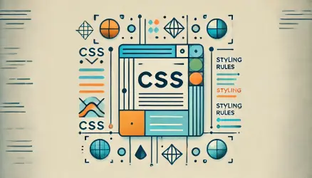
The values these properties can take
You can get a glimpse of the values that the mix-blend-mode and background-blend-mode properties can take in a slightly interactive and cool display that I encountered on the web:
CSS Syntax
mix-blend-mode: normal|multiply|screen|overlay|darken|lighten|color-dodge|color-burn|difference|exclusion|hue|saturation|color|luminosity;
These values are relevant to the two properties we mentioned. By the way, I assume that if you play with these values in CSS, you will find that the most useful ones are darken, multiply, overlay, screen, and soft-light.
In any case, looking at these values doesn’t help much in understanding the point, so let’s see some examples…
Examples of Basic Usage
Let’s present a few basic examples to start with. In the example below, there is a circle with text beneath it. The mix-blend-mode: overlay property has been added to the text, and the result is that the text merges with the circle, as you can see:
Text Blend
Here is the code used for this example:
<div class="circle"></div>
<p class="blend-me">Blend Me</p>
.blend-me {
mix-blend-mode: overlay;
margin-top: -50px;
}Text on Image
A relatively popular use of these properties is in situations with text on an image, something like this:
Green Forest
In this example, I added the following properties to the text that appears on the image:
.title {
  color: #000;
  mix-blend-mode: overlay;
}
You can also use the text-stroke property to make the text fill transparent:
Shadow
More Creative Use of mix-blend-mode
You can be much more creative with these properties. I’m sure you’ll find excellent examples on the web, as I found and present some in this post. However, let’s take a look at the following two images:

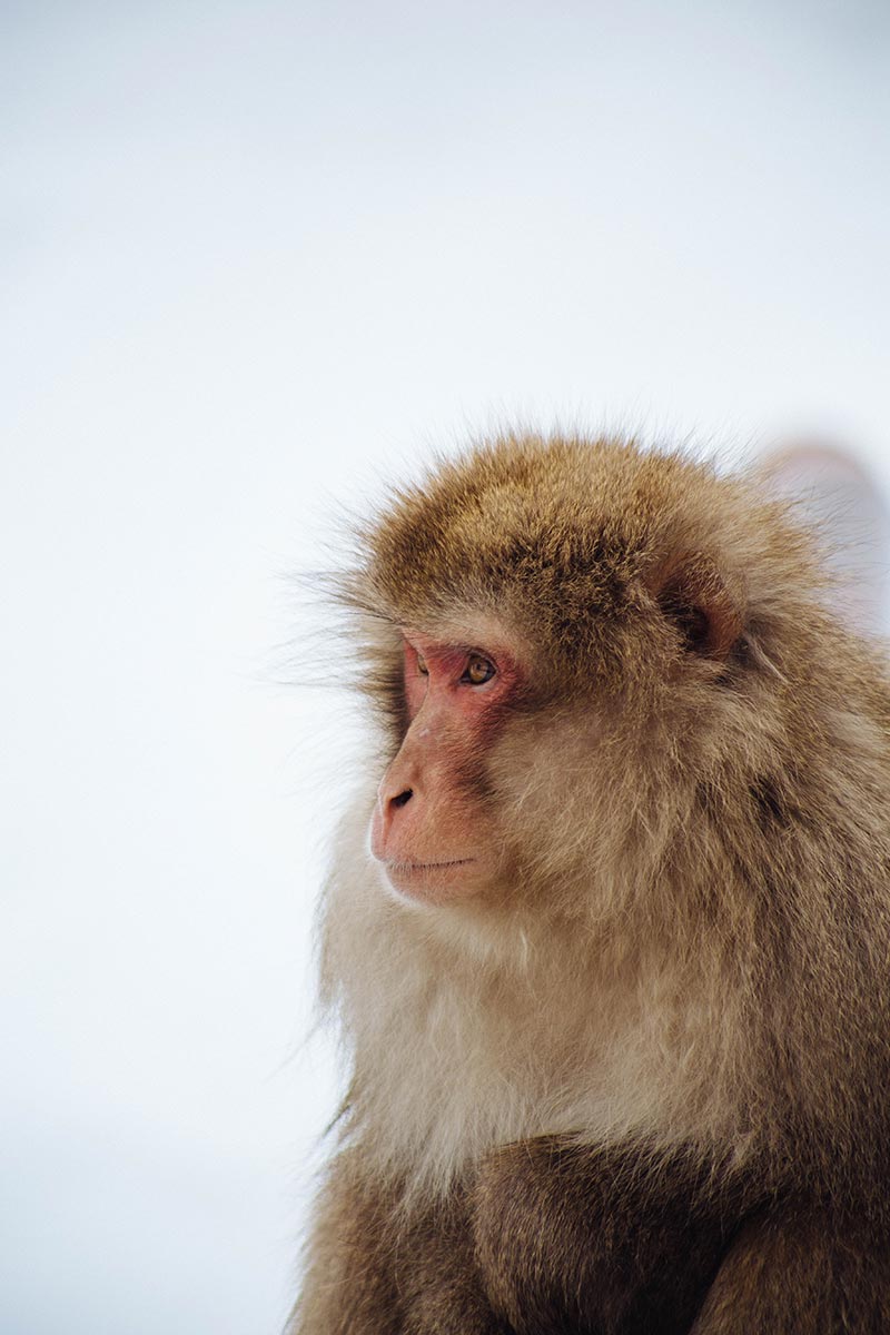
Now, let’s see what we can do with the mix-blend-mode property when the monkey image is in the foreground and uses the soft-light value:
<div class="blend-me-4">
  <img src="monkey.jpg" width="300" height="450">
  <img src="sky.jpg" width="300" height="450">
</div>
.blend-me-4 img:first-child {
position: absolute;
mix-blend-mode: soft-light;
}What about background-blend-mode?
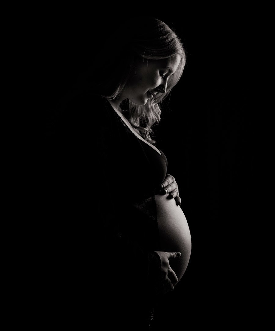
As mentioned at the beginning of the post, the background-blend-mode property is intended for combining an image and background color, and it can produce very interesting results.
In the following example, we use a dark image of a pregnant woman and a pink background color. The value we use for the background-blend-mode property is screen:
In this example, we used the value overlay and a slightly light and dark shade for the gradient:
.blend {
    width: 300px;
    height: 450px;
    max-width: 100%;
    background-blend-mode: screen;
    background-image: url(pregnant.jpg);
    background-color: #fa8072;
    background-size: cover;
}
By the way, the background-blend-mode property can also blend multiple background images together. Linear and radial gradients are considered background images in CSS, so you can blend an image with such a gradient as shown below:
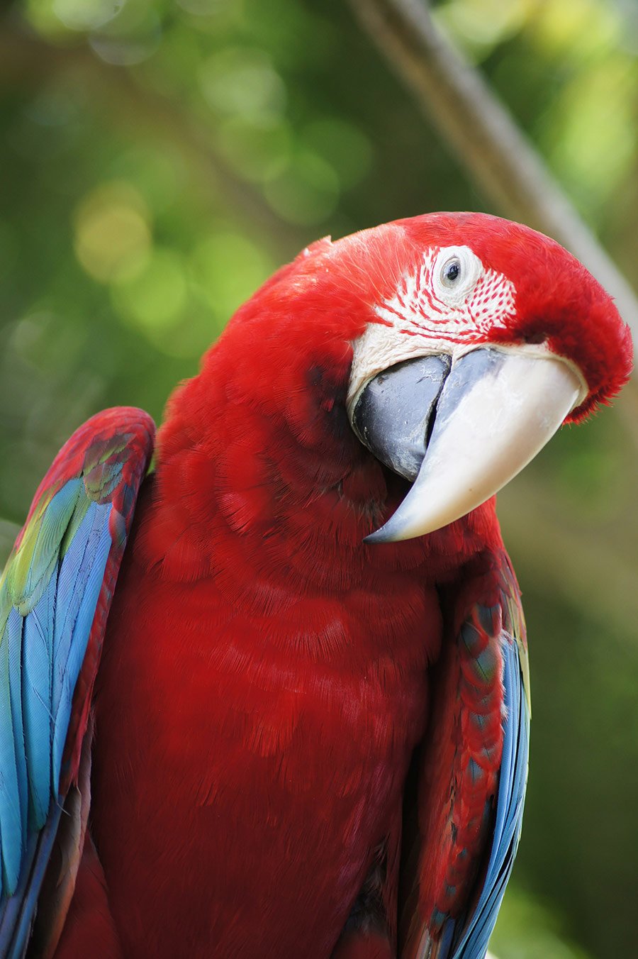
.blend {
    width: 300px;
    height: 450px;
    max-width: 100%;
    background-blend-mode: overlay;
    background-image: url("parrot.jpg"),
    linear-gradient(to bottom, #efe8f5, #8845e0);
    background-size: cover;
}
These Properties Can Upgrade the Appearance of Images
In addition to creative use of text and similar elements, the proper use of blending can enhance the look of images in certain situations, without touching or editing the original images.
The best quality

The best quality
The best quality
Final Trick – Removing White Background from an Image
The next trick is probably known to many designers or anyone who uses software like Photoshop, as blending options have existed in image editing software forever.
Let’s say you have a specific image or logo, and you don’t have it as a transparent PNG. Instead of starting to edit the image, you can use blending properties to easily remove the white background. Look at the following
example:
Here you see the same Facebook logo image in JPEG format. On one of them, I added the following value to the mix-blend-mode property:
img {
    mix-blend-mode: multiply;
}
Note: It’s not recommended to use this unless necessary. Also, note that the blue color is not exactly the same 100%.
Browser Support
Browser support is quite good, as you can see…
That’s it! Hope you learned something new! 🙂
Images from unsplash.com. Inspiration and some of the examples from various sources around the web.