CSS Flexbox and CSS Grid are both powerful layout tools. Flexbox handles one-dimensional alignment, while CSS Grid covers two-dimensional layouts with rows and columns.
When you need spacing between elements in a flex layout, margins can get messy fast. The CSS gap property (shorthand for row-gap and column-gap) solves this cleanly.
Most developers know gap from CSS Grid, but it works just as well on flex containers. I’ve been using it in production for years and it’s supported across all modern browsers.
Spacing Elements in a Flex Container with CSS Gap
CSS Gap works with CSS Grid, but there are many cases where you need spacing without a defined grid – a flex container, for example.
<div class="flex-gap">
  <div>1</div>
  <div>2</div>
  <div>3</div>
  <div>4</div>
  <div>5</div>
  <div>6</div>
</div>
.flex-gap {
display: flex;
flex-wrap: wrap;
}The flex-wrap property will allow those flex items to wrap in a row according to the parent element’s width.
Without any spacing, it looks like this:
And when we narrow the width of the parent element (container) due to the use of flex-wrap:
Spacing with Margins
If we want to add spacing between flex items, we can simply add margin to each of the elements:
.flex-gap {
  display: flex;
  flex-wrap: wrap;
}
.flex-gap > div {
margin: 6px;
}And here’s how it looks when we narrow the width of the parent element:
The margin works, but it doesn’t produce the same result as CSS Gap. Notice the extra spacing around the outer edges of the container – that’s the margin bleeding outward.
A key difference:
marginis applied to individual flex items, whilegapis applied to the flex container itself. Gap only creates space between items, never on the outer edges.
Spacing with Gap
With gap, the spacing applies only between elements – not between an element and its container. The difference becomes obvious in the next example:
.flex-gap {
  display: flex;
  flex-wrap: wrap;
  gap: 12px;
}
And it looks like this:
You can also pass two values to control row and column spacing separately:
.flex-gap {
  display: flex;
  flex-wrap: wrap;
  gap: 12px 12px;
}
Or use the longhand properties directly:
.flex-gap {
  display: flex;
  flex-wrap: wrap;
  row-gap: 12px;
  column-gap: 24px;
}
Gap with Wrapped Flex Layouts
When flex items wrap to multiple lines, gap handles both axes. The column-gap controls horizontal spacing between items on the same line, while row-gap controls vertical spacing between wrapped lines.
This is where gap pulls ahead of margin. With margins, you’d need to calculate which items are on the last row and remove their bottom margin. With gap, there’s nothing to calculate:
.tag-list {
  display: flex;
  flex-wrap: wrap;
  gap: 8px 12px; /* 8px between rows, 12px between items */
}
One thing to watch: gap doesn’t affect how flex-basis is calculated. If you want exactly 3 items per row with a 20px gap, you need to account for the gaps yourself:
.card-grid {
  display: flex;
  flex-wrap: wrap;
  gap: 20px;
}

.card-grid > * {
  /* 3 items per row: subtract 2 gaps, divide by 3 */
  flex-basis: calc((100% - 40px) / 3);
}
Gap with justify-content
When you combine gap with distributed alignment like justify-content: space-between, the gap value acts as a minimum gutter. The browser first ensures the gap is at least the size you specified, then distributes any leftover space according to the alignment rule.
.nav {
  display: flex;
  justify-content: space-between;
  gap: 16px;
}
If the container is wide enough, items spread out beyond 16px. If it’s tight, items will never get closer than 16px. This combination is useful for navigation bars and toolbars where you want even distribution but need a guaranteed minimum spacing.
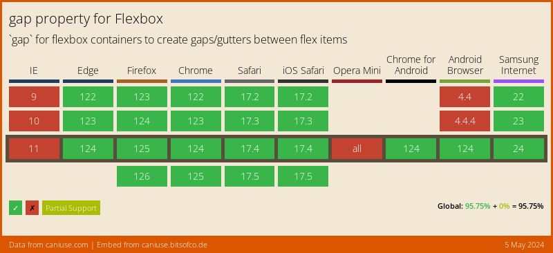
Browser Support
gap for Flexbox is supported across all major browsers. Firefox shipped it first in October 2018, Chrome followed in July 2020, and Safari added it in April 2021. The property is also flow-relative, meaning it adapts automatically to different writing modes – handy if you work with CSS logical properties.
You might think of using @supports to detect gap support in Flexbox:
@supports (display: flex) and (gap: 10px) {
  .container {
    display: flex;
    gap: 10px;
  }
}
There’s a catch: @supports (gap: 10px) returns true if the browser supports gap in any layout context (including Grid). It can’t distinguish between Grid-only and Flexbox support. In practice this no longer matters since all current browsers support both, but it’s worth knowing.
Percentage gap gotcha: Using a percentage value like gap: 10% on a flex container with no explicit height causes the row-gap to resolve to 0. Percentages in row-gap are calculated against the container’s height, and if that height is determined by its content (indefinite), the browser can’t resolve it. Stick to fixed units (px, rem) for row-gap unless the container has a set height.
What’s Next: Gap Decorations
A new CSS feature called Gap Decorations is being developed as a W3C Working Draft. It extends the existing column-rule property to work with Grid and Flexbox, and introduces a new row-rule property.
This will let you add visual separators (lines, patterns) between items without extra DOM elements or pseudo-elements. Chrome and Edge 139+ already support it behind the “Experimental Web Platform features” flag.
FAQs
gap creates spacing only between flex items, while margin adds space around every item including the outer edges. With gap you set it once on the container; with margin you typically need to target individual items and handle edge cases (like removing margin from the last item).gap: 12px 24px (row-gap first, column-gap second) or set them individually with row-gap: 12px and column-gap: 24px.gap applies spacing between the wrapped rows as well. The row-gap value controls the vertical space between lines, and column-gap controls the horizontal space between items.gap for Flexbox is supported in all modern browsers. Firefox added support in October 2018, Chrome in July 2020, and Safari in April 2021. No polyfills or fallbacks are needed.gap property works identically in both Grid and Flexbox - same syntax, same behavior. If you switch a container from display: grid to display: flex (or vice versa), the gap value carries over without changes.column-rule to Grid and Flexbox and introduces a new row-rule property. Currently available behind a flag in Chrome and Edge 139+.display: flex, the items aren't direct children of the flex container, or you're using a percentage row-gap on a container with no explicit height (which resolves to 0). Check that gap is set on the container, not on the items.gap on the container for consistent spacing between items, and margin on individual items when you need extra space around a specific element or want to push an item with margin-left: auto.That covers the CSS gap property for Flexbox. Once you start using it, you won’t go back to margin-based spacing.


Thanks for that! Short and to the point 🙂