The background-clip property allows us to control how far the background image (or background color) extends beyond the Padding or the content itself of an element.
I assume that this explanation is challenging to understand without some examples and a look at the code. So let’s see some examples, but before that, take a look at the following live example to encourage you to continue reading the post:
I found that Firefox does not display the content of this post properly. I suggest interested readers check the examples in Chrome at the moment and preferably on desktop.
So, in the spirit of Pride Week happening now, we will use pride colors in the post. The background-clip property is written as follows:
.element {
    background-clip: padding-box;
}
Possible Values for the background-clip Property
border-box– The default value. Allows the background to extend all the way to the outer edge of the element’s border.padding-box– Clips the background at the outer edge of the element’s padding and does not allow it to extend to the border.content-box– Clips the background at the outer edge of the element’s content (content box).inherit– Inherits thebackground-clipproperty from its parent element.
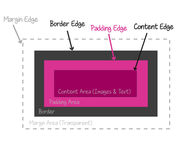
Box areas of an element – Credit – Codrops.com
As we said, the background-clip property is best explained through examples.
Examples
In the following examples, each element consists of a div and a single paragraph within it. The paragraph is the actual content of the element, and each element has a yellow background and a semi-transparent blue border. It looks like this:
1. background-clip: border-box
By default, or with the use of the background-clip: border-box property, the yellow background stretches to the outer edge of the border. Note that the border receives a green color from the background beneath it.
This paragraph is the content.
2. background-clip: padding-box
When the background-clip property is set to padding-box, the background color stops where the padding of the element ends. The blue border does not receive any background color, and the background does not extend to it.
This paragraph is the content.
3. background-clip: content-box
With the background-clip: content-box property, the background color is applied only to the content of the element (the paragraph in this case). The border and padding of the element do not receive the background color, but note that the background color stretches to the edges of the margin.
In this example, we set margins for the paragraphs using the default browser settings.
This paragraph is the content.
background-clip: content-box
As the previous example, but in this case, we added margin: 0 to the paragraph inside the element.
This paragraph is the content.
What about background-clip: text?
There is a vendor-prefixed version that allows clipping the background of text. The property is called -webkit-background-clip: text, and it is supported in Safari, Chrome, and Firefox:
-webkit-background-clip: text;In order to see how it works with transparent text, fortunately, and for the purpose of transparency, there is another property for text that efficiently overrides the color property that we all know. It’s called:
-webkit-text-fill-color: transparent;At the current stage, you may need to use
display: inlineordisplay: inline-blockfor the element to make the property work properly.
Take a look at the following example:
The CSS we used is:
.image-mask {
    background-size: cover;
    background-image: url('https://savvy.co.il/wp-content/themes/thesis/images/clip2.jpg');
    background-position: center;
    text-align: center;
    -webkit-background-clip: text;
    -webkit-text-fill-color: transparent;
    font: 900 134px 'Heebo', sans-serif;
}
The HTML is straightforward, consisting of the following markup:
<div class="image-mask">Savvy Blog</div>The text value in the -webkit-background-clip property clips the background to the foreground of the text, which is set as transparent using the -webkit-text-fill-color property.
It can also be done with a background that is fixed, so that when you scroll, the background remains in place. For example (probably won’t work on mobile):
And the CSS we used is:
.image-mask {
    background-size: cover;
    background-image: url('https://savvy.co.il/wp-content/themes/thesis/images/clip2.jpg') fixed;
    background-position: center;
    text-align: center;
    -webkit-background-clip: text;
    -webkit-text-fill-color: transparent;
    font: 900 134px 'Heebo', sans-serif;
}
Nothing has changed except for the use of the fixed background property. Additionally, the background-clip property also supports the hover selector:
The CSS is:
.image-mask-hover {
    background-size: cover;
    background-image: url('https://savvy.co.il/wp-content/themes/thesis/images/clip2.jpg') fixed;
    background-position: center;
    text-align: center;
    -webkit-background-clip: text;
    -webkit-text-fill-color: transparent;
    font: 900 134px 'Heebo', sans-serif;
    transition: all 3s;
    opacity: 0.3;
}

.image-mask-hover:hover {
     opacity: 1;
}
That’s it. Hope you learned something new… See you in the next post! 🙂