Over the years developing WordPress, I’ve noticed that identifying certain features supported by browsers is mainly done through JavaScript and libraries like Modernizer and its counterparts.
But there’s a native CSS feature that does the same thing without any JavaScript. It lets you check if the browser supports a specific property before applying styles, similar to how @media queries work for responsive design.
The feature is called @supports, and it works like this:
@supports (display: grid) {

   /* code that will only run if CSS Grid is supported by the browser.  */
   /* for example:  */

  .container {
    display: grid;
  }
}
You won’t need @supports for everything. CSS already has a natural fallback built in – if the browser doesn’t recognize a property : value pair, it just ignores it and uses whatever is defined higher up in the cascade.
Using or inheriting a property higher up in the cascade is called cascading.
That said, @supports still has plenty of good use cases:
/* Here we gonna write the fallback as you'll see in a minute */
@supports (display: grid) {
  .container {
    display: grid;
    grid-template-columns: 1fr 1fr;
    grid-gap: 2rem;
  }
}
Here we’re using CSS Grid. A few older browsers or legacy iOS versions don’t support it, which is where the fallback pattern comes in.
So in these cases (unless otherwise stated), you can simply let the browser use the default, so those elements within the container will receive the display : block property and stack vertically.
However, in many cases, this won’t suffice – for example, a gallery of images. In such scenarios, it might be appropriate to use a fallback that works with Flex by default, and if the browser supports CSS Grid, use Grid. It might look like this:
.container {
    display: flex;
    flex-wrap: wrap;
}

.container > div {
    flex: 200px;
    margin: 1rem;
}

@supports (display: grid) {
    .container {
        display: grid;
        grid-template-columns: 1fr 1fr;
        grid-gap: 2rem;
    }

    .container > div {
        margin: 0;
    }
}
Using the “not” Operator with @supports
There’s also the option to use the “not” logic with the @supports feature, like this:
/* Considered a BAD PRACTICE, at least if you're supporting IE 11 and iOS 8 and older */
@supports not (display: grid) {
    /* Isolated code for non-support of grid */
}
@supports (display: grid) {
    /* Isolated code for support of grid */
}
Notice the not operator we’ve used. In this case, the operator checks and applies some CSS only if there’s no support for CSS Grid.
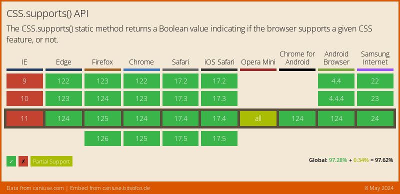
With @supports now at over 96% global browser support, the risk of a browser not understanding the rule itself is minimal. Still, the safer pattern is to write your base CSS first and use @supports to layer on enhancements.
Various Uses of the @supports Feature
Here are some more examples of using the @supports feature, like supporting the mix-blend-mode property:
.thing {
  opacity: 0.5;
}

@supports (mix-blend-mode: multiply) {
  .thing {
    mix-blend-mode: multiply;
    opacity: 0.75;
  }
}
Another example is supporting the initial-letters property for Drop Caps:
@supports (initial-letter: 4) or (-webkit-initial-letter: 4) {
  p::first-letter {
     -webkit-initial-letter: 4;
     initial-letter: 4;
  }
}
You can also use @supports to detect support for the CSS @property at-rule, which lets you register custom properties with a type for smooth gradient and color transitions.
Combining Conditions with and / or
You can combine multiple feature checks with the and and or operators. This is useful when a feature depends on multiple properties working together:
@supports (display: grid) and (gap: 1rem) {
    .layout {
        display: grid;
        gap: 1rem;
    }
}

@supports (backdrop-filter: blur(10px)) or (-webkit-backdrop-filter: blur(10px)) {
    .glass {
        backdrop-filter: blur(10px);
        -webkit-backdrop-filter: blur(10px);
    }
}
The or operator is particularly useful for testing vendor-prefixed versions of the same property. This pattern works well with newer features like CSS aspect-ratio or text-wrap that may need fallback handling.
Advanced Feature Detection: selector() and font-tech()
Since the original release of @supports, newer testing functions have been added. These let you check for more than just property:value pairs.
Testing selector support with selector()
The selector() function checks whether the browser supports a specific CSS selector. This has 94.8% global support:
@supports selector(:has(> img)) {
    .card:has(> img) {
        padding: 0;
    }
}

@supports selector(:nth-child(1 of .active)) {
    .active:nth-child(1 of .active) {
        font-weight: bold;
    }
}
This is especially useful for newer selectors like CSS :has() that aren’t supported everywhere yet.
Testing font technology with font-tech()
The font-tech() and font-format() functions let you detect support for specific font technologies:
@supports font-tech(color-COLRv1) {
    @font-face {
        font-family: "ColorEmoji";
        src: url("emoji-colr.woff2");
    }
}

@supports font-format(woff2) {
    @font-face {
        font-family: "MyFont";
        src: url("font.woff2") format("woff2");
    }
}
These are newer additions with slightly narrower support (Chrome 108+, Firefox 106+, Safari 17+), but they’re useful when working with variable fonts or color fonts.
@supports for every CSS property. Browsers already ignore properties they don’t understand. Use it when you need to apply a group of related styles together, or when the fallback requires explicitly different CSS rather than just being ignored.Browser Support for @supports Feature
The @supports rule has been supported in all major browsers for years and currently sits at over 96% global support. Chrome, Firefox, and Opera have supported it since 2013, Edge from version 12, and Safari since version 9 in 2015. You can safely use it in production without worrying about compatibility:
FAQs
@supports when you need to apply a set of related styles together, or when the fallback requires explicitly different CSS rather than just being skipped.@supports is a native CSS at-rule that runs directly in the browser's CSS engine with no JavaScript required. Modernizr is a JavaScript library that adds classes to your HTML based on feature detection. For pure CSS feature checks, @supports is faster and lighter. Modernizr is still useful when you need JavaScript-level detection or need to test features that @supports cannot check, like at-rules.@supports only tests CSS features - properties, values, selectors, and font technologies. For JavaScript feature detection, use native checks like if ('IntersectionObserver' in window) or a library like Modernizr.CSS.supports() in JavaScript. For example: CSS.supports('display', 'grid') returns true or false. It also accepts a full condition string: CSS.supports('(display: grid) and (gap: 1rem)').@supports block and apply whatever CSS is written outside of it. That is why the best practice is to write your base fallback CSS first, then use @supports to enhance it. The only browser that never supported @supports was Internet Explorer, which is no longer in use.@supports inside @media and vice versa. For example, you might check for grid support only at desktop widths: @media (min-width: 768px) { @supports (display: grid) { ... } }.That covers the core usage of
@supports and its newer extensions. I use feature queries regularly when working with newer CSS properties like container queries or @property – it’s a clean way to ship modern CSS without breaking older browsers.If you have any questions or creative uses for @supports, let me know in the comments.