CSS Nesting revolutionizes the way developers write styles by allowing CSS rules to directly mirror the hierarchical structure of HTML.
This not only enhances readability but also significantly improves maintainability, especially in complex projects with deeply nested elements.
By grouping related styles together, CSS Nesting minimizes redundancy and ensures your styles are logically organized.
Before diving into practical examples, it helps to understand the fundamental symbols and operators that power CSS Nesting. These will help you write cleaner and more efficient CSS.
“With native CSS Nesting, your styles reflect your HTML structure naturally, improving readability and reducing repetition.”
Understanding Key Symbols in CSS Nesting
CSS Nesting involves several key symbols that determine how selectors and properties are applied. Here’s a breakdown:
1. & (Ampersand)
The & represents the current parent selector in a nested rule. It’s a placeholder that allows you to append additional selectors or pseudo-classes to the parent.
HTML:
<div class="container">
  <div class="child">Child Content</div>
</div>
CSS Nesting:
.container {
  & .child {
    color: blue;
  }

  &:hover {
    background-color: yellow;
  }
}
Standard CSS:
.container .child {
  color: blue;
}

.container:hover {
  background-color: yellow;
}
Explanation:
- & .child: Targets
.childelements inside.container. - &:hover: Targets the hover state of
.container.
2. > (Direct Child Combinator)
The > combinator is used to select direct children of the current selector. This ensures that only the immediate child elements are styled, preventing unintentional targeting of nested descendants.
HTML:
<ul class="list">
  <li class="item">
    Item 1
    <ul class="sub-item">
      <li>Sub Item 1</li>
    </ul>
  </li>
</ul>
CSS Nesting:
.list {
  > .item {
    padding: 10px;

    > .sub-item {
      padding: 5px;
    }
  }
}
Standard CSS:
.list > .item {
  padding: 10px;
}

.list > .item > .sub-item {
  padding: 5px;
}
Explanation:
- > .item: Targets only
.itemelements that are direct children of.list.
3. Pseudo-Classes and Pseudo-Elements
You can nest pseudo-classes (e.g., :hover, :focus) and pseudo-elements (e.g., ::after, ::before) within your rules to style specific states or elements.
HTML:
<button class="button">Click Me</button>
CSS Nesting:
.button {
  &:hover {
    background-color: green;
  }

  &::after {
    content: '✔';
    color: red;
  }
}
Standard CSS:
.button:hover {
  background-color: green;
}

.button::after {
  content: '✔';
  color: red;
}
4. Nested Media Queries
Media queries can be nested within a selector to define responsive styles that stay contextually grouped.
HTML:
<div class="card">Responsive Card</div>
CSS Nesting:
.card {
  padding: 16px;

  @media (min-width: 768px) {
    padding: 24px;
  }
}
Standard CSS:
.card {
  padding: 16px;
}

@media (min-width: 768px) {
  .card {
    padding: 24px;
  }
}
Relaxed Nesting Syntax
When CSS Nesting was first introduced, the & symbol was required before element type selectors. This meant you had to write & h1 instead of just h1 inside a nested rule. As of late 2023, all major browsers support the relaxed syntax, which removes this restriction.
This means you can now write:
.card {
  h1 {
    font-size: 1.5rem;
  }

  p {
    color: gray;
  }
}
Instead of requiring:
.card {
  & h1 {
    font-size: 1.5rem;
  }

  & p {
    color: gray;
  }
}
The & is still useful when you need to place the parent selector in a specific position, such as appending a class (&.active) or reversing the selector order (.dark &). But for simple descendant selectors, you can omit it entirely.
Nesting and Specificity
One important detail to understand is how CSS Nesting affects specificity. The & nesting selector calculates specificity the same way as the :is() pseudo-class – it takes the highest specificity from the associated selector list.
For example:
#header, .nav {
  & a {
    color: blue;
  }
}
Even though .nav has a specificity of 0-1-0, the nested rule inherits the specificity of #header (1-0-0) because the & selector uses the highest specificity in the list. The resulting specificity of & a is 1-0-1.
Keep this in mind when debugging specificity conflicts in nested rules.
Be careful when nesting inside grouped selectors that mix IDs and classes. The & selector inherits the highest specificity from the group – just like :is() – which can cause unexpected overrides that are hard to debug.
Other Nested At-Rules
Besides @media, you can nest other at-rules inside a selector block. This keeps related styles grouped together:
.grid {
  display: grid;

  @supports (display: subgrid) {
    grid-template-columns: subgrid;
  }

  @container (min-width: 400px) {
    grid-template-columns: 1fr 1fr;
  }

  @layer utilities {
    &.hidden {
      display: none;
    }
  }
}
This approach keeps all styles for .grid in one place, regardless of whether they depend on feature support, container size, or cascade layers. For another at-rule that extends custom properties with types and smooth animations, see the CSS @property guide.
Best Practices for CSS Nesting
Native CSS Nesting is powerful, but it’s easy to overdo it. Here are a few guidelines to keep your stylesheets maintainable:
Limit nesting depth. Try to keep nesting to 3 levels or fewer. Deeply nested rules produce long selectors that are harder to override and slower for the browser to match.
Don’t mirror your HTML structure exactly. Nesting every element creates tight coupling between your CSS and markup. If the HTML changes, the styles break. Nest only when it improves clarity.
Use nesting for related states and variants. Pseudo-classes like :hover, :focus, and :active are ideal candidates for nesting. So are modifier classes like &.active or &.disabled.
If you previously relied on SCSS for nesting, the same depth guidelines apply. The only difference is that native CSS Nesting runs in the browser with no build step required.
Feature Detection
If you need to support older browsers that lack CSS Nesting, use @supports to apply nested styles only in supported environments.
Using @supports:
@supports selector(&) {
  .container {
    .child {
      color: red;
    }
  }
}

@supports not selector(&) {
  .container .child {
    color: red;
  }
}
Browser Support
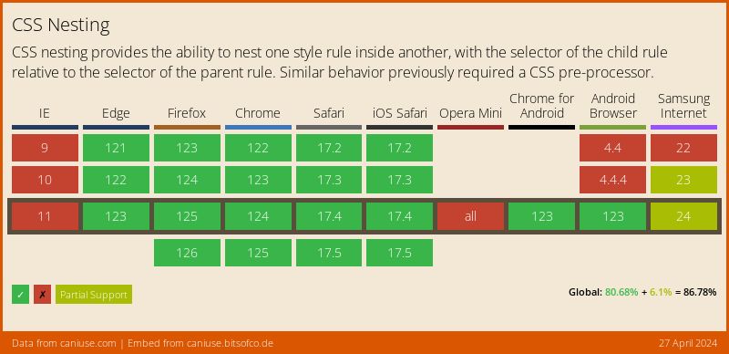
Native CSS Nesting is supported in all modern browsers: Chrome 120+, Edge 120+, Firefox 117+, and Safari 17.2+. As of 2026, CSS Nesting is considered part of the web platform Baseline, with well over 90% global browser support. It is safe to use in production for most projects.
For the latest data, check Can I Use.
FAQs
Common questions about CSS Nesting:
& (ampersand) required in CSS Nesting?
& is optional for simple descendant selectors. You can write .card { h1 { ... } } directly. The & is still needed when appending to the parent selector (e.g., &.active, &:hover) or when placing the parent in a non-default position (e.g., .dark &).& nesting selector calculates specificity the same way as the :is() pseudo-class. It uses the highest specificity value from the parent selector list. This means if your parent rule includes an ID selector alongside a class selector, the nested rule inherits the ID-level specificity even when the class matches.@media, @supports, @container, @layer, and other at-rules directly inside a selector block. This keeps responsive and conditional styles grouped with the component they belong to, improving readability and maintainability.@supports selector(&) for feature detection or a PostCSS plugin as a fallback.Conclusion
CSS Nesting allows developers to write more maintainable, intuitive styles by directly mirroring the structure of their HTML. Understanding the key symbols and avoiding common mistakes will help you harness its full potential.
“The future of CSS is here. Embrace native nesting to streamline your styling.”